HK filmmaker and martial arts super star Sammo Hung severed
ties with longtime powerhouse production company Golden Harvest as the 1980s
came to a close. With a leaner budget he soldiered on with intensity, but the
cracks were starting to show. 1990 saw the release of SKINNY TIGER AND FATTY
DRAGON, an uneven but fun action comedy that sees Hung reunite with comedy legend Karl Maka
and action master Lau Kar-wing. The fight scenes still shine brightly, while a
few of the “in between” scenes feel a little more like filler material. Still, the film remains a highlight of Hung’s 1990s output.

For the cover art, I tried to play-up the dynamic colorful nature
of the film while paying homage to the design aesthetic of the time in which
the film was made (especially inside the pages of the included booklet). I derived the color
palette from the HK title logo and gave the composition energy with an
explosion of overlapping lavender-toned characters amongst orange and teal paint
splatters. Our heroes are depicted surrounded by adversaries (even quarreling with each other in the center as they do in the film), but at the bottom stand together ready for battle.
Not being a fan of the original somewhat awkward-looking English
title, I created a new title treatment that read clearer and better fit my various uses for it (spine, disc, menu,
etc.).
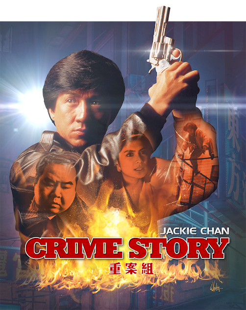
Since I feel a so-called “limited edition” o-card slipcover
should provide something that is actually limited in availability, for the
inlay artwork I decided not to reuse the same art but rather to utilize this space
to highlight the wonderful Thai poster artwork. I painted out the Thai text and
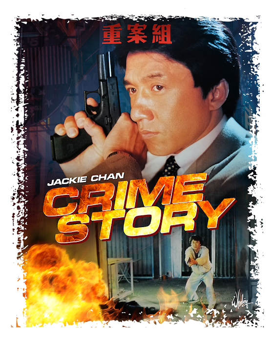
added the new English title font. And for the reverse, I recreated a close approximation
of the original Hong Kong photo poster artwork
from various elements I had, since a high resolution version could not be
provided by the licensee.

I had seen a YouTube trailer for the Mark Houghton
documentary I AM THE WHITE TIGER and suggested to my client to possibly license
the doc as an extra feature. Sometimes they go along with my
suggestions (such as fixing the color grade on THE BRIDE WITH WHITE HAIR, as
the provided master was an over-bright teal and orange mess) and sometimes they
don’t (releasing WARRIORS TWO and THE PRODIGAL SON in separate Amaray cases inside
a hard slipbox, ala CINEMATIC VENGEANCE). You win some, you lose some. But
somewhat to my surprise, a week later they told me they were now including it
on a limited bonus disc. Cool!
I wish we could’ve sourced an HD version of the entire extended
Taiwanese cut of the film. But it’s not unusual for those Mandarin-dubbed prints
to be extremely hard to find in good condition these days. At least excerpts are included in standard definition as a bonus feature.
See you next time… where we keep the DRAGON theme going. FOREVER.

