The Hong Kong "girls with guns" subgenre of action films is generally considered to have started in 1985 with the release of the action-comedy YES, MADAM! Due to it's commercial success, production company D&B Films was quick to produce more movies with a similar theme. Some starring their new starlet, Michelle Yeoh. Retroactively these loosely-connected films were marketed as a "series" called IN THE LINE OF DUTY — with YES, MADAM! being marketed as the first film in the series in some regions, and the second in other markets.
Regardless of the order of the films, YES, MADAM! remains a highlight of female-lead action cinema, and it was a pleasure to design the packaging for the first 4 films in the series. (Their success slowly dwindled after the wonderful fourth installment, and the rights holder has yet to make the remaining 3 films available in HD, but who knows what the future may hold.)
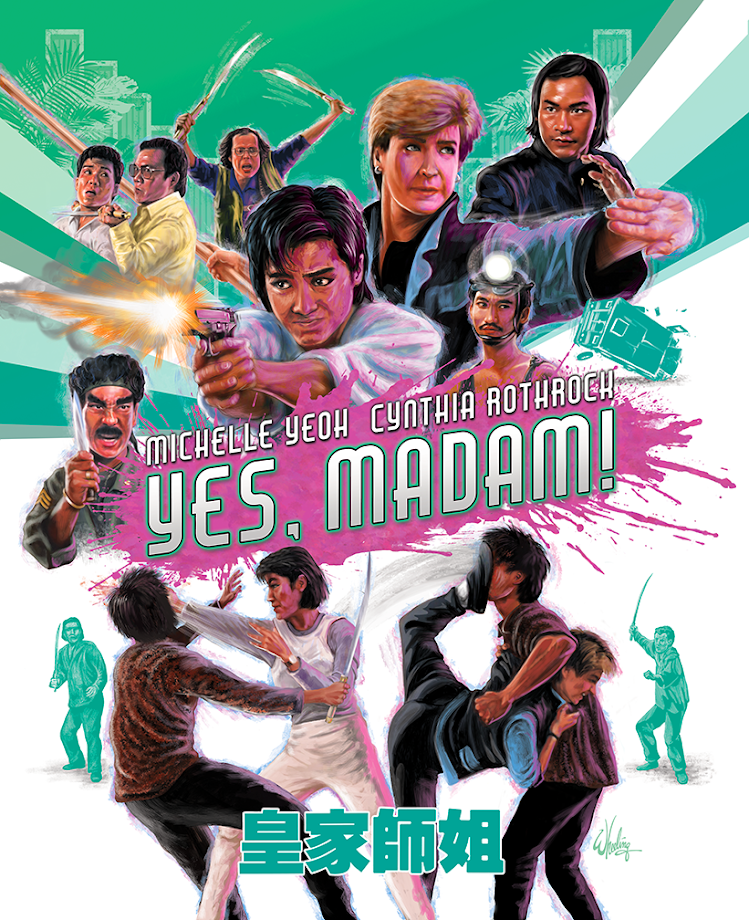
I decided to give each film a consistent bold compositional design, with a unique color theme. YES, MADAM! demanded a minty 'Miami Vice' mid-80s palette. With a splash of hot pink paint to pop the title and mimic the original HK poster art. I also decided to choose a simple title font that could work with all the film titles in the series (long or short), to further connect them visually.
I was able to illustrate the leads in representative poses exploding from the title, and give Michelle and Cynthia the emphasis they deserve. Monochromatic background elements in the upper corners are architectural details seen in the final act's big action set piece (soon to be painfully smashed by falling stuntmen).
For the booklet cover I went with a minimal black background with the leads in a tinted monochrome under the title text.
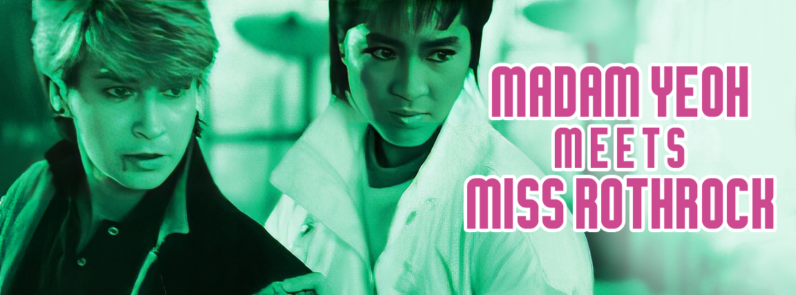
I carried this over to the Blu-ray menu, with the background design element from the cover behind the title and a color photo of the leads. This left plenty of room for a single-page layout of all the menu options.
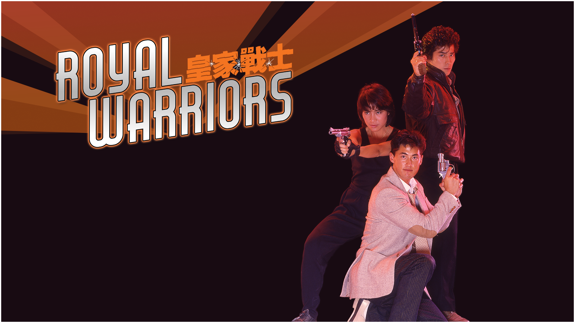
Next time,
WARRIORS get the
ROYAL treatment.