I’ve been a huge Jackie Chan fan since the 1980s. Pretty sure my friends
would label me fanatical. (You can view a video tour of 86 Chan posters—all I could fit —hanging in my garage on the Hong Kong Rescue
release of WHEELS ON MEALS. Just a sample of my overall Chan collection.) So it was
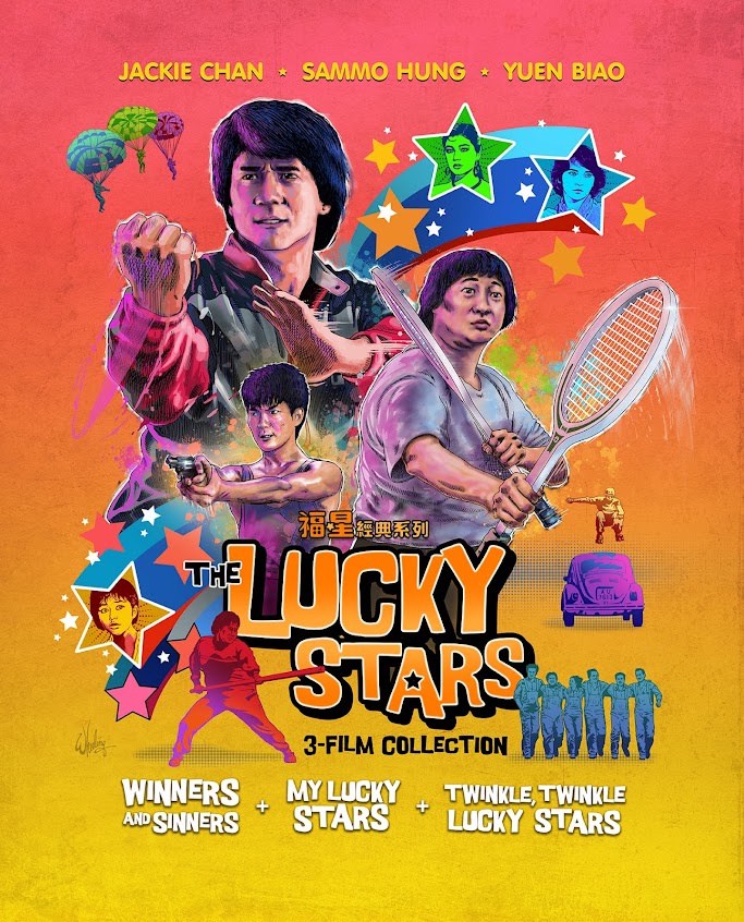
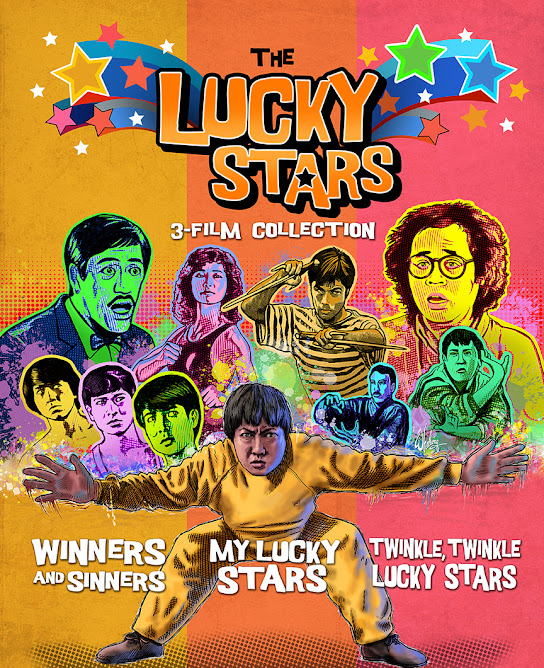
fun to get a chance to design a cover for not one, but three films, featuring Jackie
from back in his glory days.
Although Chan plays only a supporting character, he does
some great action work and co-stars among a who’s who of Golden Era Hong Kong film actors,
including two of his “Opera
School” mates Sammo Hung
(who also directed) and Yuen Biao.
This blu-ray collection featured the first 3 films in the
loosely connected 8-film LUCKY STARS series. The main attraction in the West is of course Chan, and he only appears in the first three installments. So the other sequels get no love here.
The first film, 1983’s surprise hit, WINNERS AND SINNERS, is
more of a template for what was solidified in the second outing, as the
characters have different names and backgrounds in that film. But it is
included here as it is generally considered the beginning of the series.
(Similar to the way SNAKE IN THE EAGLE’S SHADOW laid the basic template for
DRUNKEN MASTER to follow and improve on. Same cast, crew and overall premise. Sort of a "dry run" at the idea, that proved popular enough to redo with more polish.) Plus the Chinese title for WINNERS translates in English to THE 5 LUCKY
STARS, so it feels connected and includes most of the same cast in similar
roles. So, okay, it's Part One.

Approaching a cover project that is meant to represent multiple films presents a unique challenge. But it is helped in this case because the cast is
the same and the tone of each film is nearly identical. All action comedies. So a single visually cohesive
design can accurately capture the feel of all three films in the collection. I suggested the title as it is just that. Not a trilogy per say, certainly not a complete collection as I think there are 8 films total, but a "3-film collection" of LUCKY STARS films.
I remember seeing some 1980s artwork of athletes rendered in
a splashy paint style that I felt I could translate, albeit in a subtle way, to
the world of martial arts fighting. Adding in some old “Wonder Woman TV show”-style bold flying graphics in primary colors to emphasize the “star theme” (both the
LUCKY STARS of the title as well as popular stars of the film).
So it's mostly the colorful, light-hearted, energetic tone of the
film drove the visual direction of my design. (Of course some of the humor is
non-PC by today’s standards, but that is neither here nor there as it relates
to the cover art. Nothing is everyone's cup of tea. And variety in art is important at the very least to show different personal and cultural perspectives and allow the viewer to judge for themselves what to them has merit and why. If nothing creates discussion, then nothing is ever discussed. And if no one pushes the edges, we never know the boundaries. Perhaps behavior that was humorous only 30 years ago that has now become strictly verboten does at the very least serve one purpose. It proves society is progressing.)
Anyway, back to the cover, we get hero shots of the three big star attractions coiled for
action. One fist fighting, one gunplay, and one using tennis rackets as weapons
to indicate the comedic side of the action. Each film also featured a female lead
and they get the “star” treatment, flying out from behind the men. And little
vignettes of other notable scenes are sprinkled around the edges to fill out the
composition.
Each film got it’s own related disc art highlighting one of
it’s stars, and the booklet cover features more of the supporting cast along
with some villains... all being corralled by ringleader Big Brother Sammo. Of course baddie Richard Norton gets in his trademark line
for the back cover.
As far as design styles go, I’ve never been a fan of
approaching all projects with a "signature" style and forcing that into whatever
film I’m representing. If, as an artist, the look of your art is famously
recognizable and closely associated with the work within, such as Dr. Seuss or
Charles M. Schulz who illustrated text they wrote, then it makes perfect sense
as that art style is part and parcel of the whole. Just imagine Seuss illustrating Schulz's comics as opposed to his own books. Weird huh? So in some circumstances a viewer expects a certain art style from a specific author. But since I'm doing a promotional image for someone else's work, I prefer to
take myself out of the project as much as possible and approach everything with
a blank slate. I try to answer the question: What style would naturally work best for
this film given its genre, tone and era it was made? What would I want to see as a cover image that hasn't already been done? A single "signature" style does not fit
all films.

To that end, it forces me as an artist to push myself in new creative directions
and that challenge is a way I can grow beyond my comfort zone. All creators,
from musicians to visual artists tend to have their “go-to fall-backs” when left
unchallenged. So with more variety in my projects, the more new things I discover I can (or can't) do. My first professional illustration job was in 1984 so I’ve
been at this for a while, but I find I never stop learning from each project. And that’s the fun part.
Of course, I don’t have the luxury of just illustrating
characters I’ve done 100s of times already. Usually each actor’s likeness is my
“first take”. These project's budgets don’t allow for “roughs” so the final
product is pretty much my first stab at it. Of course, after I finish, THEN I
go “Oh okay, NOW I have a better idea of how to render that actor. But alas I’m
done already. Onto another one.” Hopefully I can apply what I’ve learned going forward. As someone once said, it's the journey, not the destination.
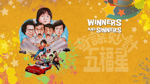
For the blu-ray menu art I mixed elements of the wonderful original poster art with new
elements to create what I thought was a cohesive composition with a good balance of positive/negative space. The first film’s poster art (subjectively) flowed
to the right so it was positioned on the left leaving room for menu text buttons
on the other side of the frame.
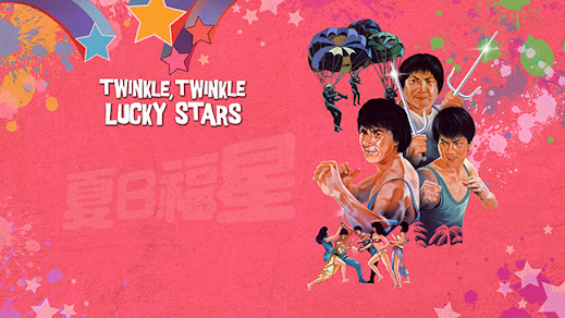
The next two films
originally did the OPPOSITE. The vintage
poster art flowed
to the left so was positioned on the right, allowing space on the left for
menu buttons. So the illustrated characters led your eyes to the menu and not off the page. And with those two films being
tied more closely together than the first, I felt it worked well that way. They
ARE a little different.
But as is sometimes the case, for any number of reasons, clients make their own 11th hour edits to the work. In the case of MY LUCKY STARS and TWINKLE, TWINKLE LUCKY STARS they surprised me by flipping my blu-ray menu art horizontally. Here is how I intended the menus to look.
Perhaps it was done so the menu coder
could plop the text menu buttons in the same place on all three films. (Sorry Biao
fans. I know he holds his sword in his right hand. At least he did in my version.) This little nitpick aside, they're still a dream client and we would work even more closely in the future.
And once the work was done on this project… my luck had
run out. Things were about to get scary. More on that - next
time.


