Having just finished work on THE LUCKY STARS 3-FILM COLLECTION project there was suddenly a unexpected hold up.
An issue with two of the films meant that new transfers
needed to be struck from negatives in
Looking forward to the fall schedule, MR. VAMPIRE was deemed ready enough to move up to fill the now vacant summer slot.
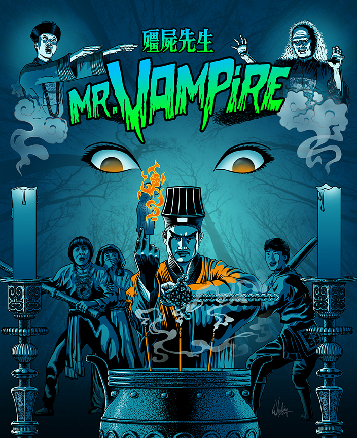
But that meant the packaging art had been done ASAP. No problem. Time to get CREEPY.
This being a horror/comedy dealing with Chinese vampires—which are actually closer in spirit to Western zombies than Western vampires—I felt it needed a moonlit, comic tone. I went with thick and thin black outlines, a limited color pallet of cool blues and greens (mimicking our vision at night) with a few pops of orange (as the complimentary color). The candles flutter out as something enters the room catching the attention of our heroes, fearful, but ready for action. Lots of direct eye contact to intensify the emotional impact. Our Taoist priest protagonist does his best to keep the evil as bay. But for how long? The stylized smoke and flames were a pleasure to draw.
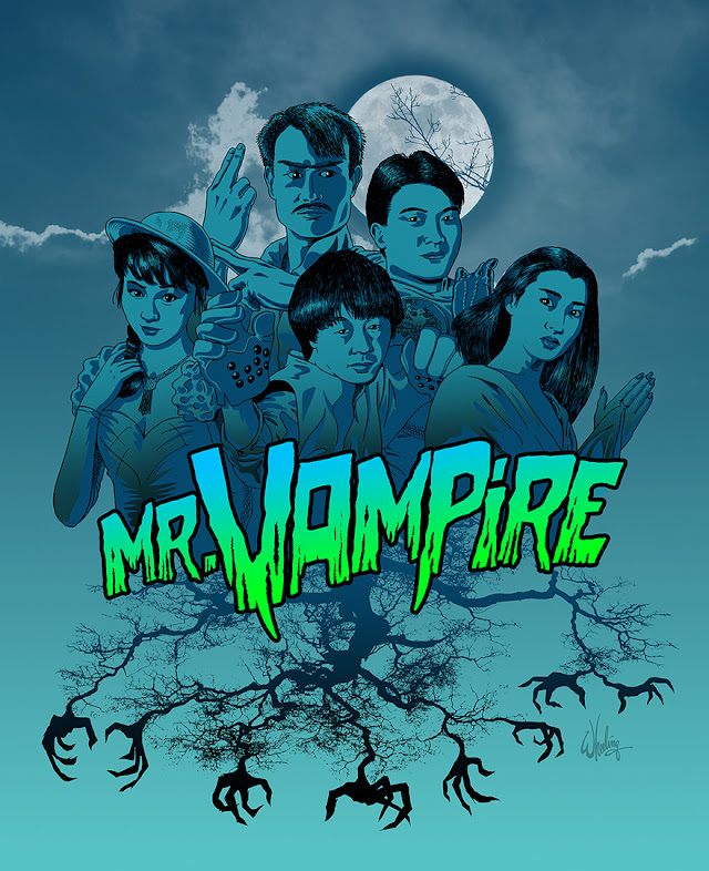
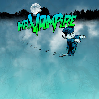
I designed a title font sporting rotting fangs and a matching color gradient.
For the booklet cover we get a tight grouping of the main cast of characters huddled together as night unfolds and a full moon looms overhead. Even nature cannot be trusted as tree branches grope and grab in all directions. But with no warm orange fire as protection this time.
Knowing more films in this genre could be forthcoming, I felt this visual approach could function as a suitable style for a matching series when similar titles get greenlit for re-release.
And so it was... for another classic HK horror/comedy was indeed in the pipeline.
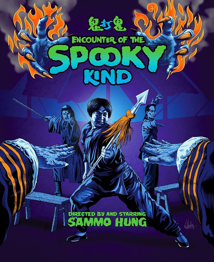
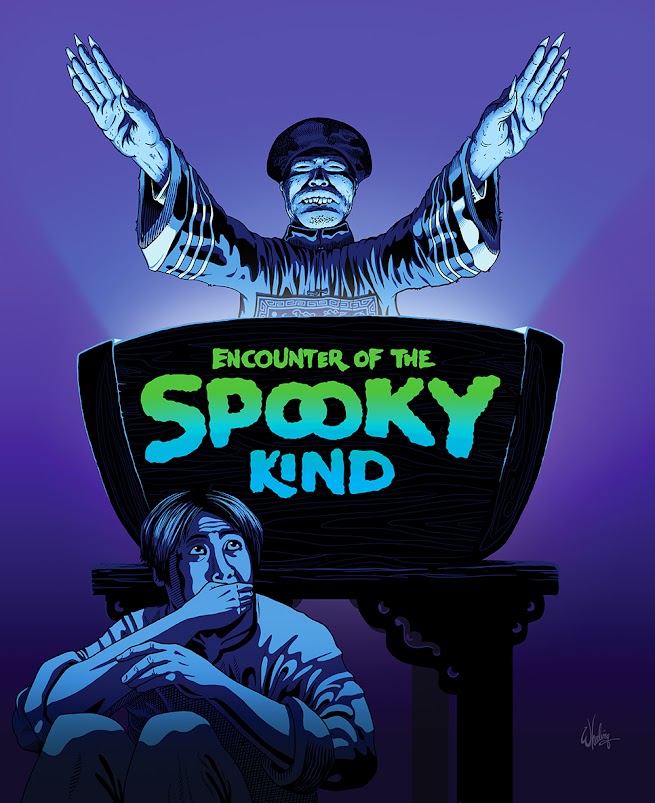
Sammo Hung's seminal 1980 martial arts action/horror/comedy classic ENCOUNTERS OF THE SPOOKY KIND (aka SPOOKY ENCOUNTERS) was given the remastered blu-ray treatment and released the following year.
Working within the style guide I set for myself with MR. VAMPIRE, I went with a slightly more purple tone for the background here so the characters could be edge lit and pop out.
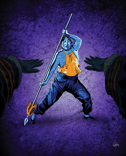
Again the characters challenge the viewer, as if our POV is that of the Jiangshi (Chinese hopping vampire) itself. It features two large gnarly, burning hands reach out to engulf the title. Again orange is used as the pop color, with blue-green gradients.
I know most fans want to see Hung posed as a confident action hero, but his character is afraid through most of the film until the very end. So to convey the threat of the undead, I also did a version where he actually looks fearful.



No comments:
Post a Comment