Tuesday, September 19, 2023

The Royal Treatment


In the early 1990s Cantonese comedian Stephen Chow burst to super stardom in Hong Kong. His films often outgrossed even Jackie Chan and Chow Yun-fat movies at home. In fact, the top five highest grossing HK films of 1992 were all Stephen Chow films. (Hey dude, howzabout leave something for the rest of us!) It is from that very furtile period that these two films arose. Well, it's more like one 3 hour film chopped into two 90 minutes halves. With bottom-denominator Wong Jing at the helm, you know what to expect and yep, it delivers. Lots of nipple twisting. Philistines rejoice. 

For the outer packaging of the Blu-ray collection of both ROYAL TRAMP films, I briefly considered going with a super-deformed big-head caricatured cartoony style synominous with Hong Kong action-comedies of the time. But although that goes over well with HK audiences, I think my client's European audiences associate that more with straight comedies, and although this film is quite silly, I think the bigger draw to this market is the over-the-top martial arts action and not the Cantonese wordplay Chow is known for. So instead I played up the bright colors, the large recognizable cast, the fanciful costumes and of course Chow's goofiness... all wrapped in an ornate, slightly formal, Chinese framework.  


October is coming and that when the spooks come out. Next time.

Sunday, September 17, 2023

A New Revelation


Many have long lamented the dearth of original ideas coming from Hollywood, and rightfully so. Even the recent Oscars had to look to an independently produced film, EVERYTHING EVERYWHERE AT ALL ONCE, to give it's highest awards to.) So perhaps audiences seeking something fresh, just haven't been looking in the right place.

THE FP is nothing if not an original idea. The brainchild of it's monocular writer/director/star Jason Trost, the film (actually there's so far four films in the saga) is an irreverent dystopian science-fiction action comedy centered around two gangs who battle for control of the titular Frazier Park by, get this, competing in a video game called Beat Beat Revelation (think Dance Dance Revolution with added death by eletrocution for the loser and you aren't far off).

I was happy to be requested personally by the director to create the outer packaging design for the Blu-ray collection of the film series. The film's colorful characters and quirky visual effects provided ready-made inspiration for my cover design. It was just a matter of fitting the disparate elements together into something cohesive while still representing the somewhat chaotic nature of the dream-like universe of the films. 

This is one of those cinematic experiences where afterward you mentally question what you remember seeing, because it's just so fancifully preposterous. But if you can open yourself up to something different and just go with the new flow, it's a rewarding venture. Four rewarding ventures.

Now was it UP, UP, DOWN, RIGHT, RIGHT, LEFT, DOWN, oh shi- *BZZZZZZZZZ* 

Time to Chow down with Stephen.
Next time.


Thursday, August 31, 2023

Dine In. Take out. Kick a$$!


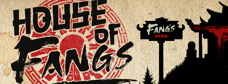
This is a fun new film project currently in development. Actor and filmmaker Michael Worth (KILLING CUPID) is aiming to reunite a bevy of kung fu cinema laureates with his latest cinematic effort, HOUSE OF FANGS. The film will be a dark action-comedy that harkens back to the style and sensibilities conveyed in beloved martial arts titles from banners like Golden Harvest, Shaw Brothers and Seasonal Film Corporation, mixed with John Wick style gunplay and generously sprinkled with Tarrantino-style humor.

Various veteran (amd modern) action actors are in talks, but the casting potentials include: Angela Mao Ying (ENTER THE DRAGON), Dragon Lee (THE CLONES OF BRUCE LEE), Bruce Le (ENTER THE GAME OF DEATH), Chiu Chi Ling (DUEL OF THE 7 TIGERS), Bruce Li (BRUCE LEE, THE MAN, THE MYTH), Don Wang Tao (THE HOT, THE COOL, AND THE VICIOUS) and Bruce Leung (KUNG FU HUSTLE). Rounding out the casting hopefuls are Michael Dudikoff (AMERICAN NINJA franchise), Mark Dacascos (ONLY THE STRONG), Scott Adkins (AVENGEMENT), Dolph Lundgren (THE EXPENDABLES franchise) and Lorenzo Lamas (SNAKE EATER trilogy). That's a veritable dreamteam of action icons.  

Worth is directing from his own script which is described as ‘DRAGON GATE INN meets JOHN WICK’ as a group of American assassins hiding out in a rural Chinese restaurant discover the owners of the establishment serve up much more than just good food!”. 

The movie also reunites Worth with fellow action veteran Andy Cheng (SHANG-CHI AND THE LEGEND OF THE TEN RINGS, THE RUNDOWN) following Isaac Florentine’s U.S. SEALS 2: THE ULTIMATE FORCE (2001), on which Cheng also served as fight choreographer.

For the teaser posters, my influence was an old 2-color ad for a Chinese restaraunt that was on the back cover of a multi-page newsprint flyer given out by the American Theater in Washington D.C. in 1988. This theater is where I enjoyed a Hong Kong double feature every Sunday evening. Best six bucks I ever spent. (Oddly enough, that exact restaurant is where I had dinner with several visiting HK movie actors years later, but that's another story.)      

If this sounds like the kind of movie you want to see. (And if not, you need your head examined.) Here's your chance to help make it a reality. Back it HERE!

To Hell with another stale Hollywood rebooted remake or reimagined regurgitation. Drop by HOUSE OF FANGS for a steaming dish of fresh action served "piping hot". (Not to mention the tastiest dim sum in town.)  

Here's the Heckler & Koch UMP-9 version:


And a Glock 19 version:


Double swords version:


Again, check it out HERECatch you nex time.


Wednesday, August 30, 2023

She Shoots Straight

I created this piece of key art for the 1990 Hong Kong action film SHE SHOOTS STRAIGHT (aka LETHAL LADY). This Corey Yuen-directed film was a starring role for rising action starlet (and Sammo hung's future wife) Joyce Mina Godenzi. The half Chinese, half Australian beauty was the 1984 Miss HK pageant winner who, like many others before and since, transitioned her talents into acting.

Under the tutelage of action master Sammo Hung, Joyce appeared and later starred in a handful of films in the late 1980s and early 1990s before retiring from showbiz. She was nominated for Best Supporting Actress in Hung's 1987 action masterpiece EASTERN CONDORS. Godenzi and Hung wed in 1995 and she had a small cameo in Jackie Chan's 1997 film MR. NICE GUY, directed by her husband and shot in Australia.

SHE SHOOTS STRAIGHT is Joyce at the peak of her powers as an action actress. Her brutal climactic battle with American-born Filipina bodybuilder, Agnes Aurelio, is legendary. And they even got a rematch in LICENSE TO STEEL. The wonderful cast features "big" Tony Leung Ka-fai, Carina Lau, Yuen Wah, Chung Fat, and even Sammo himself in a small role. (Even Mark Houghton gets a brief cameo.) Eagle-eyed viewers may even spot cameos from Amy Yip and Isabella Chow who a year later would blaze across cinema screens in the hit Cat III film SEX AND ZEN.

The films rarely slows down, has a bit more dramatic depth than these types of films are normally afforded and is a lot of fun. That high energy is what I attempted to capture in my cover art. Everybody gets their bit of action while Hung oversees the carnage. Bullets and fists fly in equal measure. And, trust me, you wouldn't want to be in the way of either one.  

 
Next up. Too old to rock n' roll, but too young to die? There's trouble in town. Time to raid the martial arts retirment home and get the band back together for one last bash. That's NEXT time.

Monday, July 31, 2023

The Fury of Rothrock

Cynthia Rothrock has the unique distinction of being possibly the only American actor to get her cinematic start in Hong Kong action films. A superior athlete, Rothrock segued her status as the undefeated World Champion in Martial Arts Forms and Weapons into a equally successful career in the world of action filmmaking. After several popular martial arts action films in Hong Kong she now primarily works on US productions as an actor, writer and producer.

In 1989 after appearing in various supporting action roles, HK juggernaut studio Golden Harvest gave Cynthia the lead role in an action comedy called THE BLONDE FURY (retitled LADY REPORTER for the export market). I won't go into details of the fragmented production schedule, but the final result is a thoroughly pleasing romp full of exciting set pieces and ernest performances. These Hong Kong performers truly risk life and limb for our "popcorn entertainment".

Commissioned to do the remastered Blu-ray package, I endeavored to capture that late 80's visual aethestic (right down to the "VHS sticker") while still making the art feel vibrant and fresh. The movie is a bit "all over the place", and so is the cover art. Her name above the title is sharpie marker on masking tape. Perhaps a little bit "punk". The film did not have a strong marketing campaign upon it's initial release so I was free to come up with my own vibe.


 The booklet cover art carries forward the same visual theme.

We'll continue the "ladies kickin' ass" theme next time with another popular film in the Hong kong girls with guns action subgenre.

Sunday, July 30, 2023

The Canton Boxer


THE SKYHAWK is a 1974 martial arts film, unique in the fact that in acts as a bridge of sorts. A passing of the "action movie torch". It stars a veteran superstar actor (nearly 70 year-old Kwan Tak-hing who had already portrayed folk hero Wong Fei-hung in about as many films) passed his prime but still kicking, along side up-and-coming superstar Sammo Hung, and powerhouse action actors Carter Wong, Hwang In-shik and even Nora Miao.

Luckily the film lives up to it pedigree. Packed with memorable action set pieces and lots of emotion, it stills thrills action fans today, while hinting at the lofty heights Hung would achieve in the decade to come.

For the cover art I followed the same visual template I designed for a previous series of kung fu/wuxia films from this period. It features larger than life villian, Hwan In-shik, menacing in a blue color theme with our weaponless heroes huddled in the center.


The booklet cover design shows our heroes walking toward their final showdown amongst the ruins of a Thai temple, rendered in a shilouetted minimalistic style. Why can't they make movie like this anymore?

Next up. The blonde fury herself, Cynthia Rothrock, gets her due in a starring role.

Monday, June 26, 2023

The Dragon Remembered


This year, 2023, marks a milestone in the history of kung fu cinema. It's now been fifty years since the release of Bruce Lee's 1973 seminal martial arts classic, ENTER THE DRAGON. The film was not only a financial success at the time, but was equally influential to subsequent action films and television programs. 

Bruce was in the middle of producing his magnum opus, GAME OF DEATH, when Warner Brothers offered him his first starring roll in an American film. So he paused his work on that film and made BLOOD AND STEEL (which he demanded by retitled ENTER THE DRAGON). 

Sadly, his untimely death right before the release of this film also meant he never got to fully expereince this new global adulation, or have the chance to complete GAME OF DEATH in Hong Kong. Just as Lee broke thru to worldwide stardom, his burgeoning career, and his life, abruptly ended. Aged just thirty-two. 

I was commissioned to produce some artwork for the cover of a retrospective look back at Bruce's Hollywood starring debut. Although the full-color image was utilized, two alternate monochromatic versions were also produced. (see below)


Bruce Lee cast a long shadow. We explore what has happened in those shadows, and see what the legendary Sammo Hung was up to the following year. Next time.

Thursday, June 22, 2023

Remember. Revisit. Respect.

Late last year I was comissioned to create a poster for a new documentary which celebrates Bruce Lee's first major film role, 1971's THE BIG BOSS. The doc locates and revisits the surviving filming locations in Thailand as they exist now. 

Usually my clients for Blu-ray movie covers offer no direction. "Can you make us a cover for such-and-such film by next Friday?". But this time, my brief directed me to use this iconic shot of Bruce from the film as the focus image. (As well as incorporate the required text.) 

So my main concern, given the similar title, was to avoid confusion and clearly convey that this is NOT a poster for THE BIG BOSS, but a new documentary about THE BIG BOSS. So to that end I "watermarked" the background with many behind-the-scenes photos from the film. And pulled one such image to the forefront in the lower left corner. One in gold and a second version in blue.

I created a title font for the film, similar to the bold red original, but now distressed as if from age, set against a muted silhouetted Thai landscape. For added interest I included a familiar black shape of Lee performing his famous jumping kick from the film's finale. 


Below is the less common blue variant.


This year is an important one for Bruce Lee fans, as it marks a milestone. We shall dig deeper into that next time as we continue the Celebration of Bruce Lee. Would that make it a "Cele-Bruce-tion"?
*sigh*
I'll show myself out.  

Wednesday, May 17, 2023

Going Mad

There are two diametrically opposed ways to approach designing packaging for a film franchise boxed set.

  1. Find a simple iconic image that can embody the entire cinematic saga —  For instance, this could be a lone X-Wing Fighter approaching the Death Star for the Star Wars saga.
  2. Or... attempt to represent ALL the main (and some supporting) characters of each film in the collection, crowded together into one busy composition.
Personally, I prefer the simple elegance of the former, but feedback indicated film fans wanted the later. So chaos rules and madness is the order of the day. 

The art style and color palette is a continuation of what I used for a series of similar films such as the first MR. VAMPIRE, THE DEAD AND THE DEADLY, and ENCOUNTER OF THE SPOOKY KIND.  

The four horror-comedy films collected for this presentation (MR. VAMPIRE II, MR. VAMPIRE III, MR. VAMPIRE SAGA IV, and VAMPIRE VS. VAMPIRE) are thematically connected by the jiangshi (hopping Chinese vampire) genre, with some reoccurring cast and crew. In typical Hong Kong fashion they are sequels in name only, without repeating characters or any over-arching storyline. Regardless, the films are a lot of goofy fun, and are prime examples of this uniquely Hong Kong film genre made during the original jiangshi boom of the 1980s.  

The essay booklet cover art features a jiangshi rendered immobile by a prayer scroll attached to his brow. A familiar sight in all of these types of films. This is an example of a more minimal design approach.

I also designed menu backgrounds for each film, but I don't know if they were used.


That's all for today. Catch me next time... for something new.

Monday, May 15, 2023

Becoming Jackie Chan


This is a cover piece done for a magazine publication to accompany an article about the early Jackie Chan's films THE YOUNG MASTER and THE BIG BRAWL (aka BATTLECREEK BRAWL). The collage features three images from each film set against a bold watercolor wash with some Chinese articles watermarked into the background. Using a homogeneous color palette of orange and blue tones, along with consistent eyelines, help pull the disparate imagery together. I contrasted the blue figures with red to pop them forward.


Next time... things start hopping. Things get scary. Things go mad.

Sunday, April 30, 2023

Blood and Steel


This piece was done for the cover of a violent martial arts epic from celebrated Hong Kong film director Ringo Lam. BURNING PARADISE offers another tale of young folk hero, Fong Sai-Yuk, battling the forces of evil - this time in a labyrinthian underground prison lair where one wrong move spells sudden death of an extremely "uncomfortable" nature.

The extreme violence of the movie naturally dictated the color palette. Blood is everywhere. Inside and out. The Chinese character for "fire", rendered in blood red, looms large and splatters everything in sight. It's emphasis is heightened by reducing all other colors down to a monochromatic grayscale wash of character action/reaction.

It's a strange dichotomy. It's a constant back-and-forth, as I struggle with the tools of the trade to render physical my vision for each piece. I wouldn't say I ever get fully comfortable in any given style. But I'm also aware of the fact that I never want to exhibit a recognizable style. I don't want to be a "style". (The art direction of the thing I'm marketing should dictate the style if it has any at all.)

If I feel I'm getting too comfortable, repeating myself, I immediately attempt to move from on it. Unless I'm doing a series where all the items need to match, I want to welcome each new design job with a set of fresh eyes not relying to previous works to guide me.

If I'm not stretching, I'm not growing. (And I've got a long, long way to grow.) That's the dichotomy. I try to improve in a certain direction, but then if I feel I'm approaching that goal, I immediately move on from it to try to pursue a different direction. I never stay in any comfort zone. The compounded effect is I'm never fully happy with the work. 

I think this comes from decades of working for hundreds of different clients, all wanting something different. So I have to be everything to everyone. So my own vision takes a backseat. But that's life as a graphic designer. Do your best. Hopefully learn something in the process. And onto the next one. 

See you on the next one. 

Friday, April 28, 2023

The Streets Run Red


This is a piece I did for a early 70s Japanese gangster film directed by Hideo Gosha. It's dark, violent and, well, takes it's brand of yakuza action to the streets. So, in a flagrant example of "truth in advertising", it's actually called VIOLENT STREETS.  

I've never been a fan of the "stack of floating heads" poster style so popular in the 1990s. (ie: names across the top, head over shoulder, head over shoulder, head over shoulder, horses running in silhouette across the bottom, done call it a day.) So when possible, I always try to give the characters a little bit of business. Holding a prop, a weapon, a phone, some sort of indication to who their character is. So viewers can get a hint of the story, or at least the type of story from the imagery.

Also juxtaposing protagonists and antagonist facing each other can visually express a sense of the conflict. In this film it's not so much "good guys versus bad guys", they are all pretty much "bad". But it's still one group versus another and my composition splits them down the middle with our protagonists on the left. The bloody Japanese title divides them and spills out onto the dark street itself where it joins the bleeding body of a woman. While the whole scene is rendered off-kilter, is contrasting hues of reds and blues. Hot and cold against a neutral gray night.    

Various elements, such as tiny flying chicken feathers, a pack of German Shepherds, a transvestite with a knife are all pulled from the film, but don't spoil any major plot point.

The rough comp is shown to the right (inset) with the final finished piece below.

The other primary color, a prominent yellow muzzle flash, subtly reflects on the actors faces and is echoed in the director's name. While all the red lighting the scene emanates from the Japanese title.


Take the sex and the violence from this film, and add martial arts. Stir until it comes to a fine boil. That's next time.

Sunday, March 26, 2023

Action Overload


I went with a blue tone for IN THE LINE OF DUTY IV starring Cynthia Khan and Donnie Yen. (Perhaps the abundance of 1980s denim played a role.) The cover strives for that balance of positive and negative space. With bold lines driving the eye toward the title. I never like to clutter the image with dozens of heads peeking over shoulders so the colored lines provide a natural visual element for layering the figures. And I was able to render every figure doing something energetic which helps define their character, and provides a better impression of the film.


Although the first four films are the most popular, it would still be wonderful to release the remaining films in the (admittedly loosely-connected) series. If nothing else but for the sake of completing the set.

Hopefully, if original film elements survive in good condition, one day Fortune Star will see fit to remaster the final few films in HD and make them available for licensing by distributors. We can only hope.

Until then, we can at least enjoy these HK cinema action classics in beautiful new transfers. They look better than ever on home video.

The series... so far.


Next time... the streets run red.

Saturday, March 25, 2023

Duty Calls

Taiwanese actress Cynthia Khan (a stage name amalgamation of Cynthia Rothrock and Michelle Khan) takes over for a retiring Michelle Yeoh in this hard-hitting installment in the very loosely connected Hong Kong "girls with guns" film series. For the IN THE LINE DUTY III cover art I continued the graphic theme established previously, this time with a yellow tone as seen on the original HK lobby cards.  

The booklet cover spread continues the visual theme. (The Thai poster is featured on the back.)

As does the menu featuring that iconic shot.


Next up... the fourth time's the charm.