Showing posts with label Blu-ray cover artwork. Show all posts

Monday, November 25, 2024

COPS OF FUTURE PASSED


Here's some Blu-ray cover art I did a couple years ago that I was starting to think might never get released. This title faced an extended delay as the distributor tried, ultimately in vain, to get a new higher quality HD scan of the original film elements. After two years, they finally decided to go ahead and do a very limited release of this 1993 goofy Wong Jing action comedy, FUTURE COPS. On the bright side, at least now there's an acceptible (if maybe not spectacular) HD version out there for fans. Yes, there ARE fans of this film. It's a bit broad for me personally. (And I often like broad humor.) And the cast is top tier. But for me, it just doesn't quite gel as a whole.

My brief from the client was to NOT raise the attention of CAPCOM's lawyers. The film has characters obviously inspired by the popular Japanese video game franchise, yet not officially licensed by CAPCOM. So my art should also not resemble the video game fighters too closely. The only "video game" reference is the old CRT monitor showing nothing but, appropriately enough, static. (Anybody else have a strange nostalgia for "tv screen snow"?) And the 8-bit font of the director's name. I leaned more into an anime style. It was a gamble, but the movie is a goofy mess, so I figured the art could be too. 

Actually this style of illustration more closely matches my normal, "comfort-zone" style (minus the manga-ish faces, which obviously is not my thing), than the painterly stuff I feel is expected of me for movie posters. As a young child I was heavily influenced by the artwork found in 60s-70s MAD Magazine. Early exposure to the work of Don Martin, Basil Wolverton, Jack Davis, Antonio Prohias and Sergio Aragonés boiled my brain, and certainly inspired my burgeoning imagination.

Side note: Recently, I was super lucky to catch the wonderful exhibition of original MAD MAGAZINE art and memorabilia at the Norman Rockwell Museum of Illustration located in his hometown of Stockbridge, Massachusetts. The Rockwell stuff was great, of course, but man, feast your eyes on that Wally Wood original?! Glorious!

Anyway, I gave each character a background color matching their costume, bursting forth from manga panels with action lines, halftones and whatever else. Hopefully you get the idea, without it really looking like typical Street Fighter art at all. Mission... accomplished?


For the inside inlay I did another piece just for variety. I wasn't sure how much anyone would care for the cover art since it was a bit different. But I guess if you hate the cover, you'll hate the inside image too, since they intentionally share a common style. 

Surprisingly the film distributor included a double-sided poster with this release featuring BOTH art pieces. Yikes!


Next up... Would you believe... we put on our X-Rays specs, our tiny hidden cameras and our shoe phones (well maybe not the shoe phones, Chief) as we delve into the stylishly super groovy mid-sixties SPY MOVIE CRAZE.... via Hong Kong, no less.

Tuesday, October 29, 2024

Miracles Never Cease


This art was done for an over-the-top fantasy/martial arts double feature entitled TWO TOAIST TALES, which includes the films TAOSIM DRUNKARD (1984) and THE YOUNG TAOISM FIGHTER (1986). These are "loose" sequels to THE MIRACLE FIGHTERS (1982) created, for the most part, by the same team of filmmakers. Because of that, and since they are also very similar in theme and tone to that first film, I continued in the same art style I used for that film's presentation previously. 

Artistic inspiration can come from anywhere. Usually it just comes from watching the film and mixing that with a general understanding of the previous marketing done for the film and what poster styles were in vogue at the time of production. I try not to design something misleading with incongruous visuals. As a designer, it's fun to attempt to work in different styles from various decades and genres. That being said, in this case I remember seeing THIS image of what I think are toys. They might be CG renders, I don't know. But something about the composition struck me. So months later, when this project came across my desk, I had to design a slipcover which included elements from both films, my memory went back to that image of the toys/CG figures. 
 

Below is the result of that inspiration. (Maybe you have to squint to see it.) But, the inspiration is in there somewhere. I promise.  


Inside the Blu-ray packaging is my art for each individual film. Here's my cover art for TAOISM DRUNKARD. Yep, this is THE ONE with that chomping "banana" eating monster. Not real bananas, but... well, you'll just have to watch it yourself. It's nuts. (I think he'd eat those too, if you're not careful.)

The kung fu shenanigans continue in THE YOUNG TAOISM FIGHTER. Is someone fighting against Taosim? Shouldn't it be The Young Taoist Fighter? I watched it and I still can't remember what the heck was happening. So, what do I know. Anyway. There was a jiāngshī hopping zombie vampire at one point. And disembodied arms and legs flying around fighting some dude with a fanatical love for black mascara, complete with cartoon sound effects. Or my meds were out of balance again. Half the time, with these flicks, I can't tell which.


For the included booklet cover, I did a simple rendering of the reflexology hand map seen on a wall in one of the films. A respite from the above scenes of colorful chaos.


Next time... we go to the FUTURE, to go to the past.

Tuesday, July 30, 2024

It's a MIRACLE

This was a weird one. One of the stranger martial arts films of the 1980s. MIRACLE FIGHTERS, directed by the amazing Yuen Woo Ping, has a little bit of everything. Part fantasy. Part Kung fu. Part magic. But mostly just insane.
 
So for the cover art, the brief I gave myself was to convey a bit of that insanity, without spoiling too much of what awaits the viewer. There's a lot going on in the film, so naturally there's s bit going on in the cover art too. A chaotic swirl of strangeness. The film has a certain color palette which may exist more in my mind than on celluloid. But those spooky "black light" colors was the feeling I got from my viewing experience. Add a tag line, some warped titles, and let simmer for 5 minutes before serving. 


For the booklet included with the Blu-ray I got a little cheeky. If fact, it took some big "cojones" to design this cover. If you've seen the movie, you'll surely get the joke.


There's more to come in this style so stay tuned.
 
But next time.
DOUBLES get CROSSED! 

Sunday, April 28, 2024

Mystery Solved


Another 'old skool' kung fu flick gets the grundgey, 'vintage-look' treatment. This piece for Joseph Kuo's fan-favorite THE MYSTERY OF CHESS BOXING was commissioned for the inlay cover of a Blu-ray release of a transfer of the only known surviving print. Not a negative transfer, but a banged-up 35mm fourty-year-old release print. So naturally the art is lovingly worn to match it's contents. 

The composition depicts the martial art 'players' strategically posing, sparring, and battling across the quadrants of a Xiangqi (Chinese chess) board. The limted color pallate takes it's cues from the game itself. The title spans the "river", with chess pieces in violent motion, mimicing the fighters above, and adding a little visual depth. 

I added folded damage to the art, not knowing that this would also be used as art for an included folded poster. Life imitates art I guess.  


Jackie Chan turns, what?, SEVENTY??? Yep. Already? That's next time...


Sunday, December 31, 2023

STRIKE While the Fist is Hot


Angela Mao returns to the silver screen with 1973's WHEN TAEKWONDO STRIKES. My art for this package takes it's cue from the visual theme I established for a previous double feature of her films. Whereas the main characters were rendered in gray tones for the cover and in-color for the interior booklet of that release, this time I reversed that approach and put more color on the cover. 

The layering of characters, splattering of paint, and the angled, dimensional title text gives it some depth, without implying the film is presented in 3D. 

For the booklet the focus is shifted to Jhoon Rhee. I grew up near his dojo in Washington D.C., so his television commercials with that famous music and "NOBODY BAHDAHS ME, EDAH" slogan was ingrained in my impressionable brain from childhood. It's unfortunate he didn't do more films. But at least this one is getting an HD re-release.  


And for fun, to close out the year, here's some Chrismas card art I did for martial artists Karen Campbell and Cynthia Rothrock. HAPPY NEW YEAR everybody. May your blessings continue.


Catch you on the flip side.

Saturday, December 30, 2023

Welcome to the Cult


I did this art for the Blu-ray packaging of Wong Jong's 1993 wuxia flick, KUNG FU CULT MASTER, starring Jet Li perhaps at the peak of his popularity. The first or a proposed two-parter, it's filled with fast-paced, high-flying wire-fu action and the requisite amount of double crosses. Who's on who's side? Well, the cover gives you a hint if you get confused. Heroes on top, villians down below. 

There was some marketing at the time of this release that accidently, and hilariously, mis-titled the film KUNG FU COLT MASTER. I remember the Hong Kong VCD was notrious in this regard. Now THAT'S a movie I'd like to see. The story of a horse who practices martial arts. Somebody get Roger Corman on the phone.

The film is jam-packed with characters, and quite a few big stars, so I felt the cover should reflect that element. Jet needed to loam large in his typical, stoic, offensive/defensive (come at me bro) pose. His name large across the top. While the art style and font choice coveyed the period, fantasy-action aspect of the film, so popular with local audiences at the time. Add some saturated colors to make it pop off a neutral background and bake for 20 minutes to a light orange.


Mao strikes back. Next time.

Monday, July 31, 2023

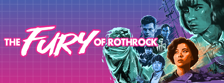
The Fury of Rothrock

Cynthia Rothrock has the unique distinction of being possibly the only American actor to get her cinematic start in Hong Kong action films. A superior athlete, Rothrock segued her status as the undefeated World Champion in Martial Arts Forms and Weapons into a equally successful career in the world of action filmmaking. After several popular martial arts action films in Hong Kong she now primarily works on US productions as an actor, writer and producer.

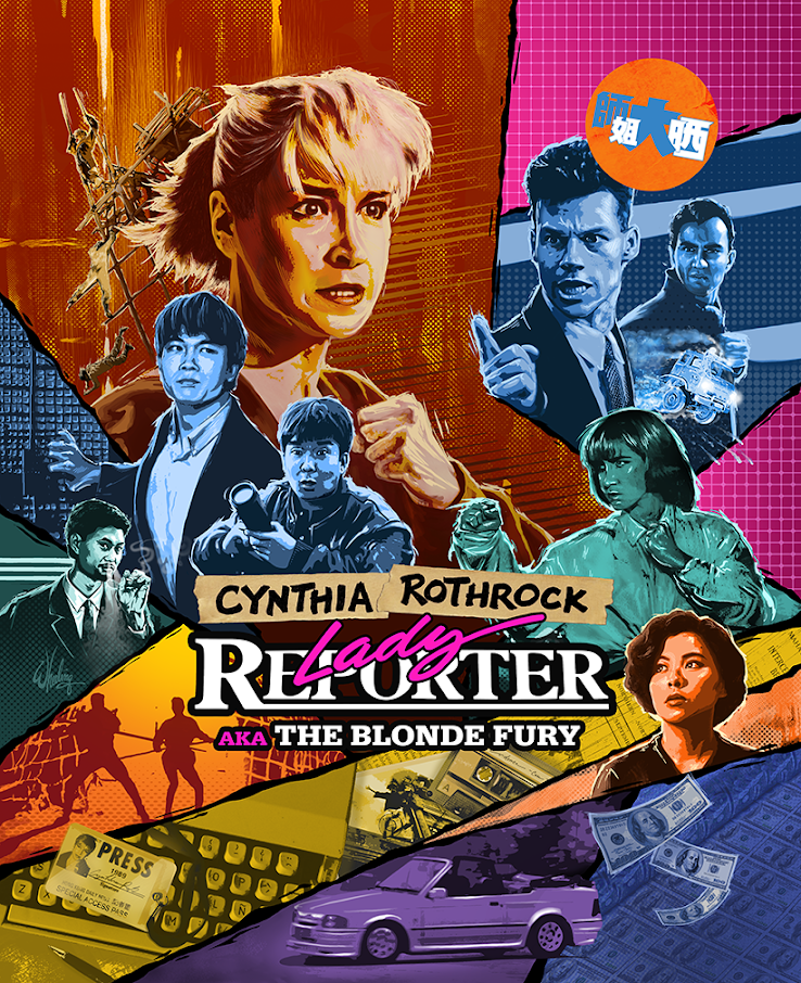
In 1989 after appearing in various supporting action roles, HK juggernaut studio Golden Harvest gave Cynthia the lead role in an action comedy called THE BLONDE FURY (retitled LADY REPORTER for the export market). I won't go into details of the fragmented production schedule, but the final result is a thoroughly pleasing romp full of exciting set pieces and ernest performances. These Hong Kong performers truly risk life and limb for our "popcorn entertainment".

Commissioned to do the remastered Blu-ray package, I endeavored to capture that late 80's visual aethestic (right down to the "VHS sticker") while still making the art feel vibrant and fresh. The movie is a bit "all over the place", and so is the cover art. Her name above the title is sharpie marker on masking tape. Perhaps a little bit "punk". The film did not have a strong marketing campaign upon it's initial release so I was free to come up with my own vibe.


 The booklet cover art carries forward the same visual theme.

We'll continue the "ladies kickin' ass" theme next time with another popular film in the Hong kong girls with guns action subgenre.

Sunday, March 26, 2023

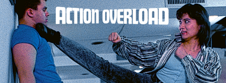
Action Overload


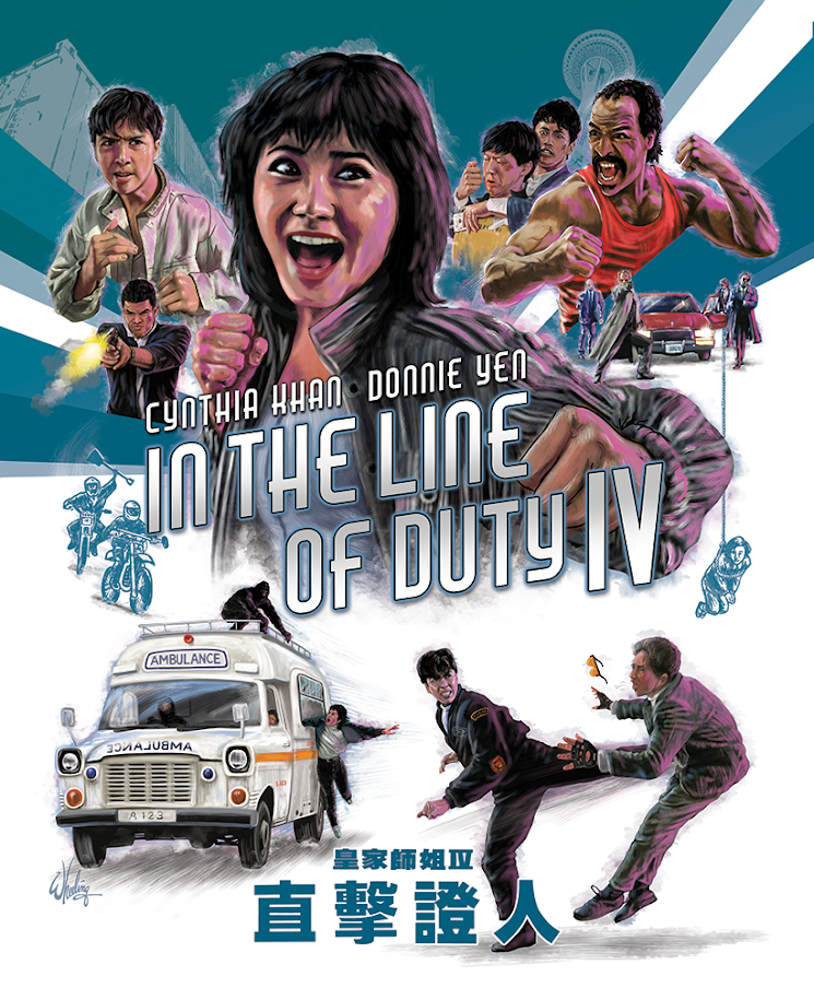
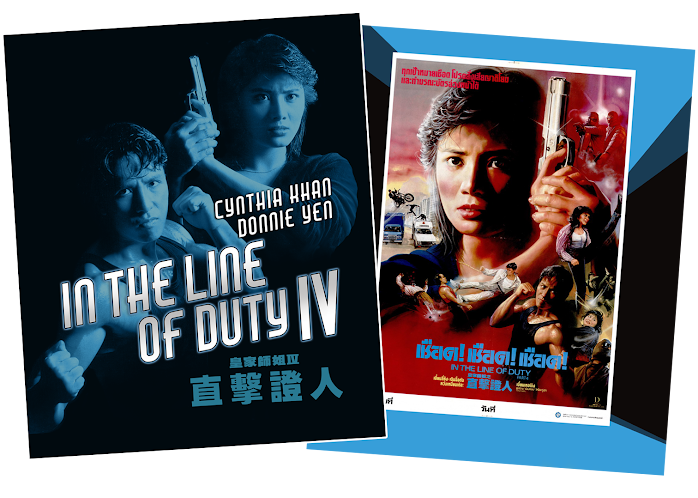
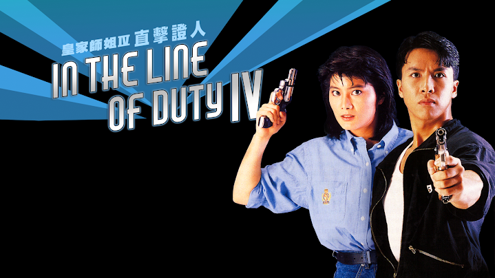
I went with a blue tone for IN THE LINE OF DUTY IV starring Cynthia Khan and Donnie Yen. (Perhaps the abundance of 1980s denim played a role.) The cover strives for that balance of positive and negative space. With bold lines driving the eye toward the title. I never like to clutter the image with dozens of heads peeking over shoulders so the colored lines provide a natural visual element for layering the figures. And I was able to render every figure doing something energetic which helps define their character, and provides a better impression of the film.


Although the first four films are the most popular, it would still be wonderful to release the remaining films in the (admittedly loosely-connected) series. If nothing else but for the sake of completing the set.

Hopefully, if original film elements survive in good condition, one day Fortune Star will see fit to remaster the final few films in HD and make them available for licensing by distributors. We can only hope.

Until then, we can at least enjoy these HK cinema action classics in beautiful new transfers. They look better than ever on home video.

The series... so far.


Next time... the streets run red.

Monday, December 26, 2022

The Dead Get Deadly

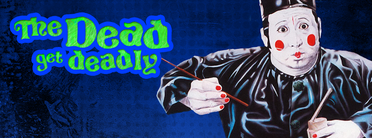
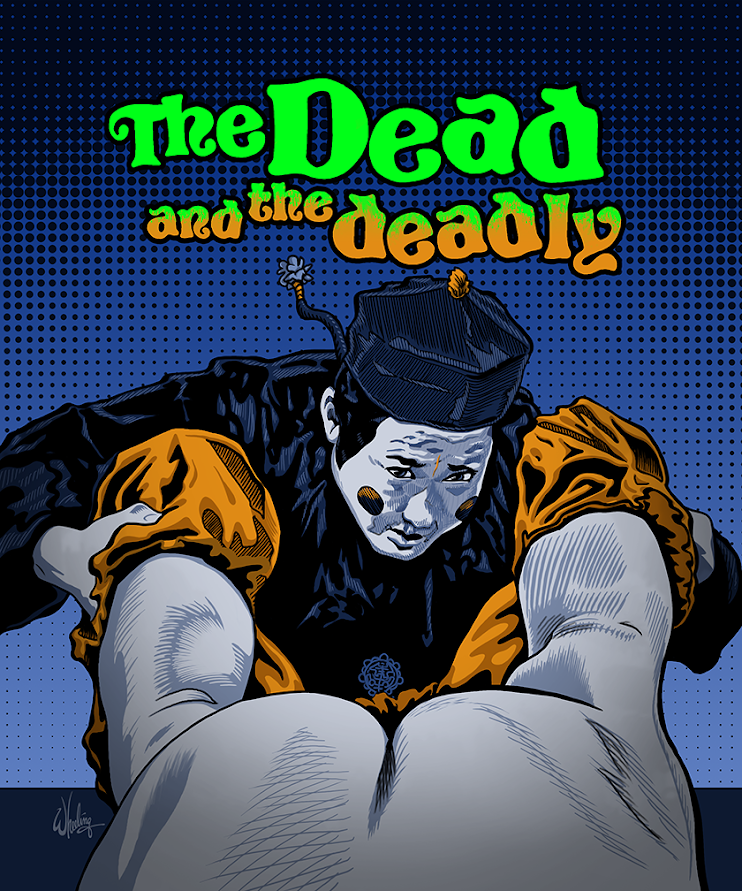
For the 1982 Sammo Hung film THE DEAD AND THE DEADLY, I naturally continued with the same visual style and general color palette I utilized in my previous Hong Kong horror comedy titles. Because of the many scenes set at night, the blue tones dominate. With contrasting orange and a glowy neon green element representing the fantastical spiritual element, the somewhat chaotic composition gives a feeling of the unexpected. The martial arts action element is downplayed in the art as it is in the film itself. 

When I was assigned this title, I knew from the start I wanted to include a visual of this "cheeky" scene where Sammo inspects a supposed eunuch. But I thought maybe it was too rude for the outer cover so I saved it for the booklet. The comedic film is a bit cartoony at times so visually I included a few comic book-style shading techniques to emphasize it's intended fun nature. It's not a truly scary horror film, it's a silly fun horror film.

Lam Ching Ying does an early version of his Taoist priest bit, Fat Chung googles his eyes, Cherie Chung struggles with animated spirits, Sammo holds his breath, Wu Ma directs and co-stars, hilarity and hijinks ensue. 

Next up... there's an issue with Bruce Lee.