Sunday, April 30, 2023

Blood and Steel


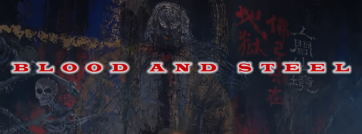
This piece was done for the cover of a violent martial arts epic from celebrated Hong Kong film director Ringo Lam. BURNING PARADISE offers another tale of young folk hero, Fong Sai-Yuk, battling the forces of evil - this time in a labyrinthian underground prison lair where one wrong move spells sudden death of an extremely "uncomfortable" nature.

The extreme violence of the movie naturally dictated the color palette. Blood is everywhere. Inside and out. The Chinese character for "fire", rendered in blood red, looms large and splatters everything in sight. It's emphasis is heightened by reducing all other colors down to a monochromatic grayscale wash of character action/reaction.

It's a strange dichotomy. It's a constant back-and-forth, as I struggle with the tools of the trade to render physical my vision for each piece. I wouldn't say I ever get fully comfortable in any given style. But I'm also aware of the fact that I never want to exhibit a recognizable style. I don't want to be a "style". (The art direction of the thing I'm marketing should dictate the style if it has any at all.)

If I feel I'm getting too comfortable, repeating myself, I immediately attempt to move from on it. Unless I'm doing a series where all the items need to match, I want to welcome each new design job with a set of fresh eyes not relying to previous works to guide me.

If I'm not stretching, I'm not growing. (And I've got a long, long way to grow.) That's the dichotomy. I try to improve in a certain direction, but then if I feel I'm approaching that goal, I immediately move on from it to try to pursue a different direction. I never stay in any comfort zone. The compounded effect is I'm never fully happy with the work. 

I think this comes from decades of working for hundreds of different clients, all wanting something different. So I have to be everything to everyone. So my own vision takes a backseat. But that's life as a graphic designer. Do your best. Hopefully learn something in the process. And onto the next one. 

See you on the next one. 

Friday, April 28, 2023

The Streets Run Red


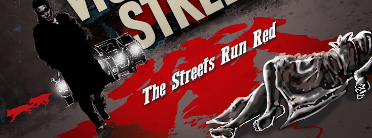
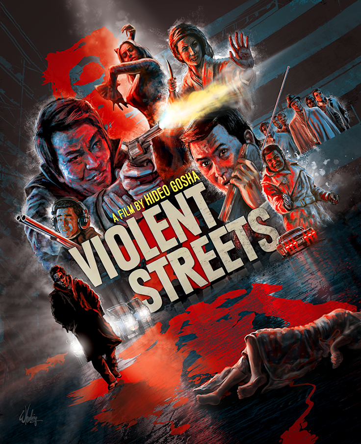
This is a piece I did for a early 70s Japanese gangster film directed by Hideo Gosha. It's dark, violent and, well, takes it's brand of yakuza action to the streets. So, in a flagrant example of "truth in advertising", it's actually called VIOLENT STREETS.  

I've never been a fan of the "stack of floating heads" poster style so popular in the 1990s. (ie: names across the top, head over shoulder, head over shoulder, head over shoulder, horses running in silhouette across the bottom, done call it a day.) So when possible, I always try to give the characters a little bit of business. Holding a prop, a weapon, a phone, some sort of indication to who their character is. So viewers can get a hint of the story, or at least the type of story from the imagery.

Also juxtaposing protagonists and antagonist facing each other can visually express a sense of the conflict. In this film it's not so much "good guys versus bad guys", they are all pretty much "bad". But it's still one group versus another and my composition splits them down the middle with our protagonists on the left. The bloody Japanese title divides them and spills out onto the dark street itself where it joins the bleeding body of a woman. While the whole scene is rendered off-kilter, is contrasting hues of reds and blues. Hot and cold against a neutral gray night.    

Various elements, such as tiny flying chicken feathers, a pack of German Shepherds, a transvestite with a knife are all pulled from the film, but don't spoil any major plot point.

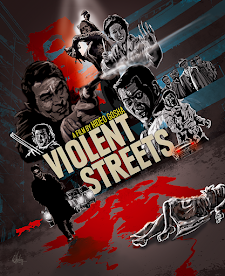
The rough comp is shown to the right (inset) with the final finished piece below.

The other primary color, a prominent yellow muzzle flash, subtly reflects on the actors faces and is echoed in the director's name. While all the red lighting the scene emanates from the Japanese title.


Take the sex and the violence from this film, and add martial arts. Stir until it comes to a fine boil. That's next time.