ISHIRO HONDA was the visionary Japanese director of the
original classic 1954 film, GODZILLA. As well as a dozen or so more Godzilla
and tokusatsu (special effects) films. His lasting legend looms high in the
hearts of kaiju (monster film) fans and throughout the annals of cinema
history. It was a treat to illustrate images for a double feature of not one, but two, of his works.
Honda’s 1959 space-invaders-attack-the-earth sci-fi
extravaganza BATTLE IN OUTER SPACE, contains reused elements, slightly modified model ships and even
character names, from Honda’s earlier 1957 film THE MYSTERIANS, but is
generally considered only a very “loose” sequel, if at all. With that in mind I
could approach this design with no need to tie it into that film. BUT, this
being sold as DOUBLE FEATURE meant I had to find a design that worked well set
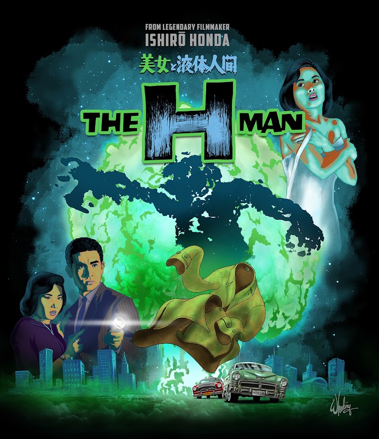
beside a vastly different film altogether, THE H-MAN. Which is a 1958 sci-fi noir
thriller, dealing with Tokyo
police investigating mysterious disappearances, where only the victims clothes
remain. These events are eventually discovered to be linked to the strange
effects of radiation fall-out from a hydrogen bomb test. No space invaders to be seen, but creeping slimy monsters none-the-less.
It’s always a challenge to find a cohesive and clever way to
meld two different films into a single design. Especially two slightly
different genres. Sure I could retrofit two posters side-by-side with little
effort. Boring. As nice as the original poster art is, and it is cool, that is not what I'm being paid to do. None of these characters are consistent between the films so
finding a single protagonist to represent both films (ala Wong Fei-hung in Tsui
Hark’s ONCE UPON A TIME IN CHINA series) won’t work either.
I got to thinking… (I know, never a good sign.)
What if the whole was something more than the sum if it’s
parts? What if the two films together could somehow create a new image (sort of
a MAD Magazine fold-in). What if they conveyed a greater understanding of
Honda’s talents than did each film alone.
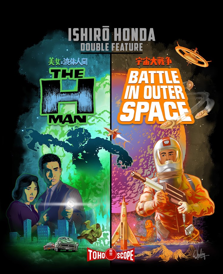
To that end I decided to try to blend the two “half” images (representing each movie) together to form something more cohesive.
The left side would feature a circular mushroom cloud with
the vertical shaft of the cloud extending straight down underneath. The right
side would be a half moon, the same size as the hydrogen bomb cloud. A
carefully positioned rocket would mimic the shaft of the explosion, the baseline
ground level would line up, and bingo bango jig-a-jog jango, the two images
would together create two halves of the same shape. Well, worth a try anyway.

BATTLE
was the first I illustrated. The client requested full-cover images of each film
on the inside Blu-ray case inlays so that was rendered with cropping it in-half
in mind. The first illustration I did was against a white background. I was just
going for something I felt was modern and gave it a fresh feel. But once I saw it
transferred from my imagination to the physical world, it didn’t please my eyes as much
as it did my mind. Back to black. As a designer I feel, if you are afforded the
luxury of time, it’s sometimes good to veer a bit “off road” even if you end up
getting back on “the path” once you see things more clearly. I tried it. Meh.
Maybe it’s more suited for something else in the future, but now I see the
value of black space. Especially for a 1950s sci-fi film. But I still couldn't resist
the urge to add a subtle splash of color
to the blackness of space to give it some life, some visual interest. Space is alive isn’t it?
Whatever. It matches the colorful film it represents. Plus I love dreamsicles ice cream treats and it reminds me of those. Mmmmm, I'll be right back.
Anyway, below is the final cover used.
Then THE- H-MAN came next and was more straight forward to
do. Once I knew the size I needed to draw the mushroom cloud and the ground
level (and that the sky was now black) it all came together easily. I digitally
recreated the films title logos from poster references and gave each film its
own color theme.
Oddly enough, after living with this design for a bit, I
eventually decided I DIDN’T like the moon rocket cut in half and moved it over
to the right. This compromised the initial intent of the composition, but I
can’t be tied to any idea, no matter how clever I thought it was, if it’s
hurting the overall work. I have to let go if something better comes along. The
work is not finished until I send it out to the printer. Usually stepping away from
the work for a bit and then returning gives me fresh impressions which can
illuminate areas of the art that should be addressed. Sure, you can kill it
with improvements. But the more I looked it at, the more I felt it might be
seen as a mistake to have the rocket halved right in the middle of the "canvas".
So below is the version that finally went to print.
I retrofitted the artwork for use as menu backgrounds and even
did WRONG REGION CODE NOTICE backgrounds you only see if your Blu-ray player is
set to any region other than 2. I also created white versions of the menus for BATTLE which can be seen below, although they were never used.
It was a fun project as I love 1950s
sci-fi, physical media, Blu-ray and Japanese cinema of that period. So
combining these elements, and getting paid in the process, was a dream come
true. I’ve long considered writing a chronological reference book on 1950s
sci-fi/fantasy cinema, but with my limited time this may be as close as I get.
For a while anyway.
Next time... we meet the KING BOXER. But
don't look him straight in the eyes.


