Showing posts with label darren wheeling. Show all posts

Sunday, June 28, 2026

EVEN PETS HAVE NIGHTMARES


Last year author F.P. LaRue published the fourth fabulous book in her award-winning SCARY SHIVERS series of spooky mystery-solving adventures for kids who read chapter books. THE PET SHOP NIGHTMARE. As with the first three in the series, I illustrated several interior images in creepy black and white (actually grayscale) along with the full color cover.  


Here's a few samples of the moody full-page interior illustrations. Scroll down, but, ONLY if you DARE.


I also created a promo video for each book as well as this SERIES PROMO video below, which gives you a little more idea of the story contents. The mysteries are fun and original, the main characters are funny, realistic and engaging, and yes, it does lead to some pretty dark and spooky shenanigans. And no, it's not "Ole Man Smithers" in a mask. These stories have actual stakes and require our heroes to muster real courage to 'save the day'. All the while being perfect mystery books for a twelve year old, ...or that twelve year old still lurking somewhere inside all of us.   


Paula (F.P.) LaRue

Award-Winning Author

The Pet Shop Nightmare – First Place Juvenile Mysteries, Juvenile Action & Adventure – Spring 2026 BookFest Awards

The Legend of the Serpent Witch – First Place Juvenile Mysteries, Action & Adventure, Fantasy & Magic – Fall 2025 BFA

The Curse of Shadow Park – First Place Juvenile Action & Adventure – Fall 2024 BookFest Awards

The Weeping House – First Place Juvenile Mysteries, Juvenile Fantasy & Magic – Spring 2024 BookFest Awards


www.FPLaRue.com

www.ScaryShivers.com

Until next time.... keep the lights on.

Monday, April 27, 2026

CHOWING THE SCENERY

No time to reload! These guns only run out of ammo when the moment is most dramatic! 

A year ago I got hired to illustrate a new poster for the Western re-release of John Woo's seminal Hong Kong 1992 action classic, HARD-BOILED, starring Chow Yun-fat and Tony Leung Chiu-wai. A fun project.

I tried to capture a sense of the energetic fun and explosive excitement of what is widely considered the apex of the heroic bloodshed film genre. I felt the original HK poster of Chow holding a toddler in a diaper (come on, THAT'S NO NEWBORN), although now pretty iconic, somewhat undersold the intense, over-the-top gun-fu spectacle audiences were about to experience. So my main priority was to put some excitement into the piece. (Of course most fans by this point have already seen this nearly 35 year old film multiple times so they know. They know.) 

Until next time... Cheers. And STAY FROSTY.

(Wrong movie, I know.)

Tuesday, March 31, 2026

Wooing the West


I caught John Woo's THE KILLER at Washington D.C.s The Kennedy Center For The Performing Arts in August 1989, (along with a double-bill of his A BETTER TOMORROW films.) And was blasted into the back of the theatre along with the rest of the audience. 

One could argue, that film, starring Chow Yun-fat, Danny Lee and Sally Yeh, was more influential, if not more popular, in the United States (and the UK), than with its native Hong Kong audience who perhaps saw it as just another heroic bloodshed picture. It was commercially successful in HK, but I think it did much more to woo (sorry) western audiences and wake up Hollywood to the amazing work of its writer/director. Of course, John Woo eventually did find a new parallel career working on American films as well as Hong Kong productions. Including a 2024 gender-swapped remake. 

Long unavailable in the West due to corporate mergers and licensing issues, now THE KILLER is not only widely available again, but has been remastered from the surviving negative. It looks and sounds stunning in 4K. 

A year ago I was lucky enough to be hired to produce new artwork for the long awaited "resurrection" of this beloved action film. I often pinch myself that this is really happening. In the year 2025. The irony is not lost on me. I'm doing hand drawn artwork (already replaced by AI) for a physical media release (already replaced by streaming) of an old celluloid film (already replaced by digital) of a story (already replaced by a remake). One could argue that the medium of the 90-minute film has itself been replaced in popularity by YouTube or TikToks or whatever. But let's not even go there.

As I've probably said before... this job combines my love of art, marketing and cinema, so I'll happily ride that train to the end of the line doing promotional art for films. 

 Below is the result.     


Alas, there once was a time when I would routinely drive over an hour to another city to see a film, weekly, by myself usually. But now, I haven't even been to a movie theatre in six and a half years. Times change. And people do too. It's so much easier today to see these foreign films, and movies in general, from the relative comfort of my home. And the cost versus quality is about the same. Physical media on a modern television keeps improving, while the theatre-going experience keeps declining. From lengthy commercials to acrophobia-inducing ticket prices. Given the choice, for the same cost I'd rather own it than see it once. If I tire of the film I can always sell it and get my money back. 

But it's true to say that something is lost amid the convenience. It's not just nostalgia for my youth, although there is some of that. (The power of that can't be underestimated.) I think the ritualistic experience of "going to see a film", much like dropping a stylus on a vinyl record, was something greater than just pressing a button from your couch. It's hard to explain, but, ahh, ... that's a whole other conversation. Don't get me started.  

Anyway.... the bullets and bodies keep flying. Next time. Right here.

Monday, February 23, 2026

WAH WAH


No, that's not a sad trombone. It's YUEN WAH! (Birth name Yung Kai-chi.)

It's a quickie piece I did for fun for a magazine cover. The cover boy is Hong Kong actor/stuntman/action choreographer (and, of course, martial artist) Yuen Wah, of the Seven Little Fortunes performing group from the 1960s—which also featured fellow classmates Jackie Chan, Sammo Hung and Yuen Biao. 

One of his early claims to fame was as the body double for Bruce Lee in FIST OF FURY and ENTER THE DRAGON. Bruce could cartwheel, but not back or front flip. Yuen could do both in his sleep. So they stuck a fast friendship and Bruce hired him to work on several fights scenes with Bruce, as well as play small parts in the films. Wah was actually the one doing the acrobatics for Lee's character.  

With AI poised to make our future entertainment, we are not likely to see the causes and conditions arise for performers like Yuen Wah to entertain us again onscreen. So it's important to recognize and appreciate their unique talents, especially while these actors are still around so they can see what they meant to us film fans.

He's still working, but naturally slowing down a wee bit at 75 years old. He's earned it. But thankfully he's still alive and, of course, kicking. Here's to you. Long live Yung Kai-chi. 


Next up.... John Woo's gun-fu classics get a fresh coat of paint.


Friday, October 13, 2023

Feeling a Scary Shiver


Considering October is when the spooks come out, (and today is Friday the Thirteenth) I thought I'd share some art I did for a fun series of children's "horror" novels. Think Scooby Doo Mysteries except that the monsters... are real. Maybe the Goosebumps series is a better comparison.

I've been illustrating the SCARY SHIVERS series for a while and have enjoyed comin up with vaguely spooky dream-like imagery. All the while staying this side of good taste, considering the intended audience. (The world's full of weird jobs. Sometimes I get paid to draw an attacking hoard of hundreds of ferocious cave-dwelling roach-like creatures with glowing eyes and dripping fangs. Just another Wednesday afternoon at my place.)

The interior art is rendered in gory grayscale, while the covers are presenting in full creepy color. The first three books in the series are THE CURSE OF SHADOW PARK, THE LEGEND OF THE SERPENT WITCH and THE WEEPING HOUSE.   

The author requested I refrain from illustrating the three tweenage protagonists thus allowing for the reader to better imprint themselves into the story. All the artwork is therefore rendered as POVs (point of views) further helping with the immersion. Here's a splattering of interior art examples featuring a couple creepy-crawlies. If you want more, well then you'll just have to buy the books.

That is... if you DARE!

Well that's all for now. Next time. Sci-fi action babes get the spotlight they deserve.

Monday, May 15, 2023

Becoming Jackie Chan


This is a cover piece done for a magazine publication to accompany an article about the early Jackie Chan's films THE YOUNG MASTER and THE BIG BRAWL (aka BATTLECREEK BRAWL). The collage features three images from each film set against a bold watercolor wash with some Chinese articles watermarked into the background. Using a homogeneous color palette of orange and blue tones, along with consistent eyelines, help pull the disparate imagery together. I contrasted the blue figures with red to pop them forward.


Next time... things start hopping. Things get scary. Things go mad.

Wednesday, December 28, 2022

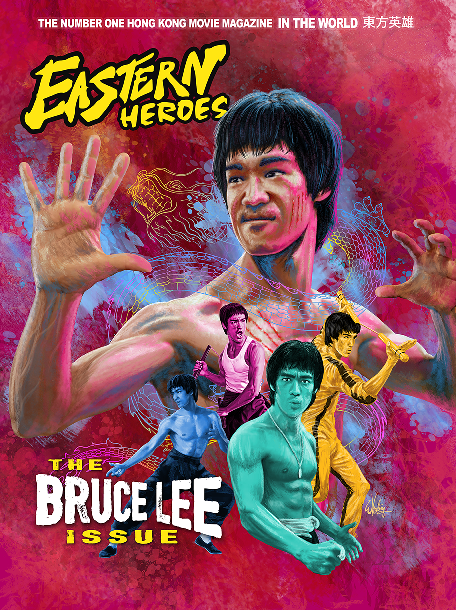
The Bruce Lee Issue


Rick Baker graciously invited me to create a cover design for his EASTERN HEROES magazine in the UK. It has long profiled Hong Kong action cinema classics and, of course, focuses often on the work of the iconic Bruce Lee.
 
He's the cover star of this issue. I was asked to concentrate on his ENTER THE DRAGON period, arguably his most famous film worldwide. Then, after seeing my art, I was requested to add additional "Bruces" from each of his other HK films, perhaps to broaden the focus and widen the general appeal. These were each rendered in unique color tone. 

Bruce's Chinese stage name translates to "Little Dragon", so it seemed appropriate to add a little colorful phantom Asian serpent flowing around the man.

I had never drawn Lee before so it was a fun exercise for me.

The magazine (and many other cool items) might still be available in the Eastern Heroes online shop. Hurry before they sell out. That particular issue also includes an interview with yours truly and features samples of some of my Blu-ray cover art.


When I draw hands I invariably use my own as reference when I'm drawing. They are just too... "handy" not to. I always have them at "hand". (Ugh, sorry.) But I do make an attempt to alter them anatomically to suit the person I'm drawing. Make the fingers shorter or the palm fatter, whatever. Yet even after all that, when I look at the finished art, I still immediately recognize them as my hands.

(I once placed my hands inside Jackie Chan's hand prints. His fingers are much shorter than mine, but they are spread so far apart it was painfully difficult to make mine even fit inside the print. It's not something you realize when watching a film, but the differences becomes very evident when given the opportunity to do what I did.)        

Well, that's it for ole 2022. I hope to continue this blog in 2023 as I have a ton more stuff to share. I like to spread it out and wait for the products to hit shelves before posting the artwork here. But more goodness is forthcoming.

Since Michelle Yeoh had such a good year in 2022, I'll kick off 2023 with some artwork I've done for her classic films. Stay tuned to this channel (blog? website? whatever.)... 

Happy New Year everyone! 


Sunday, November 20, 2022

NIGHT of the SHADOW of the WING of the HAWK


Time for another "eco-horror, animals-strike-back" flick. In fact, prepare yourself for a DOUBLE dose of late 1970s (Canadian-made) terror. Well, to be honest, I'm not too sure if either of these films are truly all that fright-inducing. But they have their moments, and are fun and entertaining in their own ways. 

NIGHTWING (1979) stars a young and handsome Nick Mancuso struggling with a swarm of angry vampire bats riled up by greedy oil prospectors. 

While SHADOW OF THE HAWK (1976) stars a young and handsome Jan-Michael Vincent coming face to face with black magic... and an angry bear in a pretty cool scene. (As is the car crash scene.) Both films deal with tribal rituals and beliefs of native peoples, so they do work well as a double bill.

For the Blu-ray cover art I selected a suitable color palette for each film, to visually group those elements, and then did a soft vertical blend giving each movie equal weight.

If I was to do the art again today, I might do it in a more loose painterly (i.e. "rough") style. Doing so might convey that 70s horror vide a bit more. But for what it's worth, I've never been that impressed with my own work. I look at it and think what's the big deal, even I could do THAT. Oh wait, I DID! 


For the cover of the enclosed Blu-ray booklet, I did a simple composite of elements from each film's vintage marketing.


Next time, I put my best foot forward.

Friday, April 29, 2022

Paper Tears

The classic 1972 Hong Kong film, KING BOXER, was given an English dub and released the following year in North America as THE FIVE FINGERS OF DEATH.

Its enormous popularity opened the door, I should say floodgates, for a wave of kung fu quickie films of the early 1970s. It even preceded Bruce Lee’s ENTER THE DRAGON by several months. Quentin Tarantino called it one of the 10 best films of all time.

That’s high praise.

But when designing cover art you can’t let the pressure get to you. Just do the best you can. In the time you are given.

This cover project was for a large Blu-ray collection of remastered Shaw Brothers martial arts films presented within a digibook style package. So this art would be seen inside the packaging next to the disc itself, and not on the cover of the outer slipcase box. Also it was a “landscape” presentation instead of the normal vertical “portrait” format.

The first version I rendered is below.


I was caring for my ailing father at this time and he passed away while I was drawing this.

At his funeral I had a large black poster board with family photos mounted on it. A few days after the service I removed the photos, unintentionally ripping the poster board. The black paper turned out to be white on the inside. Never one to ignore an interesting texture, I scanned those rips and incorporated them into the design. Jaggedly radiating out from Lo Lieh, dividing the screen into 5 sections (the fingers) and one lower section (the hand/wrist.) 

(If I had a dime for every rusty truck tailgate and crumbling wall I’ve photographed with the hopes of later using it in some design.)

Sadly the client was less than enthused with the design. Particularly pointing out the rips and the "comic book" halftones in the background. So a second (more painterly?) version was done which they accepted. As seen below.

Many months later when I saw the final release, I realized that although I was afforded a full page for my art, many other films shared a single page in the digibook style package. Two movies on a single disc. Therefore, two cover images on a single page. 

And what was the divider between each film’s artwork?

A paper rip. 

So maybe they objected to it because they planned to use it BETWEEN the cover artwork on a page and didn’t want it used within a single film’s art. (Or maybe they got the “rip” idea from me. Ha. Who knows.) But one way or another, that rip is now tearing up 5 out of the 10 pages in the package. Instead of just mine.

Way to go Dad. 

----

Next time. We visit a zoo. To meet a Skinny Tiger... and a Fatty Dragon. 


Ishiro Honda Future Fears


ISHIRO HONDA was the visionary Japanese director of the original classic 1954 film, GODZILLA. As well as a dozen or so more Godzilla and tokusatsu (special effects) films. His lasting legend looms high in the hearts of kaiju (monster film) fans and throughout the annals of cinema history. It was a treat to illustrate images for a double feature of not one, but two, of his works.

Honda’s 1959 space-invaders-attack-the-earth sci-fi extravaganza BATTLE IN OUTER SPACE, contains reused elements, slightly modified model ships and even character names, from Honda’s earlier 1957 film THE MYSTERIANS, but is generally considered only a very “loose” sequel, if at all. With that in mind I could approach this design with no need to tie it into that film. BUT, this being sold as DOUBLE FEATURE meant I had to find a design that worked well set beside a vastly different film altogether, THE H-MAN. Which is a 1958 sci-fi noir thriller, dealing with Tokyo police investigating mysterious disappearances, where only the victims clothes remain. These events are eventually discovered to be linked to the strange effects of radiation fall-out from a hydrogen bomb test. No space invaders to be seen, but creeping slimy monsters none-the-less.

It’s always a challenge to find a cohesive and clever way to meld two different films into a single design. Especially two slightly different genres. Sure I could retrofit two posters side-by-side with little effort. Boring. As nice as the original poster art is, and it is cool, that is not what I'm being paid to do. None of these characters are consistent between the films so finding a single protagonist to represent both films (ala Wong Fei-hung in Tsui Hark’s ONCE UPON A TIME IN CHINA series) won’t work either.

I got to thinking… (I know, never a good sign.)

What if the whole was something more than the sum if it’s parts? What if the two films together could somehow create a new image (sort of a MAD Magazine fold-in). What if they conveyed a greater understanding of Honda’s talents than did each film alone.

To that end I decided to try to blend the two “half” images (representing each movie) together to form something more cohesive.


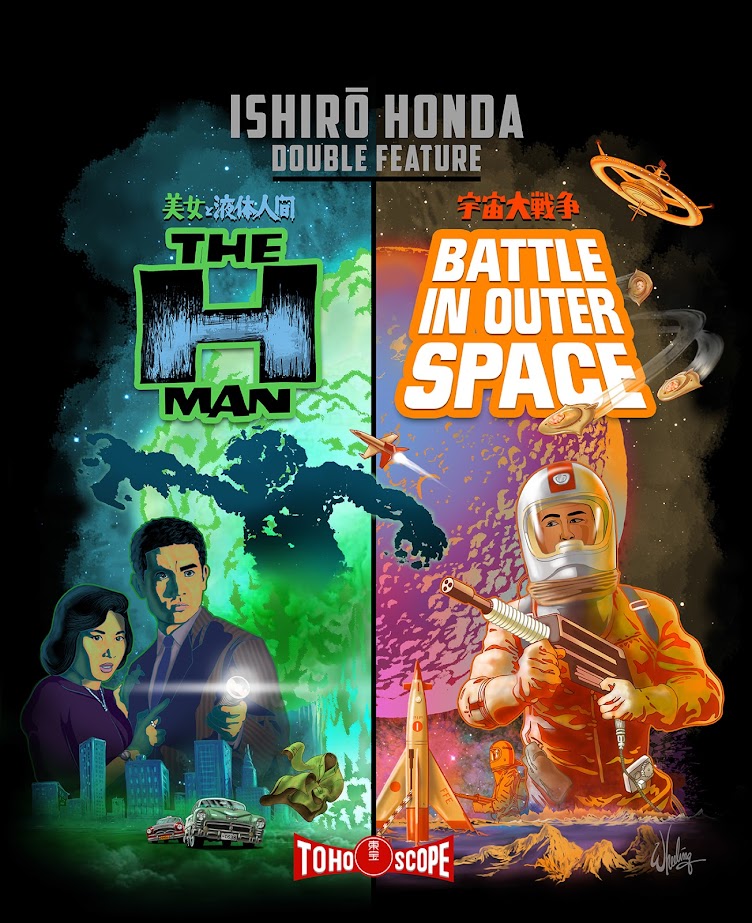
The left side would feature a circular mushroom cloud with the vertical shaft of the cloud extending straight down underneath. The right side would be a half moon, the same size as the hydrogen bomb cloud. A carefully positioned rocket would mimic the shaft of the explosion, the baseline ground level would line up, and bingo bango jig-a-jog jango, the two images would together create two halves of the same shape. Well, worth a try anyway.

BATTLE was the first I illustrated. The client requested full-cover images of each film on the inside Blu-ray case inlays so that was rendered with cropping it in-half in mind. The first illustration I did was against a white background. I was just going for something I felt was modern and gave it a fresh feel. But once I saw it transferred from my imagination to the physical world, it didn’t please my eyes as much as it did my mind. Back to black. As a designer I feel, if you are afforded the luxury of time, it’s sometimes good to veer a bit “off road” even if you end up getting back on “the path” once you see things more clearly. I tried it. Meh. Maybe it’s more suited for something else in the future, but now I see the value of black space. Especially for a 1950s sci-fi film. But I still couldn't resist the urge to add a subtle splash of color to the blackness of space to give it some life, some visual interest. Space is alive isn’t it? Whatever. It matches the colorful film it represents. Plus I love dreamsicles ice cream treats and it reminds me of those. Mmmmm, I'll be right back. 

Anyway, below is the final cover used.

Then THE- H-MAN came next and was more straight forward to do. Once I knew the size I needed to draw the mushroom cloud and the ground level (and that the sky was now black) it all came together easily. I digitally recreated the films title logos from poster references and gave each film its own color theme.
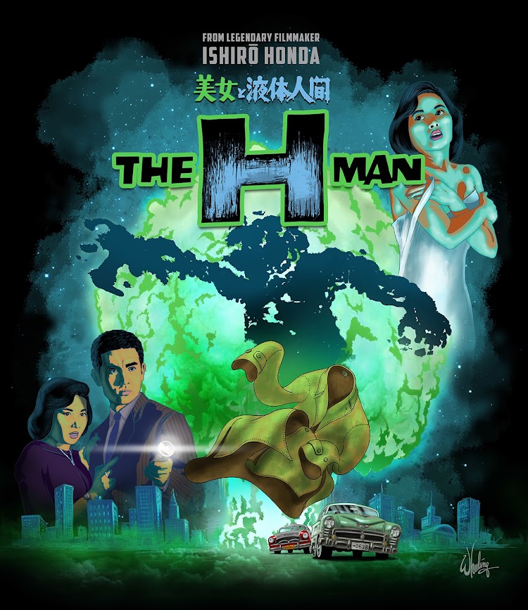
Oddly enough, after living with this design for a bit, I eventually decided I DIDN’T like the moon rocket cut in half and moved it over to the right. This compromised the initial intent of the composition, but I can’t be tied to any idea, no matter how clever I thought it was, if it’s hurting the overall work. I have to let go if something better comes along. The work is not finished until I send it out to the printer. Usually stepping away from the work for a bit and then returning gives me fresh impressions which can illuminate areas of the art that should be addressed. Sure, you can kill it with improvements. But the more I looked it at, the more I felt it might be seen as a mistake to have the rocket halved right in the middle of the "canvas". So below is the version that finally went to print.
I retrofitted the artwork for use as menu backgrounds and even did WRONG REGION CODE NOTICE backgrounds you only see if your Blu-ray player is set to any region other than 2. I also created white versions of the menus for BATTLE which can be seen below, although they were never used.


It was a fun project as I love 1950s sci-fi, physical media, Blu-ray and Japanese cinema of that period. So combining these elements, and getting paid in the process, was a dream come true. I’ve long considered writing a chronological reference book on 1950s sci-fi/fantasy cinema, but with my limited time this may be as close as I get. For a while anyway.

Next time... we meet the KING BOXER. But don't look him straight in the eyes.


Wednesday, April 17, 2013

Sight for Sound: "I Remember"


third in a series of illustrated song lyrics ]

 words by molly drake (mother of nick drake)


We tramped the open moorland in the rainy April weather,
And came upon the little inn that we had found together,
The Landlord gave us toast and tea and stopped to share a joke.
And I remember firelight, I remember firelight,
I remember firelight, ... and you remember smoke.


We ran about the meadow grass with all the hairbells bending,
And shaking in the summer wind, a summer never-ending,
We wandered to the little stream, among the river flats.
And I remember willow trees, I remember willow trees,
I remember willow trees, ... and you remember gnats.


We strolled the Spanish marketplace at ninety in the shade,
With all the fruit and vegetables so temptingly arrayed,
And we can share a memory, as every lover must.
And I remember oranges, I remember oranges,
I remember oranges, ... and you remember dust.


The autumn leaves are tumbling down and winter’s almost here,
But through the spring and summertime we laughed away the year,
And now we can be grateful for the gift of memory.
For I remember having fun, two happy hearts that beat as one,
When I had thought that we were “we”, ... but we were “you” and “me”.


Sunday, March 31, 2013

Plop Art Pop Art: The Beauty of Ugly


PLOP! "The New Magazine of Weird Humor!" was a 24 issue "anthology comic" magazine, published bi-monthly from Sept./Oct. 1973 to Nov./Dec.1976. Boasting many of the talented artists from the early years of the satirical counter-culture rag MAD Magazine, PLOP! delivered gruesome yet comic morality tales (usually "hosted" by a cast of three reoccurring characters, Cain, Abel and Eve) illustrated in typical offbeat fashion (from the pen of master cartoonist Sergio Aragonés). 

A Wolverton classic based upon his even uglier Lena the Hyena
As a juvenile at the time, I was attracted to it's grotesquely zany cover art of exaggerated anatomy by the uniquely inventive and free-flowing artist Basil Wolverton and the brilliantly versatile but deeply troubled Wallace Wood. This work represents both veteran artists near the end of their lives. Looking back I can see how these outlandish characters influenced my early free-form doodles and "just for fun" illustrations. In fact my school notebooks looked like leftover PLOP! cover concept galleries.  

Wolverton, referred to as the 'Michelangelo of MAD' by The New York Times, had a trademark "crossed-hatched rubber-hosed bug-eyed" style and was very fond of grotesque portraiture. You may have seen his famous cover for the May 1954 issue of MAD Magazine, parodying Life Magazine's "Beautiful Girl of the Month" issues. (Image at right) Yep, she sure is sumfin.

Wood had a more refined and varied style, illustrating everything from Atlas and Marvel comics (Daredevil, Dr. Doom), children's picture books, record album covers, Mars Attacks trading cards, product packaging, as well as writing and drawing syndicated comic strips. 

He's also well known for his edgy satirical work. He illustrated a few risqué titles which featured parodies of Disney characters shown engaging in "unexpected situations". Sadly, Wallace later took his own life. 

So welcome to this long overdue "virtual retrospective" of the PLOP! ART of Basil Wolverton and Wally Wood. You are more likely to find their work hanging on some college dorm room wall, than in the Louvre or the Smithsonian. And something tells me that's just how these guys would've prefered it. Admission here is always free, but if you should feel like offering a contribution... we only accept your comments. Your money is no good here. Enjoy!  

Art Arteries by Basil Wolverton

Roarin' Rodney Roadrunner by Wally Wood

Messy Tessie and Darlin' Daisy Dallyrimple by Basil Wolverton

Untitled by Basil Wolverton

Famous Four Eyes "Bo" Garth by Wally Wood
Josephine by Basil Wolverton (an obvious satire of those controversial 1971 ads for National Airlines)

Feets Fleagle by Basil Wolverton

Untitled  by Wally Wood


Nooly Nostrildamus by Basil Wolverton
"Arms" Armstrong by Basil Wolverton

"Smokin' Sanford" by Wally Wood
Billy Button by Basil Wolverton
Ashur, Crasher and Basher by Basil Wolverton


"Multiple Mouth McCardy" by Wally Wood


Alfred Adamsapple and Snapper Snodgrass by Basil Wolverton
As far as I know this one is untitled, but I like to call it Blobby McGee

Byron Bigbrain III by Basil Wolverton

Basil Wolverton has such an interesting catalog of work... I'll highlight more of his fun stuff in a future post.