Wednesday, December 28, 2022

The Bruce Lee Issue


Rick Baker graciously invited me to create a cover design for his EASTERN HEROES magazine in the UK. It has long profiled Hong Kong action cinema classics and, of course, focuses often on the work of the iconic Bruce Lee.
 
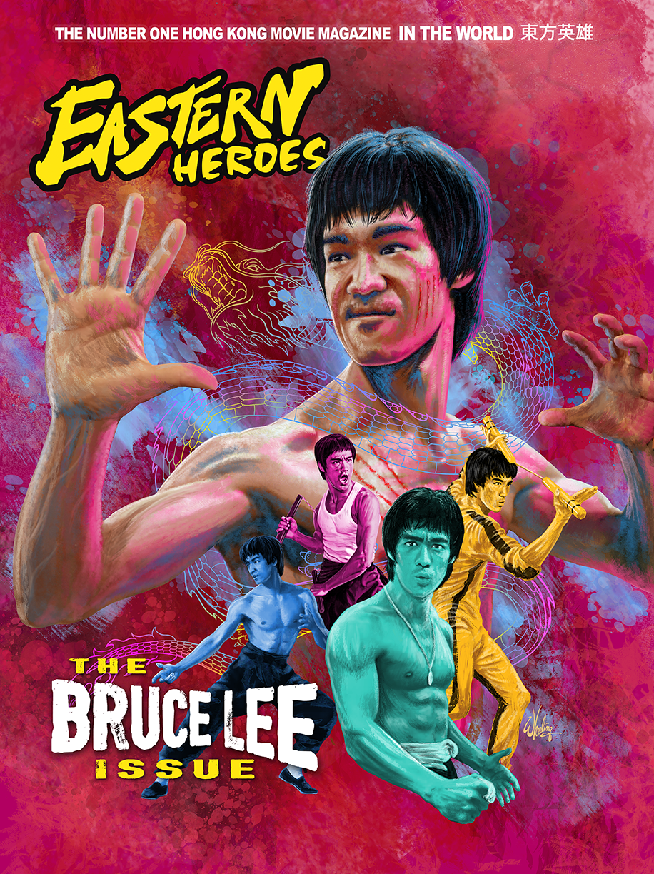
He's the cover star of this issue. I was asked to concentrate on his ENTER THE DRAGON period, arguably his most famous film worldwide. Then, after seeing my art, I was requested to add additional "Bruces" from each of his other HK films, perhaps to broaden the focus and widen the general appeal. These were each rendered in unique color tone. 

Bruce's Chinese stage name translates to "Little Dragon", so it seemed appropriate to add a little colorful phantom Asian serpent flowing around the man.

I had never drawn Lee before so it was a fun exercise for me.

The magazine (and many other cool items) might still be available in the Eastern Heroes online shop. Hurry before they sell out. That particular issue also includes an interview with yours truly and features samples of some of my Blu-ray cover art.


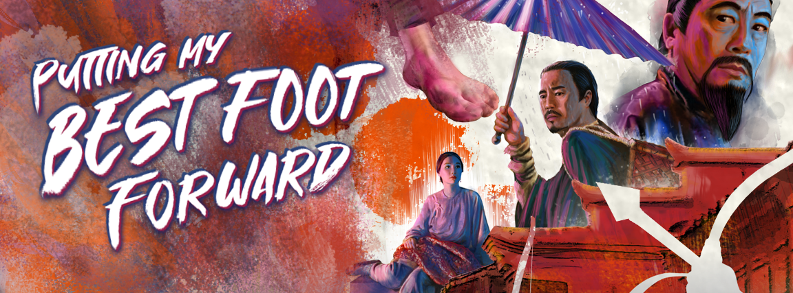
When I draw hands I invariably use my own as reference when I'm drawing. They are just too... "handy" not to. I always have them at "hand". (Ugh, sorry.) But I do make an attempt to alter them anatomically to suit the person I'm drawing. Make the fingers shorter or the palm fatter, whatever. Yet even after all that, when I look at the finished art, I still immediately recognize them as my hands.

(I once placed my hands inside Jackie Chan's hand prints. His fingers are much shorter than mine, but they are spread so far apart it was painfully difficult to make mine even fit inside the print. It's not something you realize when watching a film, but the differences becomes very evident when given the opportunity to do what I did.)        

Well, that's it for ole 2022. I hope to continue this blog in 2023 as I have a ton more stuff to share. I like to spread it out and wait for the products to hit shelves before posting the artwork here. But more goodness is forthcoming.

Since Michelle Yeoh had such a good year in 2022, I'll kick off 2023 with some artwork I've done for her classic films. Stay tuned to this channel (blog? website? whatever.)... 

Happy New Year everyone! 


Monday, December 26, 2022

The Dead Get Deadly

For the 1982 Sammo Hung film THE DEAD AND THE DEADLY, I naturally continued with the same visual style and general color palette I utilized in my previous Hong Kong horror comedy titles. Because of the many scenes set at night, the blue tones dominate. With contrasting orange and a glowy neon green element representing the fantastical spiritual element, the somewhat chaotic composition gives a feeling of the unexpected. The martial arts action element is downplayed in the art as it is in the film itself. 

When I was assigned this title, I knew from the start I wanted to include a visual of this "cheeky" scene where Sammo inspects a supposed eunuch. But I thought maybe it was too rude for the outer cover so I saved it for the booklet. The comedic film is a bit cartoony at times so visually I included a few comic book-style shading techniques to emphasize it's intended fun nature. It's not a truly scary horror film, it's a silly fun horror film.

Lam Ching Ying does an early version of his Taoist priest bit, Fat Chung googles his eyes, Cherie Chung struggles with animated spirits, Sammo holds his breath, Wu Ma directs and co-stars, hilarity and hijinks ensue. 

Next up... there's an issue with Bruce Lee. 


Sunday, November 27, 2022

Putting My Best Foot Forward

 
For my cover design for 1993 Hong Kong martial arts actioner, THE BARE-FOOTED KID, I decided to put my best foot forward. Literally. 

I coated the bottom of my foot with India ink and stamped it on Bristol board. Then I painted the characters around it leading the eye back toward the protagonist, the titular "kid" (Kwan Fung-yiu), played by Cantopop superstar Aaron Kwok. (Can't miss him, I have several arrows pointing right at him!)

His bare feet drawing attention, as they alone break the lower frame. Maggie Cheung looking pensive as she does so well. The late Kenneth Tsang adding gravitas, as he did so well. Shaw Brothers veteran, Ti Lung, walks off into the distance. Which is suitable, since this film was a remake of the 1975 Shaw classic DISCIPLE OF SHAOLIN, and was produced as the studio itself sadly faded into the history books. Trapped on all sides, mysterious, unseen, marauders provide a threat to our ragged hero. As his love interest, always left behind, weighs heavy on his shoulders. (I added a tiny tear running down her cheek, but it's so small it's hard to notice.)  

Originally I had more paint drips, referencing Kwan' job at the dye factory. But ultimately it was more of a distraction and, at the behest of my client, I removed them.

The film is a fairly beige affair, so I tried to liven up the color palette a bit and settled on orange. It's in the same overall vein as beige, but less drab and more energetic. I then added some "cool blue" tones for Tsang as the antagonist. 


Next time... the dead get deadly.

Sunday, November 20, 2022

NIGHT of the SHADOW of the WING of the HAWK


Time for another "eco-horror, animals-strike-back" flick. In fact, prepare yourself for a DOUBLE dose of late 1970s (Canadian-made) terror. Well, to be honest, I'm not too sure if either of these films are truly all that fright-inducing. But they have their moments, and are fun and entertaining in their own ways. 

NIGHTWING (1979) stars a young and handsome Nick Mancuso struggling with a swarm of angry vampire bats riled up by greedy oil prospectors. 

While SHADOW OF THE HAWK (1976) stars a young and handsome Jan-Michael Vincent coming face to face with black magic... and an angry bear in a pretty cool scene. (As is the car crash scene.) Both films deal with tribal rituals and beliefs of native peoples, so they do work well as a double bill.

For the Blu-ray cover art I selected a suitable color palette for each film, to visually group those elements, and then did a soft vertical blend giving each movie equal weight.

If I was to do the art again today, I might do it in a more loose painterly (i.e. "rough") style. Doing so might convey that 70s horror vide a bit more. But for what it's worth, I've never been that impressed with my own work. I look at it and think what's the big deal, even I could do THAT. Oh wait, I DID! 


For the cover of the enclosed Blu-ray booklet, I did a simple composite of elements from each film's vintage marketing.


Next time, I put my best foot forward.

Monday, October 31, 2022

Something In The Water


The 1979 eco-horror-thriller PROPHECY has its fair share of fans, as well as detractors. Perhaps the story worked better on paper, than in execution. Sometimes its jump scares elicit more chuckles than gasps. But I feel its heart was in the right place.

A paper mill releases mercury into a river causing horrible animal mutations. Mutated animals go on rampage. Man versus nature. Nature, eventually, always wins. 

The original poster art featured a mutated animal embryo. Possibly more strange than terrifying. So my brief from the client was to amp it up a bit and include the main creature, a mutant 15-foot bear, ferociously attacking. 

Sometimes life happens when you are working, and an important personal event becomes forever linked to what you were doing at the time. I was still working on this piece when I got the call with the news that my father had passed away. So when I look at this, that's what I remember most. It was a difficult time.

Many films have a key scene that audiences remember above all others. Ridley Scott's ALIEN has the chest bursting scene. And John Frankenheimer's PROPHECY has the sleeping bag bursting scene. If you've seen the film, you likely remember this "highlight". So I illustrated the moment before that event for the booklet cover. So no spoilers, but fans should get that "oh yeah" feeling when seeing the cover.


For the Blu-ray disc art I drew a bear's paw print made of mercury.

Why don't we continue the 1970s eco-horror theme with a double feature.
That's next time. 

Saturday, October 29, 2022

When the Devil Calls


In celebration of "spooky month", I look back at some cover art I did for a 1988 horror film entitled 976-EVIL

The film, directed by Robert "Freddy Krueger" Englund, features a Twilight Zone-esque concept where a bullied introvert discovers a fantastical connection (a phone line in this case) to a higher power (Satan himself) enabling him to turn the tables and get revenge on his tormentors. But, of course, there's a catch. There always is.

Perhaps inspired by the epic play Faust, our protagonist descends deeper into madness as his soul becomes more and more consumed by Satan until in the final reel... well, you'll just have to witness it yourself.

The piece is fairly straightforward in concept. 

Our protagonist-turned-antagonist looms threateningly large over the cast. Enticing the viewer with his red hot phone, receiver in hand. Satan's fire reflecting in his eyes (the windows to his soul). He wears his sunglasses at night because he's a Corey Hart fan. But who isn't?

His overtly religious, domineering mother sits nervously on the plastic covered couch with her multitude of cat companions. That never ends well. 

His "bad-boy, cool-guy" cousin, whom he idolizes, tries to reach him but, "his line is busy". Always is these days. 

And his therapist, (or something, it's been so long I can't remember who she is) looks on cautiously. "Was that a strange noise? I absolutely must go, alone, unarmed, into that dark room to find out what horrible creature made such a sound. Oh, an unlocked trap door in the floor I've never noticed before. Well, I'm not exactly dressed properly for exploring mysterious, labyrinthian passageways, but what could possibly happen to me? Hello. Anyone there? Helllooo?"

See you next time as the horror continues and things get messy when someone feeds a bear a little too much mercury. 

Friday, September 30, 2022

They're Both Super Cops


For the third entry in the popular POLICE STORY series, Jackie Chan turned the directorial duties over to a young stuntman-turned-director, Stanley Tong. Tong suggested Chan partner with action actress Michelle Yeoh, who was looking for a suitable project for her return to cinema screens after her brief retirement (and marriage). This was a first for Jackie, as usually his female co-stars were primarily there for him to rescue in the third act. Not so with Michelle. Their on-screen chemistry, along with Tong’s talent for staging jaw-dropping stunts, gave the film a freshness, humor and was a recipe for both commercial and critical success. I was pleased to be offered the opportunity to do package design for this Hong Kong action classic. I didn’t have much time to complete the project, but I wasn’t gonna pass it up either.

Every month I like to drive up to the mountains for a few days rest. It’s a four hour drive and I’ve taken that road so many times I basically drive on auto-pilot. Not literally. (It’s not a self-driving car.)  But when I have a design project I often pass the time by doing the creative design work on the road. Choosing fonts, colors and building the composition mentally on the inside of the windshield. In my head I’m talking to myself. “How about these colors? No wait. Move the leads to the top and position the car crash at the bottom. Or how about down the side? Run the text vertical or better yet on an angle. Oh so now the whole thing flows this way. And that leaves me room for… “

By the time I arrive, the design is done and all I have to do now is to physically render it. Not an insignificant task, but at least the drive is fruitful and I can sit at my desk with some deliberate direction instead of my typical blank thousand-yard stare. 

That was the process with POLICE STORY III: SUPER COP.


I placed the visual emphasis on a desperate and nearly beaten Jackie and Michelle being "in over their heads" and out-numbered. Only by working side-by-side with fists and firepower could they overcome seemingly unsurmountable odds. Add in some bold explosive colors, dynamic text, representations of the famous stunts by both leads, and a Kuala Lumpur skyline. Stir until it boils. And if you look closely at the top Michelle's expression. She has already pulled the grenade's pin. No going back now.

For the interior inlay card I played it a bit more safe. This design is a more typical "action movie" composition.


For the booklet cover I designed a passing train silhouette instead of a skyline silhouette. Since all the characters come together on top of the train at the end of the film it seemed a natural choice. I set it against a wash of yellow with a collage of watermarked production photos. (Cinemart, Milky Way and Japanese photo mooks to the rescue!) 


Each of the three times I drew Michelle Yeoh I think I got a little better at capturing her likeness. I think that will serve me well with my upcoming projects.

SUPER COP was SUPER FUN.


 Next month is Halloween... things are gonna get spooky.

Thursday, September 29, 2022

The Queen Holds Court

Hey, what happened to the last blog post? Where did it go?

The poster art I was commissioned to do for an upcoming film featured the likeness of an actor who is no longer in the production. Due to this change in cast I removed the post. The artwork is being altered to reflect the finished film.

Angela Mao. Queen of Kung Fu. She burst onto the martial arts movie scene at the dawn of the 1970s and became a popular star in the burgeoning open-hand (weaponless) kung fu film genre. Her early work illuminated theatre screens alongside the films of Bruce Lee, Jimmy Wang Yu and Lo Lieh. At the time, she was even marketed as the “female Bruce Lee”. But she definitely had her own persona.

Although I don’t personally know Angela, I wanted to create a design that I thought she might like. Something bold, but still feminine. With that purpose in mind I started in a fresh direction. My client generally provides many reference images (as well as a screener if I need it) to find moments/elements from the film that I find representative of the film as a whole. I also normally check my magazine collection, but in this case my Cinemart collection only goes back to 1976. Luckily I did have some other books with appropriate reference imagery.


For this double feature presentation of LADY WHIRLWIND and HAPKIDO, I experimented with a composition centered around an image of a very determined looking Mao in front of a large rose. I chose a slightly disheveled image of her as she looks likes she’s thinking, “I’m here to kick butt, not to look pretty.” (Ironically, it makes her look even more attractive.) I tried to work in scenes from the two films into the rose petals, giving it a congruous 1970s design. But for me it didn’t work as I had envisioned. (Ultimately I did do something somewhat similar for the booklet cover.)

So instead I just illustrated the characters free floating around her, attacking from all directions. Everything was kept grayscale to unify the art which was done is a slightly rough and loose style. I then created a colorful, intentionally sloppy “mandala” to contain and contrast against the figures. Once I chose the flowing logo-style font for her name it just made logical sense to add the film titles in a flowing ribbon. The “softly exploding” background negative space was inspired by the 1974 debut album from my favorite band, RUSH.     


Individual art was also done for each film. I drew scenes from that film inside her silhouette, which was also from an action scene in the corresponding film. For identity, each film got its own unique color theme, repeated on the disc, menu and booklet. Per usual, I crammed in as many rare images as I could fit into the allotted pages of the booklet.


I hope she likes it. Cuz, she’s still in pretty good shape. I bet she could still kick my butt.

Next up. It’s a bird. It’s a plane. No it’s SUPER COP!.


Tuesday, August 30, 2022

Time Waits For No One

Sometimes I base a Blu-ray cover design on a memorable moment in the film, or a collage of key actors and elements. In this case, it was more an overall impression. But not an impression from seeing the film. Nope. An impression from seeing the trailer. Marketing based on marketing. I’ll explain.

In a perfect situation I would be very familiar with the film or product I’m designing a package for. In the case of a film, the client may usually provide a screener for reference if I haven’t seen it.

But, I can’t remember the last “perfect” situation I’ve experienced. As everyone knows, we are NOT living in “normal” times. You simply have to be flexible. And in this unusual instance, I had long resisted all opportunities to view this specific film due to indifference. Who knew I would be asked to design a cover for it one day.

And frankly, this indifference to the movie seemed odd even to me. Because the film in question, TIME AND TIDE, was directed by the man, Tsui Hark,  responsible for my favorite film, the genre-bending 1986 masterpiece, PEKING OPERA BLUES. And of course his name is connected to dozens of bonafide Hong Kong cinema classics, including THE KILLER, A CHINESE GHOST STORY, ONCE UPON A TIME IN CHINA. (And even lesser known pleasures such as I LOVE MARIA and WEB OF DECEPTION.)

But much like filmmaker, James Cameron, whose work I usually enjoy, I similarly have zero interest in watching his TITANIC film. It just did not interest me. I rather liked A NIGHT TO REMEMBER, the 1958 retelling of the story of the sinking. So I have no objection to the basic premise of the story, but rather the trappings. Spending three hours with Kate Winslet and pretty boy Leonardo DiCaprio on a sinking ship to the tune Celine Dion? Nah, pass. I still have never watched it to this day. No offence to anyone who likes it. I just would rather watch Ray Harryhausen’s THE GOLDEN VOYAGE OF SINBAD for the umpteenth time instead. To each their own.

The end of the 90s was a declining time for the HK film industry. By 1996, my wife and I had shuttered VIDEO CITY—our Chinese video rental store in Maryland. In the few years leading up the Chinese 'handover' in 1997, there had been a mass exodus of talent leaving HK for attempts at greener (or at more free) pastures in America. Or just retiring from show business in general. Even Hark himself got caught up in the “migration”, trying his hand at helming two lackluster American-produced Jean-Claude Van Damme films.

So Hark, like the industry in general at the time, was in a bit of a slump. And not being a big fan of pretty boy Nicholas Tse, especially coupled with the whole “totally-extreme-surf-the-neon-net-double-barreled-dutch-angled-Matrix-style-action” that was so current then. That bored me. So I skipped it. Every chance I got, I skipped it.


So being tasked with designing the cover, I relied on my memory of my general “impression” of this film I never saw. That, and a low resolution trailer I found on YouTube. I hope I did justice to it’s “Year 2000-ness”. Not sure. I’ve still never seen it.

Below is my cover design for the accompanying booklet.


I should give it a spin one day. Co-star Anthony Wong is a solid character actor. (I actually ran into him a couple times on the streets of Hong Kong the year this film came out.) And Tse has been pretty good in more recent Benny Chan films such as INVISIBLE TARGET and RAGING FIRE. Even DiCaprio has matured into a respected actor and I do enjoy his work sometimes now.

So maybe, perhaps it’s time… for me to give it another chance?

I dunno, that THIS IS SUPERMARIONATION documentary is just screaming my name. It’s soooo shiny!

"STAND BY FOR ACTION!" Damn, foiled again.

Next time... accidents will happen.

Sunday, July 31, 2022

Dreadful Plot

The martial arts mini series continued with director Yuen Woo-ping's 1981 "madman-on-the-loose" actioner DREADNAUGHT. For this title I used black as the thematic color. Well, not true black. I wanted the parchment paper textured to be visible, as it is with the other colors in this series. So it's actually a very dark gray, so the true black areas such as Biao's hair can stand out and pop against the background. 

The composition is straight forward. Yeun Shun-yi's serial killer looms ominously overhead. Yuen Biao's "laundry kung fu" (which was surprisingly parodied in BATMAN FOREVER) takes center stage, as it is a key element to the plot. Bryan "Beardy" Leung Kar-yan and Kwan Tak-hing flank him, while the Chinese lion/dragon dance/competition anchor the base.


The quasi-duotone booklet cover art focused on the bell necklace which drove White Tiger into a fit of angry rage throughout the film. Along with the blood splatter which ultimately resulted from his madness.


For the next title released in the series, THE SHAOLIN PLOT, I went with a hot magenta tone. A color pulled the costume worn by Chen Hsing's (aka Chan Sing). The narrowing perspective of the temple courtyard pulls the viewer's gaze into the image. With a single character partially turning to make eye contact with the viewer. As if to casually welcome you to witness the bloody conflict playing out in the heavens overhead, like angry Gods doing battle in a tremendous tempest. With villain Chen Hsing positioned as if manipulating deceitful strings of control over the proceedings.

(Although not a sequel, the bulk of the talented cast would carry over into Sammo Hung's directorial debut, THE IRON-FISTED MONK, made later that same year.)


My booklet art highlights Sammo Hung's weapon of choice in the film. A pair of deadly Golden Cymbals. His character even takes his nickname from this odd accoutrement. For the cover art I depicted the second, more deadly, version of the weapon (employed after the first pair get destroyed in battle) sporting teeth-like blades―for added carnage. 


Stay safe. And keeping riding the tide, until the next time we meet.

Thursday, July 28, 2022

Odd Knocking


In keeping with the visual style on this mini series of old skool martial arts films remastered on Blu-ray, my cover design for the 1979 Lau Kar-wing/Sammo Hung weapons classic ODD COUPLE, was fairly straight forward.

This time I chose an olive green for the color theme and created a composition reflecting the dynamic interplay between the two leads. The plot features an interesting premise. Hung and Lau portray aging masters (via old age makeup) who have a long-standing competitive relationship. Who is the better master of their weapon of choice? Once a year they meet to duel it out. Hung as the "King of Sabres" and Lau as the "King of Spears". But every year it ends in a draw, with neither the clear winner. 

So, considering their advancing years, they decide it's time to each take on a younger apprentice with the hopes of them settling the score. Cleverly, Hung plays Lau's student, and vice versa. So, without the need for costly or technically difficult visual effects (remember this was 1979) the actors could appear throughout the film, in nearly every scene, playing one of their two characters. And they both get to showcase their impressive skills with both the sabre and the spear.      

So the cover art features the masters leering at each other from behind their weapons, as their younger students do the clashing between them. In the finale they are forced to team up to defeat a common foe in Bryan "Beardy" Leung Kar-yan. Before resuming their age old feud. Which ends with... well, you'll just have to see the film if you haven't.

The included booklet cover continued my minimalistic 3-color approach to the design. The ending of the film is represented, (spoilers) with weapons marking the graves of the masters.


For the 1979 action comedy KNOCKABOUT, the focus was on breakout star Yuen Biao. Director Sammo Hung and the producers at Golden Harvest were hoping for a star-making performance from Biao, something similar to what DRUNKEN MASTER had done a year prior for Jackie Chan. The resulting film, although perhaps not as ground breaking as Chan's film, still resonates with fans today and is widely considered a classic of the genre.   

Sammo, in the beggar-turned-kung-fu-master role (at least on the surface), instructs Biao in the illusive ways of monkey style (猴拳, "monkey fist") kung fu. So my art is designed to reflect that memorable aspect of the film. Biao does his training in the looming shadow of Hung. The co-stars are shown in boxes which was a common design trope of star-studded films from the 1970s (think Irwin Allen).  

The booklet cover art concentrated on the monkey and the thorned vine from the climactic battle.  


Next time... the plot turns dreadful.


Thursday, June 30, 2022

Warrior Son

My client decided to release these two martial art films co-starring Sammo Hung as a double bill due to them both sharing a character. Real life pioneer of Wing Chun, Leung Jan, was portrayed in WARRIORS TWO (1978) as an old master by Bryan “Beardy” Leung in old-age make-up. While Yuen Biao portrays a younger, scrappy version of the character in THE PROGIAL SON (1981).

The WARRIORS TWO design is below.

To streamline the release, both discs were housed in a flipper case with a limited edition booklet and o-card slipcover. I was asked to create cover and booklet artwork for each film, as well as a combined version for the o-card. By this point I was also handling all design and layout duties for these releases which means I got to maintain visual continuity throughout, as well as cram in as many rare photos as I could.

In keeping with the same visual style I had started with ONE ARMED BOXER, these sport a main accent color for each film and a consistent lighting theme on the characters. Yellow rim light from the left and blue from the right. In doing a photo collage in Photoshop, it’s often difficult to get the appearance of a common light source on all your figures as they usually were not originally photographed that way. So when combined together they often look strange, as if they don’t occupy the same physical space. Luckily in illustration, that can be easily remedied. I just draw the lighting however I choose.

The accompanying booklet cover features the same established minimalistic visual style. This time, highlighting a Wing Chun wooden practice dummy. 

For THE PRODIGAL SON, I went with a mid-tone blue, spotlighting a determined Yuen Biao. Although not his first starring role, many fans cite this (along with KNOCKABOUT) as his first break-out role. These two films proved Biao had what it took to be a future super star, and not just a side kick.

The booklet cover features Biao is bold Peking Opera face paint.

Then came the o-card. There's many different ways to present multiple films in a single image. Simple side-by-side posters squeezed to fit the new shape. New illustrations with a clear dividing line. Down the middle, angled or contained in some shape. For the ISHIRO HONDA set I tried to blend the two "half" images to create a third new "combined" image. Therefore not drawing visual attention to the actual divider.

But for this one I decided to just let the background colors be the natural separator. With characters and text reconfigured to fit equal triangles of space.

Given the opportunity to do it again, I might try a different approach. And, in fact, I did with the ANGEL MAO double feature. But that's a story for another time.

One cannot progress without trying something new, and I'm trying to progress.


Next up... the kicks continue!

Saturday, June 25, 2022

Variations on a Theme


When my client graciously presented me with their slate of upcoming releases for the next 12 months, it afforded me the rare opportunity to plan the cover designs well ahead. I could see where certain movie titles, particularly 1970s and early 80s period martial arts films, would work well grouped as a loose series. As a fan of physical media, I appreciate how items look when collected and displayed on a shelf. It's a big part of the fun of collecting. So considering that, I set about creating a cover for the first title, 1971’s kung fu classic ONE ARMED BOXER starring Jimmy Wang Yu, with an eye toward making the layout style modular. Certain elements could be retained for the next film, connecting it visually to a “series”, while other visual elements would be unique to this release. This plays into my own "collector" mentality as I have to get them all

I chose red as the thematic color of this release. A key plot point, halfway through the film, is the protagonist getting his arm literally torn off during a skirmish. (It’s obviously important, as the film takes its title from this.) Throughout the film, audiences are treated to overly bright, gushing streams of crimson. So, naturally, the cover displays a gash of bold scarlet splattered across an aged paper texture. Along with the font styling, yellowish color treatment of secondary characters, this grungy background would become a fundamental element of the base template for all these films.

I knew going in, with a film title like that, I was definitely NOT going to represent Wang Yu with TWO arms. Much like my previously designed THE BRIDE WITH WHITE HAIR, I wanted the cover image to match the title, even if the character doesn't look that way until the last half of the movie. Let's be honest. You come to this film to watch a guy fight with ONE arm, so THAT'S the draw of the film. So THAT makes the cover.

But, where appropriate, I do like to have fun with the interplay of positive and negative space. So if you look closely, the bottom edge of the red slash becomes the top edge of the jagged cliff seen in the finale. With the villains silhouetted against a blood red sky, leering down on our raging hero. With scores of defeated foes scattered across the background landscape.

For the included booklet cover I decided to go minimal. Designing simple iconographs that function to obviously represent a Hong Kong movie is difficult. It CAN be done. Some bird cages with hand guns perhaps. HARD-BOILED I guess. But it hardly represents the full excitement of that film.

However it's much easier to do this for American films. A DeLorean. You know right away. BACK TO THE FUTRE. A fedora and whip? INDIANA JONES. A t-rex head. JURASSIC PARK. Even a fin in the water. JAWS. (Spielberg likes to keep his marketing clean and simple. Smart.)

But for HK movies I usually have to rely on images of the actors coiled for battle. It's always more interesting if they are JUST ABOUT TO make contact. That second BEFORE impact holds more tension. I call that the "Frazetta Factor". His paintings make you want to see what happens NEXT.

Anyway I digress.

Since this is a design for a booklet enclosed INSIDE the package and doesn't have to convey the excitement of the film across a crowded point-of-sale display. I felt I could take a risk and go simple. So for ONE ARMED BOXER, I reduced it down to Yu's lost right arm. Again the theme is followed by using only the theme color (red), black and the aged paper color. With a pop of overlaid yellow text.


For the next release, 1983's wuxia pian classic DUEL TO THE DEATH, the color of the day was violet, pulled mostly from Damian Lau's costume and the foggy ocean mist of the final duel. Sometimes an artist has to answer odd questions like "what color does this movie make you feel?"

Anyway, below was the result.


And below is my design for the minimalistic booklet cover. Chinese and Japanese swords clashing in their decennial conflict.


Next up... the series continues.