Hey, what happened to the last blog post? Where did it go?
The poster art I was commissioned to do for an upcoming film featured the likeness of an actor who is no longer in the production. Due to this change in cast I removed the post. The artwork is being altered to reflect the finished film.
Angela Mao. Queen of Kung Fu. She burst onto the martial arts movie scene at the dawn of the 1970s and became a popular star in the burgeoning open-hand (weaponless) kung fu film genre. Her early work illuminated theatre screens alongside the films of Bruce Lee, Jimmy Wang Yu and Lo Lieh. At the time, she was even marketed as the “female Bruce Lee”. But she definitely had her own persona.
Although I don’t personally know Angela, I wanted to create a design that I thought she might like. Something bold, but still feminine. With that purpose in mind I started in a fresh direction. My client generally provides many reference images (as well as a screener if I need it) to find moments/elements from the film that I find representative of the film as a whole. I also normally check my magazine collection, but in this case my Cinemart collection only goes back to 1976. Luckily I did have some other books with appropriate reference imagery.
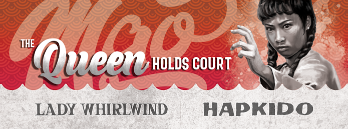
For this double feature presentation of LADY WHIRLWIND and HAPKIDO, I experimented with a composition centered around an image of a very determined looking Mao in front of a large rose. I chose a slightly disheveled image of her as she looks likes she’s thinking, “I’m here to kick butt, not to look pretty.” (Ironically, it makes her look even more attractive.) I tried to work in scenes from the two films into the rose petals, giving it a congruous 1970s design. But for me it didn’t work as I had envisioned. (Ultimately I did do something somewhat similar for the booklet cover.)
So instead I just illustrated the characters free floating around her, attacking from all directions. Everything was kept grayscale to unify the art which was done is a slightly rough and loose style. I then created a colorful, intentionally sloppy “mandala” to contain and contrast against the figures. Once I chose the flowing logo-style font for her name it just made logical sense to add the film titles in a flowing ribbon. The “softly exploding” background negative space was inspired by the 1974 debut album from my favorite band, RUSH.
Individual art was also done for each film. I drew scenes from that film inside her silhouette, which was also from an action scene in the corresponding film. For identity, each film got its own unique color theme, repeated on the disc, menu and booklet. Per usual, I crammed in as many rare images as I could fit into the allotted pages of the booklet.
I hope she likes it. Cuz, she’s still in pretty good shape. I bet she could still kick my butt.
Next up. It’s a bird. It’s a plane. No it’s SUPER COP!.


No comments:
Post a Comment