Friday, September 30, 2022

They're Both Super Cops


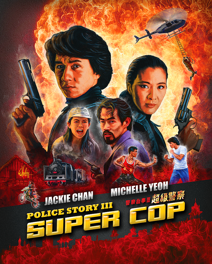
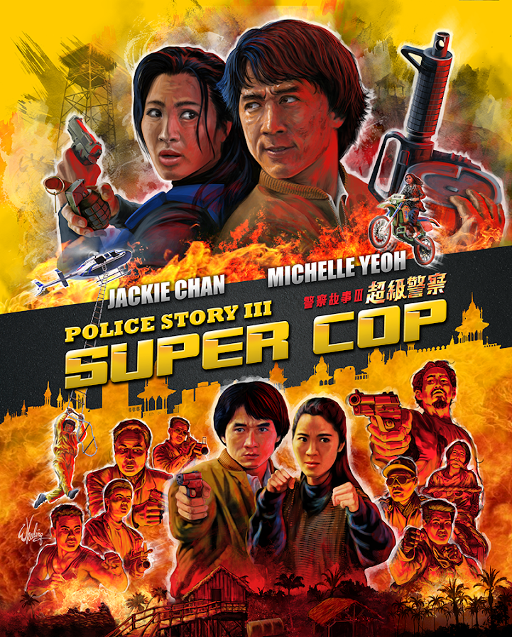
For the third entry in the popular POLICE STORY series, Jackie Chan turned the directorial duties over to a young stuntman-turned-director, Stanley Tong. Tong suggested Chan partner with action actress Michelle Yeoh, who was looking for a suitable project for her return to cinema screens after her brief retirement (and marriage). This was a first for Jackie, as usually his female co-stars were primarily there for him to rescue in the third act. Not so with Michelle. Their on-screen chemistry, along with Tong’s talent for staging jaw-dropping stunts, gave the film a freshness, humor and was a recipe for both commercial and critical success. I was pleased to be offered the opportunity to do package design for this Hong Kong action classic. I didn’t have much time to complete the project, but I wasn’t gonna pass it up either.

Every month I like to drive up to the mountains for a few days rest. It’s a four hour drive and I’ve taken that road so many times I basically drive on auto-pilot. Not literally. (It’s not a self-driving car.)  But when I have a design project I often pass the time by doing the creative design work on the road. Choosing fonts, colors and building the composition mentally on the inside of the windshield. In my head I’m talking to myself. “How about these colors? No wait. Move the leads to the top and position the car crash at the bottom. Or how about down the side? Run the text vertical or better yet on an angle. Oh so now the whole thing flows this way. And that leaves me room for… “

By the time I arrive, the design is done and all I have to do now is to physically render it. Not an insignificant task, but at least the drive is fruitful and I can sit at my desk with some deliberate direction instead of my typical blank thousand-yard stare. 

That was the process with POLICE STORY III: SUPER COP.


I placed the visual emphasis on a desperate and nearly beaten Jackie and Michelle being "in over their heads" and out-numbered. Only by working side-by-side with fists and firepower could they overcome seemingly unsurmountable odds. Add in some bold explosive colors, dynamic text, representations of the famous stunts by both leads, and a Kuala Lumpur skyline. Stir until it boils. And if you look closely at the top Michelle's expression. She has already pulled the grenade's pin. No going back now.

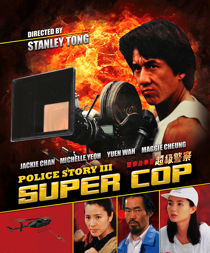
For the interior inlay card I played it a bit more safe. This design is a more typical "action movie" composition.

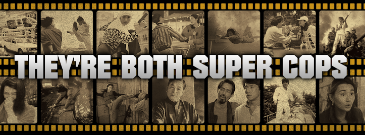
For the booklet cover I designed a passing train silhouette instead of a skyline silhouette. Since all the characters come together on top of the train at the end of the film it seemed a natural choice. I set it against a wash of yellow with a collage of watermarked production photos. (Cinemart, Milky Way and Japanese photo mooks to the rescue!) 


Each of the three times I drew Michelle Yeoh I think I got a little better at capturing her likeness. I think that will serve me well with my upcoming projects.

SUPER COP was SUPER FUN.


 Next month is Halloween... things are gonna get spooky.

Thursday, September 29, 2022

The Queen Holds Court

Hey, what happened to the last blog post? Where did it go?

The poster art I was commissioned to do for an upcoming film featured the likeness of an actor who is no longer in the production. Due to this change in cast I removed the post. The artwork is being altered to reflect the finished film.

Angela Mao. Queen of Kung Fu. She burst onto the martial arts movie scene at the dawn of the 1970s and became a popular star in the burgeoning open-hand (weaponless) kung fu film genre. Her early work illuminated theatre screens alongside the films of Bruce Lee, Jimmy Wang Yu and Lo Lieh. At the time, she was even marketed as the “female Bruce Lee”. But she definitely had her own persona.

Although I don’t personally know Angela, I wanted to create a design that I thought she might like. Something bold, but still feminine. With that purpose in mind I started in a fresh direction. My client generally provides many reference images (as well as a screener if I need it) to find moments/elements from the film that I find representative of the film as a whole. I also normally check my magazine collection, but in this case my Cinemart collection only goes back to 1976. Luckily I did have some other books with appropriate reference imagery.


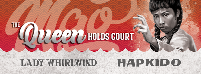
For this double feature presentation of LADY WHIRLWIND and HAPKIDO, I experimented with a composition centered around an image of a very determined looking Mao in front of a large rose. I chose a slightly disheveled image of her as she looks likes she’s thinking, “I’m here to kick butt, not to look pretty.” (Ironically, it makes her look even more attractive.) I tried to work in scenes from the two films into the rose petals, giving it a congruous 1970s design. But for me it didn’t work as I had envisioned. (Ultimately I did do something somewhat similar for the booklet cover.)

So instead I just illustrated the characters free floating around her, attacking from all directions. Everything was kept grayscale to unify the art which was done is a slightly rough and loose style. I then created a colorful, intentionally sloppy “mandala” to contain and contrast against the figures. Once I chose the flowing logo-style font for her name it just made logical sense to add the film titles in a flowing ribbon. The “softly exploding” background negative space was inspired by the 1974 debut album from my favorite band, RUSH.     


Individual art was also done for each film. I drew scenes from that film inside her silhouette, which was also from an action scene in the corresponding film. For identity, each film got its own unique color theme, repeated on the disc, menu and booklet. Per usual, I crammed in as many rare images as I could fit into the allotted pages of the booklet.


I hope she likes it. Cuz, she’s still in pretty good shape. I bet she could still kick my butt.

Next up. It’s a bird. It’s a plane. No it’s SUPER COP!.