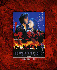
THE BRIDE WITH WHITE HAIR has long been a favorite of mine.
(You’ll probably hear me say that about a LOT
of the films I have done blu-ray covers for. But, not ALL of them.) The
original HK poster for BRIDE hung on my studio wall for over a decade and, as
much as I loved the image with its deep colors and photogenic leads, the fact
that the bride with "white hair" sported "black hair" in the poster always bugged
me. So I knew right away when doing the art for the film that I would represent
her AFTER her hair transitioned to white. My white haired bride would have white hair. Naturally.
I’ve also never been a fan of anachronistic packaging. So for
instance, if the film was made in 1955 then the packaging or marketing
materials should look as if they were made around that same time, with a 1955 approach
to the art style. After all, the cover is meant to represent the product inside.
(Hong Kong action fans who bared witness to
that ubiquitous mid-90s Jackie Chan "black t-shirt photo" used on dozens of
re-released films dating back to his teen years know what I mean.) Come on. Try
a little harder.
So in representing a romantic action fantasy film from 1993,
the requisite I set for myself was to create a cover piece that prominently featured the two famous leads, hints at their interaction and teases the action
element, while setting the tone and atmosphere in a bold visual style befitting a
film from that era.
Many currently popular art styles, commonly represented in the
awesome work of Mondo, reinterpret the visual tone of old films with modern graphic
art styles. As if to say, “What if John Carpenter’s THE THING were made TODAY?
How would it marketed to a younger generation? What if it looked more like the cover of a graphic novel?” I considered this, but
ultimately felt old school was the proper way to go to represent it respectfully.
Plus I’m kinda old school myself (or maybe just old), so it was just more natural for me to go
that way. Who knows.
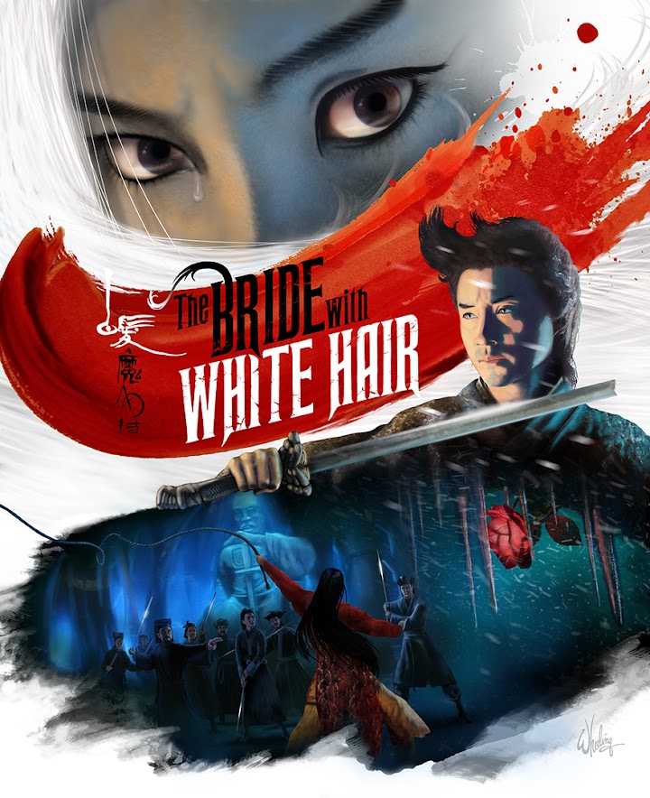
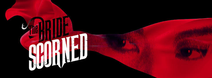
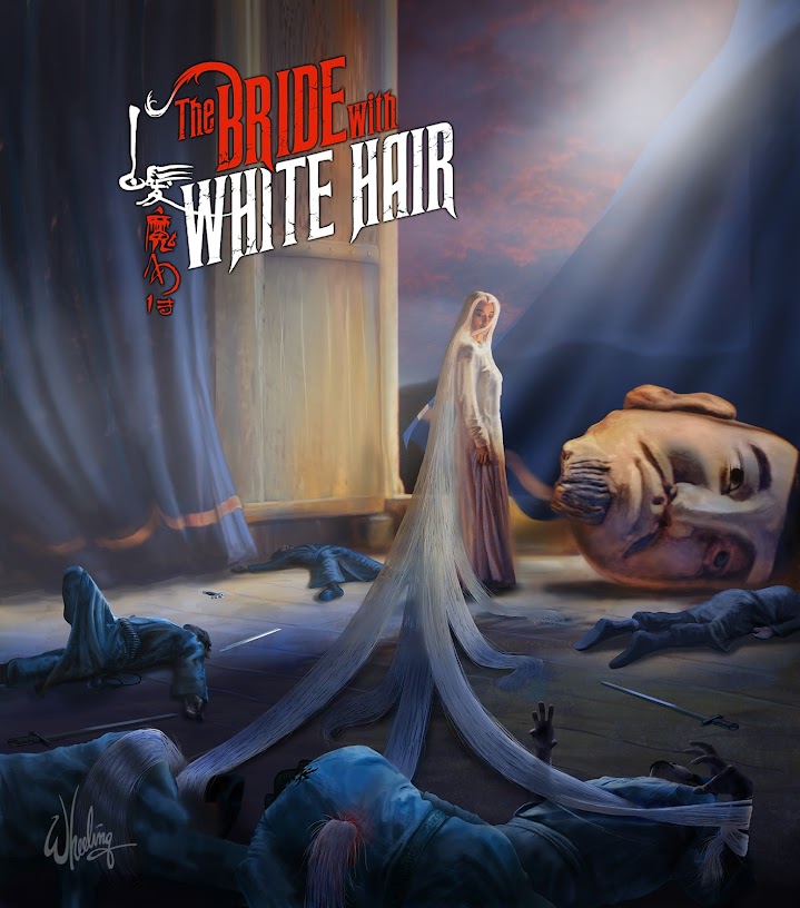
This was another Hong Kong film that didn't have a "designed" font for the English title. Just a boring sans-serif ARIAL. So I created a distressed jagged logo with flowing strands of the word BRIDE literally turning white. Set against a blood red swath of watercolor. The billowing snow and hair, and the cracking whip give it some movement, even if the characters are static in their poses. Much like the start/stop feel of the film's action. You can almost hear the image. Leslie Cheung protects the magical rose (as it blooms in his heart) with his broken sword.
But I felt the main focus should be, of course, Brigitte Lin Ching Hsia's dramatic intense stare. Angry and hurt. Tearful and shocked. Scorned and bitter. Powerful and vengeful to the very end.
For the cover of the Limited Edition book, I fast forwarded to the climax of the film. I felt the image is a bit too "spoilery" for the outer cover, but was just too cool a mental image NOT to create for the book. I had fun with this one. I actually posed for photo reference as all the dead soldiers.
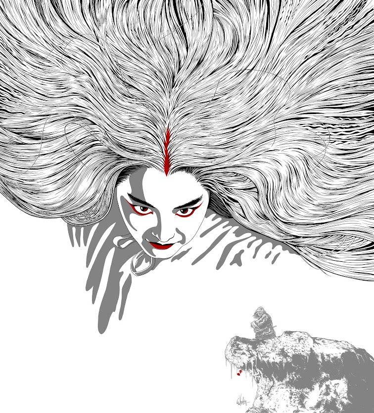
For the disc art
I went with a simpler more graphic style approach. I had less than a hour to do
something so I did a simple image (emphasizing Lin's flowing locks) that would
hopefully reproduce well when printed on a plastic disc. (I was fairly new to this
UK
client and wasn't sure of the image quality of their on-disc printing.) I live
in the US
and their products are not commonly found on shelves here. Heck, blu-rays are
getting harder to find in stores in general, much less 30 year-old Hong Kong
films re-released by UK
companies in Region B.
Surprisingly, a
month later I was approached by a German company who particularly liked my disc
artwork and asked if they could license it for the outer box cover of THEIR
release of the film (packaged along with a new transfer of it's sequel, which
sadly wasn't available at the time of the UK release). But it didn't sit well
with me to sell the same art to two clients, nor did I want any potential
confusion in the marketplace from having the same art on two totally different
releases of the film. That defeats the whole point of creating new art for
these old films—it's a selling point that differentiates
your release of the film from others.
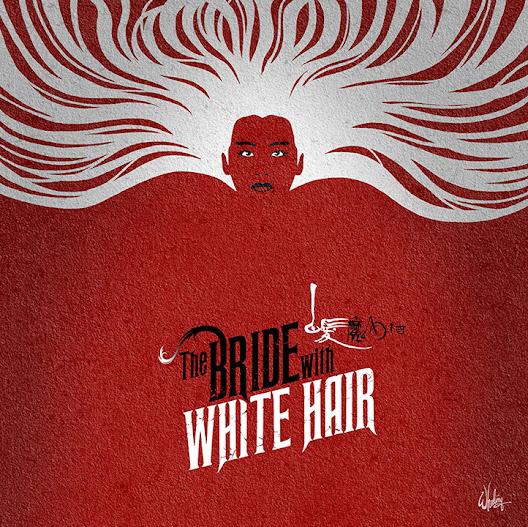
So for the German
company I created new art in a similar flat style. I spent the better part of a
week just drawing individual strands of Brigitte's hair. But her HAIR is the
visual 'hook' of the film, so it HAD to be done. Lin looms large over a small
figure of Leslie, nestled on his snowy perch, patiently awaiting the rare bloom
of the magic flower that will return his love to him.
It's curious how
one thing leads to another. I don't think I would've been approached by the
German company to do the art for THE BRIDE WITH WHITE HAIR, if I
had not ALREADY done the same thing for the UK company. But this stereotyping
as a "Brigitte Lin Artist" would not last long, as I was soon off to
illustrate JACKIE CHAN, SAMMO HUNG, and YUEN BIAO in three exciting adventures.
But that's another story.
For next time.