Returning to blogging after a 10 year break?
Sure why not.
I thought I would reflect back on some of my illustration and design work completed over the past couple years. Particularly in the area of blu-ray packaging for legacy titles (i.e. old movies).
I had been working behind the scenes on various projects to restore classic Hong Kong films for re-release on blu-ray in the US, UK and elsewhere. Providing deleted footage, subtitles, original soundtracks, references for color grading, rare photos and other bonus materials from my 35+ years of collecting. After a while I was asked if I’d like to contribute some artwork as well.
Sure why not.
I was tasked with illustrating a limited edition slipcover
(commonly called an O-card in the
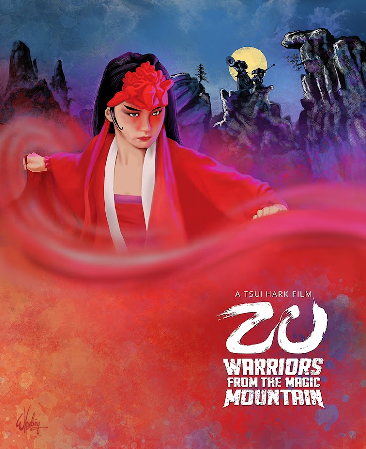
Collectors (a rabid group, which I certainly consider myself a member) love to fill our shelves with physical media, even more special if it’s the rare “fancy version”. In this case, the first few thousand purchasers of the title would also receive a limited edition cardboard slipcover as well as (roughly) 28 page full-color booklet featuring an essay on the film and its production. (My cover art for the booklet is shown at the bottom of this page.)
So the first film I was asked to illustrate was Tsui Hark’s 1983 seminal fantasy film ZU: WARRIORS FROM THE MAGIC MOUNTAIN (Chinese: 新蜀山劍俠).
Although less-than a blockbuster upon release, the film was
highly influential, inspiring Asian filmmakers as well as those in the West
such as John Carpenter (BIG TROUBLE IN LITTLE CHINA), Sam Raimi (EVIL DEAD). Considered
the first ‘modern’ special effects film made in
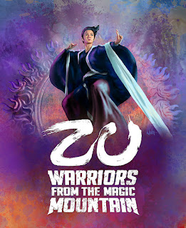
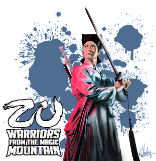
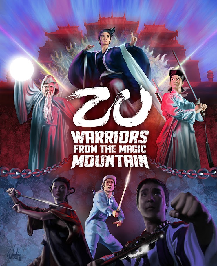
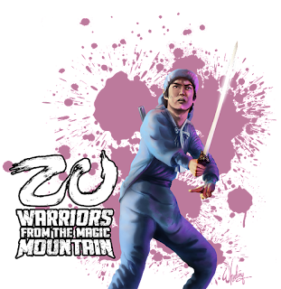
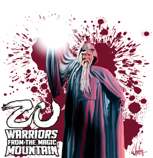
The films plot is a bit scatterbrained and characterization is merely archetypal, so the main attractions is mostly the all-star cast, breakneck action and colorful visual spectacles which were novel at the time. So my artistic approach was to feature the main cast prominently in their classic ready-for-battle poses, while emphasizing the bright fantasy colors and hinting at the dark undertones. Any story elements are mostly left out of the composition, leaving the plot for the first-time viewer to discover.
The characters completely surround the film’s title, which I redesigned as a Chinese calligraphic-inspired logo (in a modern reverse knockout white). I normally prefer to use the original English film title treatment, if any aesthetic thought had originally been put into it. Otherwise I make a new “pretty” one for English-friendly audiences. Sometimes with these old HK films, subtitles were an afterthought and the English title is simply a tiny Arial font centered under the Chinese title. As authentic as that may be for a Chinese audience, that won’t due for my client in the English-speaking market. Here "ZU" sits proudly on its thrown pedestal of "WARRIORS".
Much of the film takes places in a neither-here-nor-there mythical netherworld so to represent this aspect the characters are set against a splattered color wash with chains (featured in the film) turning to beams of radiant light dividing the worlds between them. The lower half of the canvas features two ready-for-action characters rim-lit with lead actor Yuen Biao getting the spotlight.
Creatives know that rarely does that initial vision make its way to the physical world unchanged. Whether it’s music or the visual arts. Much of that evolution is necessary and welcomed. Interesting discovers can and do happen along the way. But managing understandings of the limitations of the physical world versus the boundless nature of imagination can be a balancing act of artistic frustration, ego, and the fundamental nature of commercial art. You’ve got a deadline to meet. Period.
So you get it done, meet your clients expectations, learn something along the way and hopefully move on to the next project. That’s the measure of success.
It was a pleasure drawing these characters from a film I’ve long enjoyed. The cast are luminaries of HK cinema’s golden age. Brigitte Lin starred in my favorite film PEKING OPERA BLUES, also directed TSUI HARK. I was lucky enough to meet her back in the 1980s at a film festival in her honor. And as it happened, this would not be the last time I was hired to illustrate her chiseled features and famously cleft chin.

No comments:
Post a Comment