There are two diametrically opposed ways to approach designing packaging for a film franchise boxed set.
- Find a simple iconic image that can embody the entire cinematic saga — For instance, this could be a lone X-Wing Fighter approaching the Death Star for the Star Wars saga.
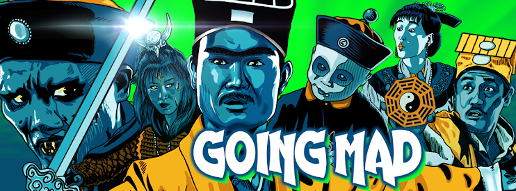
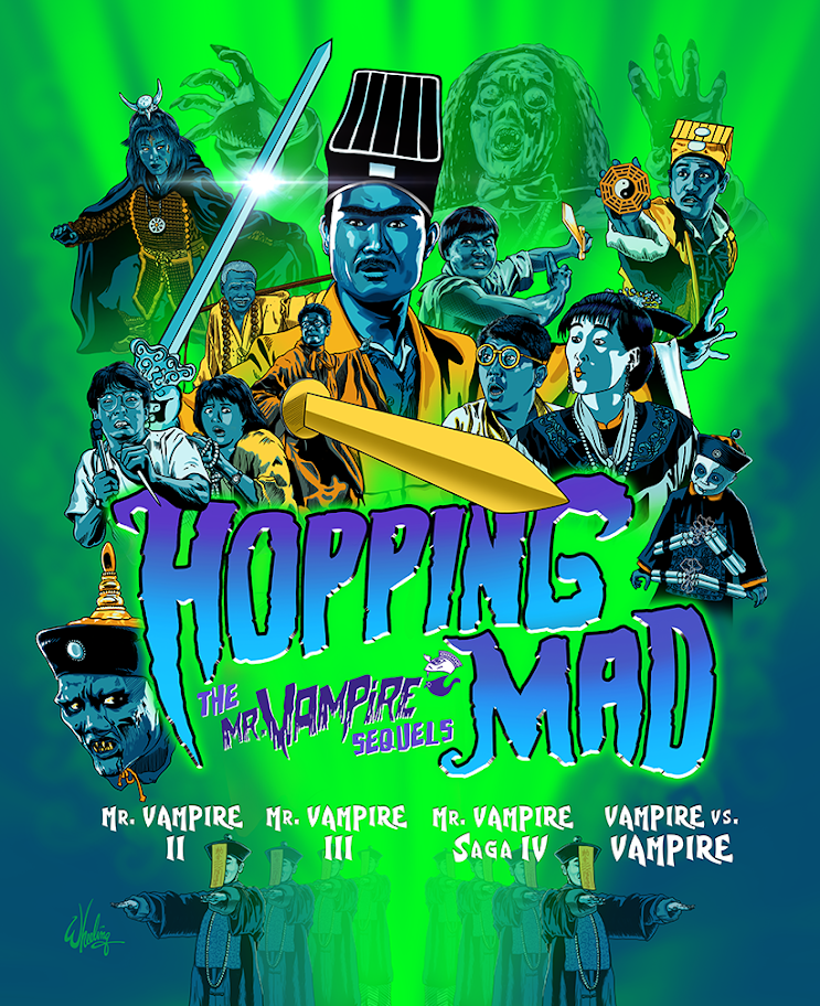
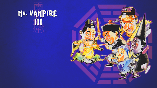
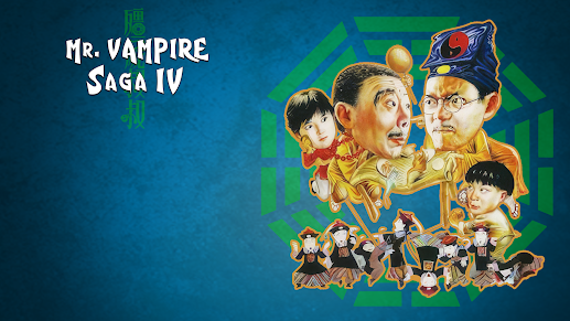
- Or... attempt to represent ALL the main (and some supporting) characters of each film in the collection, crowded together into one busy composition.
Personally, I prefer the simple elegance of the former, but feedback indicated film fans wanted the later. So chaos rules and madness is the order of the day.
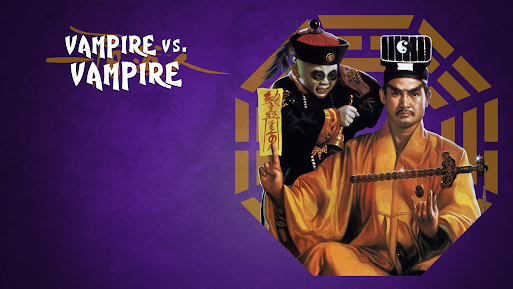
The art style and color palette is a continuation of what I used for a series of similar films such as the first MR. VAMPIRE, THE DEAD AND THE DEADLY, and ENCOUNTER OF THE SPOOKY KIND.
The four horror-comedy films collected for this presentation (MR. VAMPIRE II, MR. VAMPIRE III, MR. VAMPIRE SAGA IV, and VAMPIRE VS. VAMPIRE) are thematically connected by the jiangshi (hopping Chinese vampire) genre, with some reoccurring cast and crew. In typical Hong Kong fashion they are sequels in name only, without repeating characters or any over-arching storyline. Regardless, the films are a lot of goofy fun, and are prime examples of this uniquely Hong Kong film genre made during the original jiangshi boom of the 1980s.
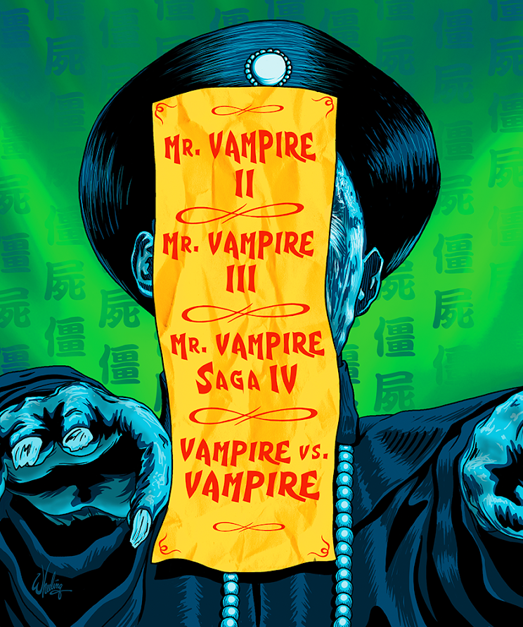
The essay booklet cover art features a jiangshi rendered immobile by a prayer scroll attached to his brow. A familiar sight in all of these types of films. This is an example of a more minimal design approach.
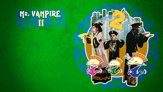
I also designed menu backgrounds for each film, but I don't know if they were used.
That's all for today. Catch me next time... for something new.

