My client decided to release these two martial art films co-starring Sammo Hung as
a double bill due to them both sharing a character. Real life pioneer of Wing
Chun, Leung Jan, was portrayed in WARRIORS TWO (1978) as an old master
by
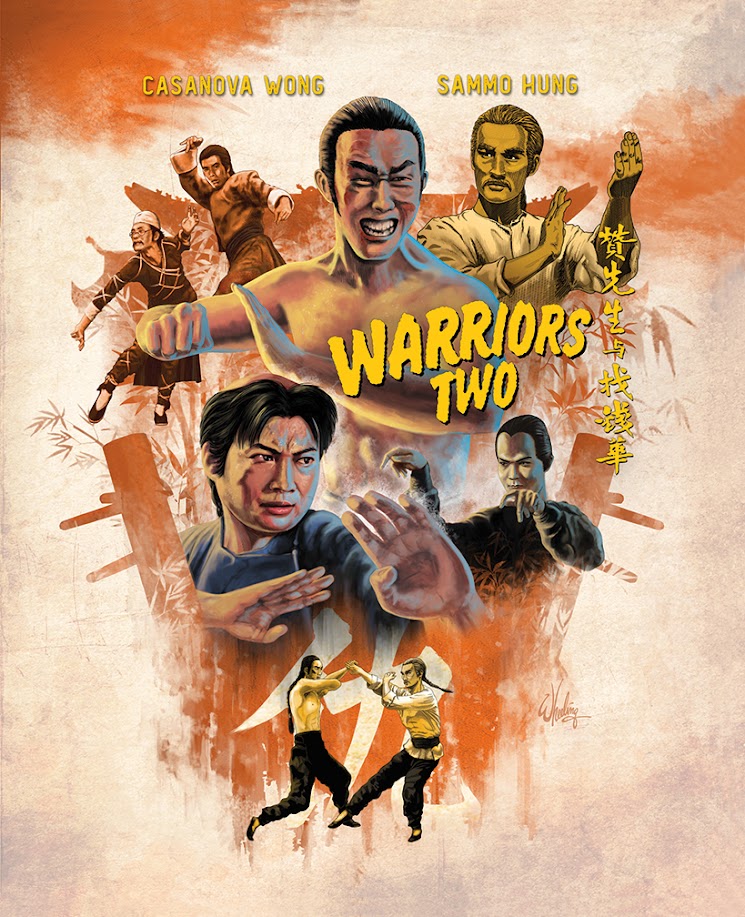
The WARRIORS TWO design is below.
To streamline the release, both discs were housed in a flipper
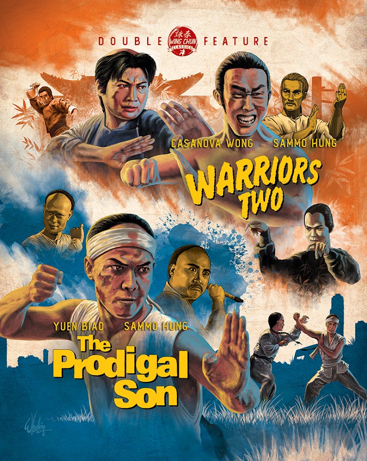
case with a limited edition booklet and o-card slipcover. I was asked to create
cover and booklet artwork for each film, as well as a combined version for the
o-card. By this point I was also handling all design and layout duties for
these releases which means I got to maintain visual continuity throughout, as
well as cram in as many rare photos as I could.
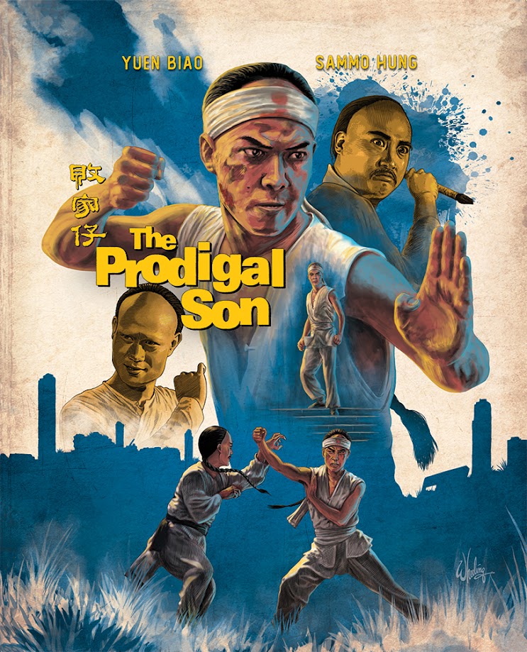
In keeping with the same visual style I
had started with ONE ARMED BOXER, these sport a main accent color for each film
and a consistent lighting theme on the characters. Yellow rim light from the
left and blue from the right. In doing a photo collage in Photoshop, it’s often
difficult to get the appearance of a common light source on all your figures as
they usually were not originally photographed that way. So when combined
together they often look strange, as if they don’t occupy the same physical
space. Luckily in illustration, that can be easily remedied. I just draw the lighting
however I choose.
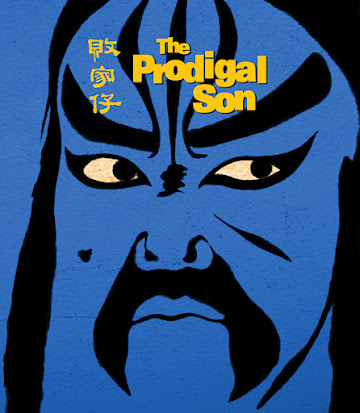
The accompanying
booklet cover features the same established minimalistic visual style. This
time, highlighting a Wing Chun wooden practice dummy.
For THE PRODIGAL SON, I went with a mid-tone blue, spotlighting a determined Yuen Biao. Although not his first starring role, many fans cite this (along with KNOCKABOUT) as his first break-out role. These two films proved Biao had what it took to be a future super star, and not just a side kick.
The booklet cover features Biao is bold Peking Opera face paint.
Then came the o-card. There's many different ways to present multiple films in a single image. Simple side-by-side posters squeezed to fit the new shape. New illustrations with a clear dividing line. Down the middle, angled or contained in some shape. For the ISHIRO HONDA set I tried to blend the two "half" images to create a third new "combined" image. Therefore not drawing visual attention to the actual divider.
But for this one I decided to just let the background colors be the natural separator. With characters and text reconfigured to fit equal triangles of space.
Given the opportunity to do it again, I might try a different approach. And, in fact, I did with the ANGEL MAO double feature. But that's a story for another time.
One cannot progress without trying something new, and I'm trying to progress.


No comments:
Post a Comment