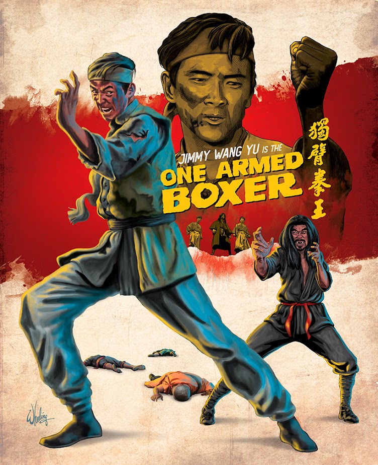
When my client graciously presented me with their slate of upcoming releases for the next 12 months, it afforded me the rare opportunity to plan the cover designs well ahead. I could see where certain movie titles, particularly 1970s and early 80s period martial arts films, would work well grouped as a loose series. As a fan of physical media, I appreciate how items look when collected and displayed on a shelf. It's a big part of the fun of collecting. So considering that, I set about creating a cover for the first title, 1971’s kung fu classic ONE ARMED BOXER starring Jimmy Wang Yu, with an eye toward making the layout style modular. Certain elements could be retained for the next film, connecting it visually to a “series”, while other visual elements would be unique to this release. This plays into my own "collector" mentality as I have to get them all.
I chose red as the thematic color of this release. A key plot point, halfway through the film, is the protagonist getting his arm literally torn off during a skirmish. (It’s obviously important, as the film takes its title from this.) Throughout the film, audiences are treated to overly bright, gushing streams of crimson. So, naturally, the cover displays a gash of bold scarlet splattered across an aged paper texture. Along with the font styling, yellowish color treatment of secondary characters, this grungy background would become a fundamental element of the base template for all these films.
I knew going in, with a film title like that, I was definitely NOT going to represent Wang Yu with TWO arms. Much like my previously designed THE BRIDE WITH WHITE HAIR, I wanted the cover image to match the title, even if the character doesn't look that way until the last half of the movie. Let's be honest. You come to this film to watch a guy fight with ONE arm, so THAT'S the draw of the film. So THAT makes the cover.
But, where appropriate, I do like to have fun with the interplay of positive and negative space. So if you look closely, the bottom edge of the red slash becomes the top edge of the jagged cliff seen in the finale. With the villains silhouetted against a blood red sky, leering down on our raging hero. With scores of defeated foes scattered across the background landscape.
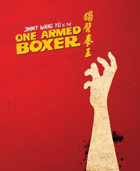
For the included booklet cover I decided to go minimal. Designing simple iconographs that function to obviously represent a Hong Kong movie is difficult. It CAN be done. Some bird cages with hand guns perhaps. HARD-BOILED I guess. But it hardly represents the full excitement of that film.
However it's much easier to do this for American films. A DeLorean. You know right away. BACK TO THE FUTRE. A fedora and whip? INDIANA JONES. A t-rex head. JURASSIC PARK. Even a fin in the water. JAWS. (Spielberg likes to keep his marketing clean and simple. Smart.)
But for HK movies I usually have to rely on images of the actors coiled for battle. It's always more interesting if they are JUST ABOUT TO make contact. That second BEFORE impact holds more tension. I call that the "Frazetta Factor". His paintings make you want to see what happens NEXT.
Anyway I digress.
Since this is a design for a booklet enclosed INSIDE the package and doesn't have to convey the excitement of the film across a crowded point-of-sale display. I felt I could take a risk and go simple. So for ONE ARMED BOXER, I reduced it down to Yu's lost right arm. Again the theme is followed by using only the theme color (red), black and the aged paper color. With a pop of overlaid yellow text.


No comments:
Post a Comment