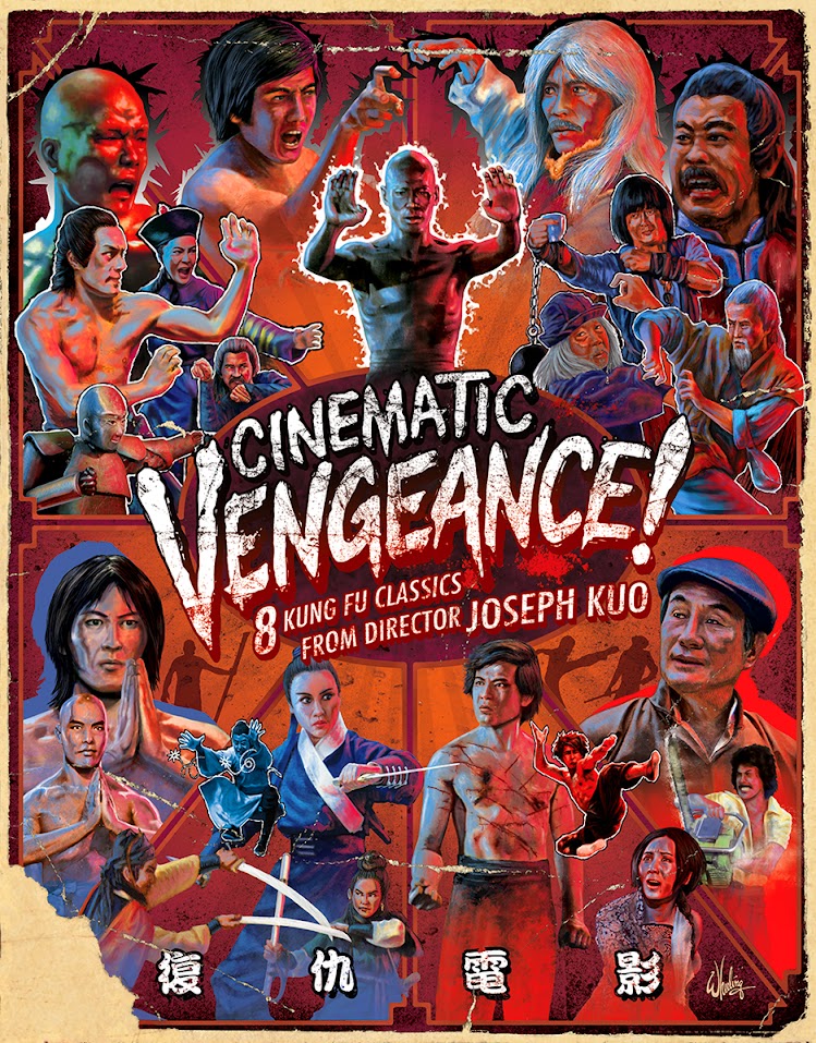
My responsibilities continued to grow. This time I was afforded the opportunity to actually name the release, as it was a collection of 8 action films from the same director. The “Joseph Kuo Collection” just wasn’t gonna cut it, so I suggested CINEMATIC VENGEANCE! 8 KUNG FU CLASSICS FROM DIRECTOR JOSEPH KUO. The exclamation point is key.
It’s always an interesting challenge when tasked to represent several movies in a single image. Especially when it’s not a series of sequel films in a continuing saga, (such as Indiana Jones) but rather films only linked loosely by genre and director. And, sadly, not one who is instantly recognizable (such as Alfred Hitchcock, who used his own silhouette as his logo).
So with those issues in play, I decided the title, handwritten in a pseudo graffiti style (as hand-made as these films are), should be prominent and perhaps surrounded by his cast of archetypical kung fu characters. All tensed and ready for action. Or more precisely, VENGEANCE!
I divided the cover into eight equal sections, each representing a film in the order they appear in the set. Then filled each with the cast from that film.
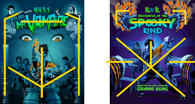
To me the negative space between elements can be as important as the elements themselves. For example, the space between notes in a song, (the semitones) are what give the music its rhythm and character. Otherwise it's all noise. The same can be said to be true in the visual medium. I call an image with no eye-lines “wallpaper”. (Apologies to Jackson Pollack fans.)
I generally try to avoid this. But, in the case of CINEMATIC VENGEANCE! after cramming in a few characters from each film, at least 23 figures in total, into the cover, it came dangerously close to becoming just that—wallpaper. Efforts were taken to keep all the section’s dividing lines leading the viewer's eye toward the title. And all the characters were also facing the center, again, leading the eye toward the title.
Notice the “blue left side” and “red right side”. Adding a consistent lighting scheme to all the painted figures is an easy way to bring them all into the same environment. (This can be done much more easily with illustrated art than when Photoshopping a bunch of separate photos together. Careful attention has to be paid toward getting all the lighting consistent in a composite shot otherwise something just seems off.)
To me, two of the most important aspects of the design, is tone and composition.
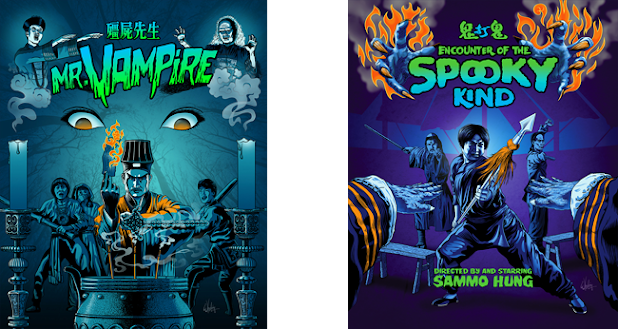
In my previous post I discussed some art I did for a couple horror/action/comedy films.
See below.
The tone reflects the color palette of the predominantly nocturnal stories. While the symmetrical compositions create eye-lines that effectively lock the viewers gaze into the center of the frame. Which is also helped by the direct eye-contact from all the characters. It's an "eye-catching" cover by design, not necessarily by its content or fairly simple rendering.
See below.
Your eyes might not have noticed, but your brain did.
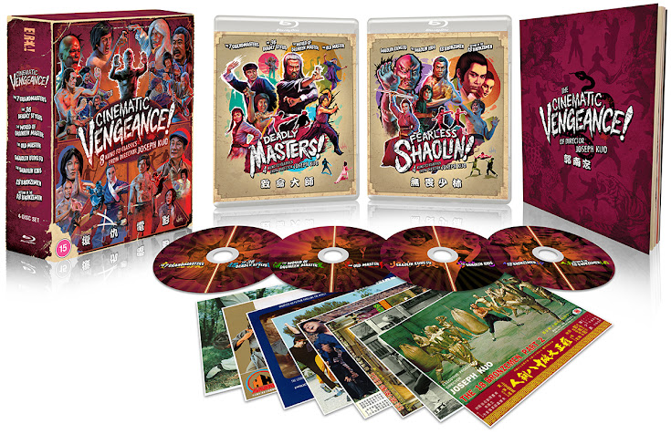
After considering the age and “rediscovered” nature of the films in this collection, I then decided to add further visual interest by giving the box art some natural distressed wear and tear. As if it’s been on a shelf in some backroom of a long abandoned Taiwanese film studio. But as you open the box the contents get cleaner and cleaner until you get to the gleaming mirror blu-rays themselves. The sparkling jewels within. Giving the customer a subtle feeling of discovery.
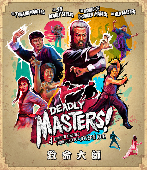
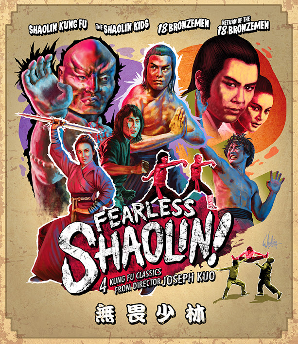
Inside the hard slipcase is housed two separate Amaray style cases with two discs in each. I was asked to come up with names for these as well in case these might get solo releases one day. So I divided the films into two logical groupings, one becoming DEADLY MASTERS and the other FEARLESS SHAOLIN.
The art for these only includes characters from those four films and carries over the graffiti style for the titles as well as a similar framing border. The weathering is noticeably less, but still present to some extent.
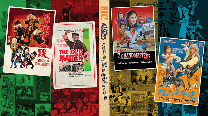
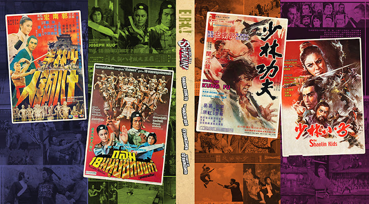
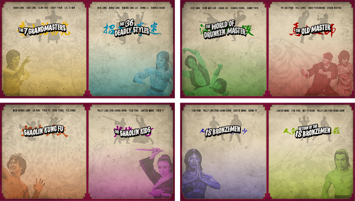
I did reversible color-coded covers featuring the original poster art fans may remember. Sadly the posters had to shrunk to fit the available real estate, but I made them as big as I could filling both "front and back" panels of the spread. Personally, I’m a fan of using the original poster art, but I also understand the need for studios to give fans something new, as well as to distinguish their release from others (such a Joy Sales or some Japanese distributors that only use the old poster art) especially when viewed as a thumbnail online. A lot of work goes into these releases so it makes sense to make your product unique so fans don’t order the wrong version. Therefore unique cover art is essential. But I always include as much of the original promo art as I can where I can. As a designer I naturally love that stuff.

No comments:
Post a Comment