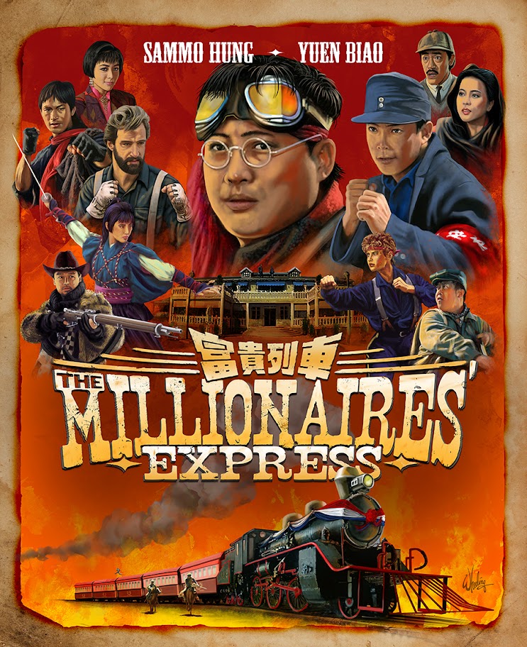
THE MILLIONAIRES’ EXPRESS is an all-star
I'd do some things differently if I had a redo, but that's the case with almost all my art if I sit with it long enough. At some point it's "pencils down". But I hopefully take what I learn and apply it to the next one. Train keep a rollin'.
Originally these HK films feature the Chinese title large and the English subtitle as a smaller afterthought beneath. But for these English-friendly re-releases I have to reverse the emphasis. For this one, my redesign left the Chinese title still on top (like a little hat), but I tried to emulate the WIDESCREEN SCOPE aspect of classic western movies (such as HOW THE WEST WAS WON) in the subtly arching distressed antique English type. Even if you can’t actually read what it says, hopefully you can still comprehend what it conveys, through the careful use of these tropes.
Although the film boasts many stars, I like to limit the number of actor names on the cover to just a few of the key players so as not to clutter an already busy piece. Blu-ray covers are small enough as it is. And target audiences tend to already be quite familiar with these 40 year old films anyway. There’s no need to list half a dozen names regardless of their popularity.
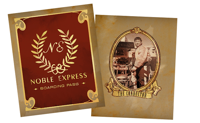
Although the slip cover art was rather straight forward, I did get a little cheeky with the included booklet cover concept. Designing it to appear to be the boarding pass for the titular train. With a back cover featuring the “conductor”, director Hung.
I remember back in 1990 I worked for a television station in the production studio. We finished video taping a segment and the on-air talent came into the control room to view the playback. She looked forlorn, then finally turned and asked me if I could make her look thinner. I looked at her inquisitively as if to say “Uh, how?” She then said, “I dunno, can’t you push a button or something?”
Ever since then I’ve had this reoccurring feeling that others who don’t truly understand what you do, what you actually do, always think there is just some button you push. So perhaps I’m writing these reflections down just to express what it is designers actually do, I mean, before we push the magic button that draws all the pictures for us.
These reminisces on past projects are not presented in exact chronological order, just whatever order that strikes my fancy. Next time, we go further back in time… to the late 1950s.
To reflect on a midcentury view of the future of


No comments:
Post a Comment