Monday, October 31, 2022

Something In The Water


The 1979 eco-horror-thriller PROPHECY has its fair share of fans, as well as detractors. Perhaps the story worked better on paper, than in execution. Sometimes its jump scares elicit more chuckles than gasps. But I feel its heart was in the right place.

A paper mill releases mercury into a river causing horrible animal mutations. Mutated animals go on rampage. Man versus nature. Nature, eventually, always wins. 

The original poster art featured a mutated animal embryo. Possibly more strange than terrifying. So my brief from the client was to amp it up a bit and include the main creature, a mutant 15-foot bear, ferociously attacking. 

Sometimes life happens when you are working, and an important personal event becomes forever linked to what you were doing at the time. I was still working on this piece when I got the call with the news that my father had passed away. So when I look at this, that's what I remember most. It was a difficult time.

Many films have a key scene that audiences remember above all others. Ridley Scott's ALIEN has the chest bursting scene. And John Frankenheimer's PROPHECY has the sleeping bag bursting scene. If you've seen the film, you likely remember this "highlight". So I illustrated the moment before that event for the booklet cover. So no spoilers, but fans should get that "oh yeah" feeling when seeing the cover.


For the Blu-ray disc art I drew a bear's paw print made of mercury.

Why don't we continue the 1970s eco-horror theme with a double feature.
That's next time. 

Saturday, October 29, 2022

When the Devil Calls


In celebration of "spooky month", I look back at some cover art I did for a 1988 horror film entitled 976-EVIL

The film, directed by Robert "Freddy Krueger" Englund, features a Twilight Zone-esque concept where a bullied introvert discovers a fantastical connection (a phone line in this case) to a higher power (Satan himself) enabling him to turn the tables and get revenge on his tormentors. But, of course, there's a catch. There always is.

Perhaps inspired by the epic play Faust, our protagonist descends deeper into madness as his soul becomes more and more consumed by Satan until in the final reel... well, you'll just have to witness it yourself.

The piece is fairly straightforward in concept. 

Our protagonist-turned-antagonist looms threateningly large over the cast. Enticing the viewer with his red hot phone, receiver in hand. Satan's fire reflecting in his eyes (the windows to his soul). He wears his sunglasses at night because he's a Corey Hart fan. But who isn't?

His overtly religious, domineering mother sits nervously on the plastic covered couch with her multitude of cat companions. That never ends well. 

His "bad-boy, cool-guy" cousin, whom he idolizes, tries to reach him but, "his line is busy". Always is these days. 

And his therapist, (or something, it's been so long I can't remember who she is) looks on cautiously. "Was that a strange noise? I absolutely must go, alone, unarmed, into that dark room to find out what horrible creature made such a sound. Oh, an unlocked trap door in the floor I've never noticed before. Well, I'm not exactly dressed properly for exploring mysterious, labyrinthian passageways, but what could possibly happen to me? Hello. Anyone there? Helllooo?"

See you next time as the horror continues and things get messy when someone feeds a bear a little too much mercury. 

Friday, September 30, 2022

They're Both Super Cops


For the third entry in the popular POLICE STORY series, Jackie Chan turned the directorial duties over to a young stuntman-turned-director, Stanley Tong. Tong suggested Chan partner with action actress Michelle Yeoh, who was looking for a suitable project for her return to cinema screens after her brief retirement (and marriage). This was a first for Jackie, as usually his female co-stars were primarily there for him to rescue in the third act. Not so with Michelle. Their on-screen chemistry, along with Tong’s talent for staging jaw-dropping stunts, gave the film a freshness, humor and was a recipe for both commercial and critical success. I was pleased to be offered the opportunity to do package design for this Hong Kong action classic. I didn’t have much time to complete the project, but I wasn’t gonna pass it up either.

Every month I like to drive up to the mountains for a few days rest. It’s a four hour drive and I’ve taken that road so many times I basically drive on auto-pilot. Not literally. (It’s not a self-driving car.)  But when I have a design project I often pass the time by doing the creative design work on the road. Choosing fonts, colors and building the composition mentally on the inside of the windshield. In my head I’m talking to myself. “How about these colors? No wait. Move the leads to the top and position the car crash at the bottom. Or how about down the side? Run the text vertical or better yet on an angle. Oh so now the whole thing flows this way. And that leaves me room for… “

By the time I arrive, the design is done and all I have to do now is to physically render it. Not an insignificant task, but at least the drive is fruitful and I can sit at my desk with some deliberate direction instead of my typical blank thousand-yard stare. 

That was the process with POLICE STORY III: SUPER COP.


I placed the visual emphasis on a desperate and nearly beaten Jackie and Michelle being "in over their heads" and out-numbered. Only by working side-by-side with fists and firepower could they overcome seemingly unsurmountable odds. Add in some bold explosive colors, dynamic text, representations of the famous stunts by both leads, and a Kuala Lumpur skyline. Stir until it boils. And if you look closely at the top Michelle's expression. She has already pulled the grenade's pin. No going back now.

For the interior inlay card I played it a bit more safe. This design is a more typical "action movie" composition.


For the booklet cover I designed a passing train silhouette instead of a skyline silhouette. Since all the characters come together on top of the train at the end of the film it seemed a natural choice. I set it against a wash of yellow with a collage of watermarked production photos. (Cinemart, Milky Way and Japanese photo mooks to the rescue!) 


Each of the three times I drew Michelle Yeoh I think I got a little better at capturing her likeness. I think that will serve me well with my upcoming projects.

SUPER COP was SUPER FUN.


 Next month is Halloween... things are gonna get spooky.

Thursday, September 29, 2022

The Queen Holds Court

Hey, what happened to the last blog post? Where did it go?

The poster art I was commissioned to do for an upcoming film featured the likeness of an actor who is no longer in the production. Due to this change in cast I removed the post. The artwork is being altered to reflect the finished film.
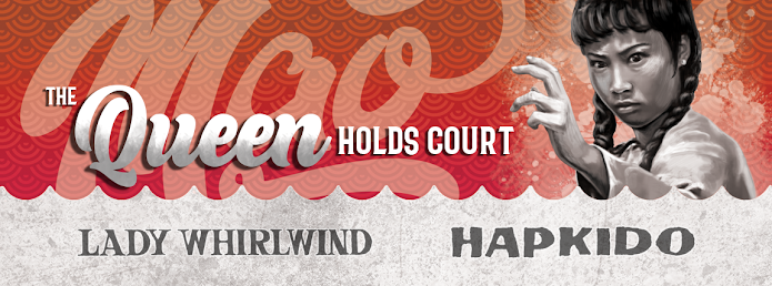
Angela Mao. Queen of Kung Fu. She burst onto the martial arts movie scene at the dawn of the 1970s and became a popular star in the burgeoning open-hand (weaponless) kung fu film genre. Her early work illuminated theatre screens alongside the films of Bruce Lee, Jimmy Wang Yu and Lo Lieh. At the time, she was even marketed as the “female Bruce Lee”. But she definitely had her own persona.

Although I don’t personally know Angela, I wanted to create a design that I thought she might like. Something bold, but still feminine. With that purpose in mind I started in a fresh direction. My client generally provides many reference images (as well as a screener if I need it) to find moments/elements from the film that I find representative of the film as a whole. I also normally check my magazine collection, but in this case my Cinemart collection only goes back to 1976. Luckily I did have some other books with appropriate reference imagery.


For this double feature presentation of LADY WHIRLWIND and HAPKIDO, I experimented with a composition centered around an image of a very determined looking Mao in front of a large rose. I chose a slightly disheveled image of her as she looks likes she’s thinking, “I’m here to kick butt, not to look pretty.” (Ironically, it makes her look even more attractive.) I tried to work in scenes from the two films into the rose petals, giving it a congruous 1970s design. But for me it didn’t work as I had envisioned. (Ultimately I did do something somewhat similar for the booklet cover.)

So instead I just illustrated the characters free floating around her, attacking from all directions. Everything was kept grayscale to unify the art which was done is a slightly rough and loose style. I then created a colorful, intentionally sloppy “mandala” to contain and contrast against the figures. Once I chose the flowing logo-style font for her name it just made logical sense to add the film titles in a flowing ribbon. The “softly exploding” background negative space was inspired by the 1974 debut album from my favorite band, RUSH.     
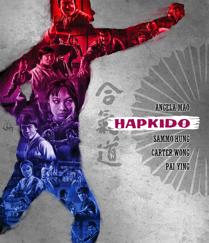

Individual art was also done for each film. I drew scenes from that film inside her silhouette, which was also from an action scene in the corresponding film. For identity, each film got its own unique color theme, repeated on the disc, menu and booklet. Per usual, I crammed in as many rare images as I could fit into the allotted pages of the booklet.


I hope she likes it. Cuz, she’s still in pretty good shape. I bet she could still kick my butt.

Next up. It’s a bird. It’s a plane. No it’s SUPER COP!.


Tuesday, August 30, 2022

Time Waits For No One

Sometimes I base a Blu-ray cover design on a memorable moment in the film, or a collage of key actors and elements. In this case, it was more an overall impression. But not an impression from seeing the film. Nope. An impression from seeing the trailer. Marketing based on marketing. I’ll explain.

In a perfect situation I would be very familiar with the film or product I’m designing a package for. In the case of a film, the client may usually provide a screener for reference if I haven’t seen it.

But, I can’t remember the last “perfect” situation I’ve experienced. As everyone knows, we are NOT living in “normal” times. You simply have to be flexible. And in this unusual instance, I had long resisted all opportunities to view this specific film due to indifference. Who knew I would be asked to design a cover for it one day.

And frankly, this indifference to the movie seemed odd even to me. Because the film in question, TIME AND TIDE, was directed by the man, Tsui Hark,  responsible for my favorite film, the genre-bending 1986 masterpiece, PEKING OPERA BLUES. And of course his name is connected to dozens of bonafide Hong Kong cinema classics, including THE KILLER, A CHINESE GHOST STORY, ONCE UPON A TIME IN CHINA. (And even lesser known pleasures such as I LOVE MARIA and WEB OF DECEPTION.)

But much like filmmaker, James Cameron, whose work I usually enjoy, I similarly have zero interest in watching his TITANIC film. It just did not interest me. I rather liked A NIGHT TO REMEMBER, the 1958 retelling of the story of the sinking. So I have no objection to the basic premise of the story, but rather the trappings. Spending three hours with Kate Winslet and pretty boy Leonardo DiCaprio on a sinking ship to the tune Celine Dion? Nah, pass. I still have never watched it to this day. No offence to anyone who likes it. I just would rather watch Ray Harryhausen’s THE GOLDEN VOYAGE OF SINBAD for the umpteenth time instead. To each their own.

The end of the 90s was a declining time for the HK film industry. By 1996, my wife and I had shuttered VIDEO CITY—our Chinese video rental store in Maryland. In the few years leading up the Chinese 'handover' in 1997, there had been a mass exodus of talent leaving HK for attempts at greener (or at more free) pastures in America. Or just retiring from show business in general. Even Hark himself got caught up in the “migration”, trying his hand at helming two lackluster American-produced Jean-Claude Van Damme films.

So Hark, like the industry in general at the time, was in a bit of a slump. And not being a big fan of pretty boy Nicholas Tse, especially coupled with the whole “totally-extreme-surf-the-neon-net-double-barreled-dutch-angled-Matrix-style-action” that was so current then. That bored me. So I skipped it. Every chance I got, I skipped it.


So being tasked with designing the cover, I relied on my memory of my general “impression” of this film I never saw. That, and a low resolution trailer I found on YouTube. I hope I did justice to it’s “Year 2000-ness”. Not sure. I’ve still never seen it.

Below is my cover design for the accompanying booklet.


I should give it a spin one day. Co-star Anthony Wong is a solid character actor. (I actually ran into him a couple times on the streets of Hong Kong the year this film came out.) And Tse has been pretty good in more recent Benny Chan films such as INVISIBLE TARGET and RAGING FIRE. Even DiCaprio has matured into a respected actor and I do enjoy his work sometimes now.

So maybe, perhaps it’s time… for me to give it another chance?

I dunno, that THIS IS SUPERMARIONATION documentary is just screaming my name. It’s soooo shiny!

"STAND BY FOR ACTION!" Damn, foiled again.

Next time... accidents will happen.

Sunday, July 31, 2022

Dreadful Plot

The martial arts mini series continued with director Yuen Woo-ping's 1981 "madman-on-the-loose" actioner DREADNAUGHT. For this title I used black as the thematic color. Well, not true black. I wanted the parchment paper textured to be visible, as it is with the other colors in this series. So it's actually a very dark gray, so the true black areas such as Biao's hair can stand out and pop against the background. 

The composition is straight forward. Yeun Shun-yi's serial killer looms ominously overhead. Yuen Biao's "laundry kung fu" (which was surprisingly parodied in BATMAN FOREVER) takes center stage, as it is a key element to the plot. Bryan "Beardy" Leung Kar-yan and Kwan Tak-hing flank him, while the Chinese lion/dragon dance/competition anchor the base.


The quasi-duotone booklet cover art focused on the bell necklace which drove White Tiger into a fit of angry rage throughout the film. Along with the blood splatter which ultimately resulted from his madness.


For the next title released in the series, THE SHAOLIN PLOT, I went with a hot magenta tone. A color pulled the costume worn by Chen Hsing's (aka Chan Sing). The narrowing perspective of the temple courtyard pulls the viewer's gaze into the image. With a single character partially turning to make eye contact with the viewer. As if to casually welcome you to witness the bloody conflict playing out in the heavens overhead, like angry Gods doing battle in a tremendous tempest. With villain Chen Hsing positioned as if manipulating deceitful strings of control over the proceedings.

(Although not a sequel, the bulk of the talented cast would carry over into Sammo Hung's directorial debut, THE IRON-FISTED MONK, made later that same year.)


My booklet art highlights Sammo Hung's weapon of choice in the film. A pair of deadly Golden Cymbals. His character even takes his nickname from this odd accoutrement. For the cover art I depicted the second, more deadly, version of the weapon (employed after the first pair get destroyed in battle) sporting teeth-like blades―for added carnage. 


Stay safe. And keeping riding the tide, until the next time we meet.

Thursday, July 28, 2022

Odd Knocking


In keeping with the visual style on this mini series of old skool martial arts films remastered on Blu-ray, my cover design for the 1979 Lau Kar-wing/Sammo Hung weapons classic ODD COUPLE, was fairly straight forward.

This time I chose an olive green for the color theme and created a composition reflecting the dynamic interplay between the two leads. The plot features an interesting premise. Hung and Lau portray aging masters (via old age makeup) who have a long-standing competitive relationship. Who is the better master of their weapon of choice? Once a year they meet to duel it out. Hung as the "King of Sabres" and Lau as the "King of Spears". But every year it ends in a draw, with neither the clear winner. 

So, considering their advancing years, they decide it's time to each take on a younger apprentice with the hopes of them settling the score. Cleverly, Hung plays Lau's student, and vice versa. So, without the need for costly or technically difficult visual effects (remember this was 1979) the actors could appear throughout the film, in nearly every scene, playing one of their two characters. And they both get to showcase their impressive skills with both the sabre and the spear.      

So the cover art features the masters leering at each other from behind their weapons, as their younger students do the clashing between them. In the finale they are forced to team up to defeat a common foe in Bryan "Beardy" Leung Kar-yan. Before resuming their age old feud. Which ends with... well, you'll just have to see the film if you haven't.

The included booklet cover continued my minimalistic 3-color approach to the design. The ending of the film is represented, (spoilers) with weapons marking the graves of the masters.


For the 1979 action comedy KNOCKABOUT, the focus was on breakout star Yuen Biao. Director Sammo Hung and the producers at Golden Harvest were hoping for a star-making performance from Biao, something similar to what DRUNKEN MASTER had done a year prior for Jackie Chan. The resulting film, although perhaps not as ground breaking as Chan's film, still resonates with fans today and is widely considered a classic of the genre.   

Sammo, in the beggar-turned-kung-fu-master role (at least on the surface), instructs Biao in the illusive ways of monkey style (猴拳, "monkey fist") kung fu. So my art is designed to reflect that memorable aspect of the film. Biao does his training in the looming shadow of Hung. The co-stars are shown in boxes which was a common design trope of star-studded films from the 1970s (think Irwin Allen).  

The booklet cover art concentrated on the monkey and the thorned vine from the climactic battle.  


Next time... the plot turns dreadful.