Monday, May 15, 2023

Becoming Jackie Chan


This is a cover piece done for a magazine publication to accompany an article about the early Jackie Chan's films THE YOUNG MASTER and THE BIG BRAWL (aka BATTLECREEK BRAWL). The collage features three images from each film set against a bold watercolor wash with some Chinese articles watermarked into the background. Using a homogeneous color palette of orange and blue tones, along with consistent eyelines, help pull the disparate imagery together. I contrasted the blue figures with red to pop them forward.


Next time... things start hopping. Things get scary. Things go mad.

Sunday, April 30, 2023

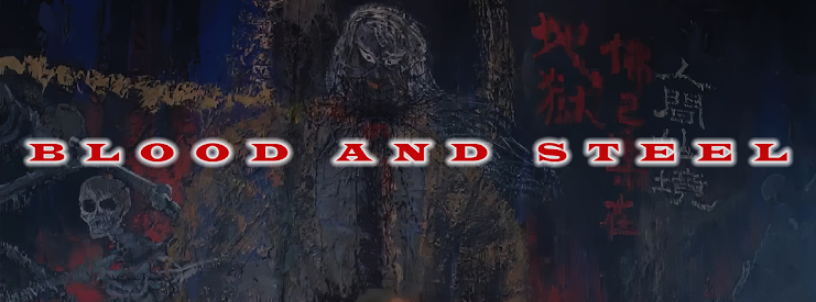
Blood and Steel


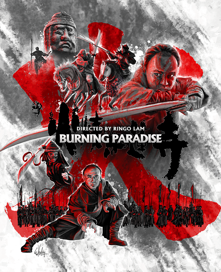
This piece was done for the cover of a violent martial arts epic from celebrated Hong Kong film director Ringo Lam. BURNING PARADISE offers another tale of young folk hero, Fong Sai-Yuk, battling the forces of evil - this time in a labyrinthian underground prison lair where one wrong move spells sudden death of an extremely "uncomfortable" nature.

The extreme violence of the movie naturally dictated the color palette. Blood is everywhere. Inside and out. The Chinese character for "fire", rendered in blood red, looms large and splatters everything in sight. It's emphasis is heightened by reducing all other colors down to a monochromatic grayscale wash of character action/reaction.

It's a strange dichotomy. It's a constant back-and-forth, as I struggle with the tools of the trade to render physical my vision for each piece. I wouldn't say I ever get fully comfortable in any given style. But I'm also aware of the fact that I never want to exhibit a recognizable style. I don't want to be a "style". (The art direction of the thing I'm marketing should dictate the style if it has any at all.)

If I feel I'm getting too comfortable, repeating myself, I immediately attempt to move from on it. Unless I'm doing a series where all the items need to match, I want to welcome each new design job with a set of fresh eyes not relying to previous works to guide me.

If I'm not stretching, I'm not growing. (And I've got a long, long way to grow.) That's the dichotomy. I try to improve in a certain direction, but then if I feel I'm approaching that goal, I immediately move on from it to try to pursue a different direction. I never stay in any comfort zone. The compounded effect is I'm never fully happy with the work. 

I think this comes from decades of working for hundreds of different clients, all wanting something different. So I have to be everything to everyone. So my own vision takes a backseat. But that's life as a graphic designer. Do your best. Hopefully learn something in the process. And onto the next one. 

See you on the next one. 

Friday, April 28, 2023

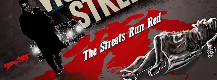
The Streets Run Red


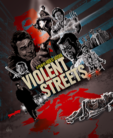
This is a piece I did for a early 70s Japanese gangster film directed by Hideo Gosha. It's dark, violent and, well, takes it's brand of yakuza action to the streets. So, in a flagrant example of "truth in advertising", it's actually called VIOLENT STREETS.  

I've never been a fan of the "stack of floating heads" poster style so popular in the 1990s. (ie: names across the top, head over shoulder, head over shoulder, head over shoulder, horses running in silhouette across the bottom, done call it a day.) So when possible, I always try to give the characters a little bit of business. Holding a prop, a weapon, a phone, some sort of indication to who their character is. So viewers can get a hint of the story, or at least the type of story from the imagery.

Also juxtaposing protagonists and antagonist facing each other can visually express a sense of the conflict. In this film it's not so much "good guys versus bad guys", they are all pretty much "bad". But it's still one group versus another and my composition splits them down the middle with our protagonists on the left. The bloody Japanese title divides them and spills out onto the dark street itself where it joins the bleeding body of a woman. While the whole scene is rendered off-kilter, is contrasting hues of reds and blues. Hot and cold against a neutral gray night.    

Various elements, such as tiny flying chicken feathers, a pack of German Shepherds, a transvestite with a knife are all pulled from the film, but don't spoil any major plot point.

The rough comp is shown to the right (inset) with the final finished piece below.
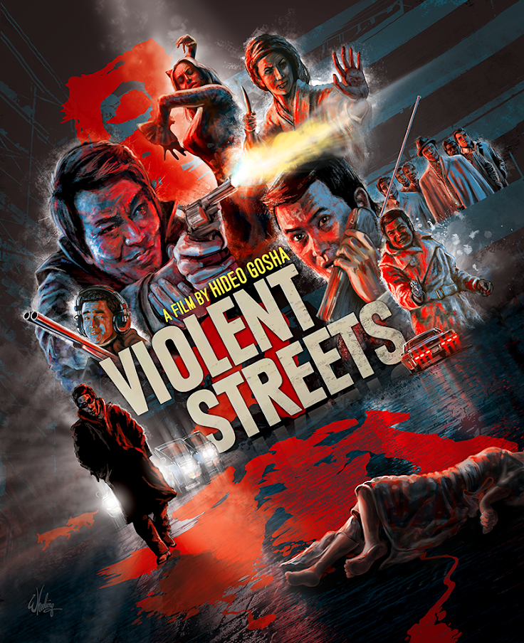
The other primary color, a prominent yellow muzzle flash, subtly reflects on the actors faces and is echoed in the director's name. While all the red lighting the scene emanates from the Japanese title.


Take the sex and the violence from this film, and add martial arts. Stir until it comes to a fine boil. That's next time.

Sunday, March 26, 2023

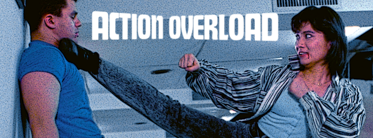
Action Overload


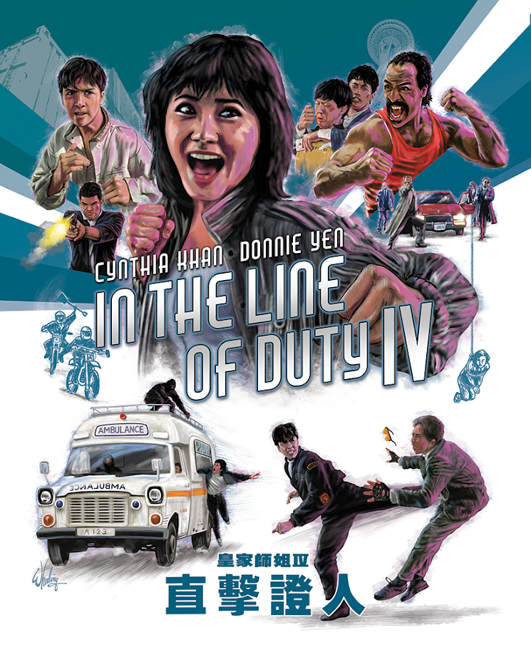
I went with a blue tone for IN THE LINE OF DUTY IV starring Cynthia Khan and Donnie Yen. (Perhaps the abundance of 1980s denim played a role.) The cover strives for that balance of positive and negative space. With bold lines driving the eye toward the title. I never like to clutter the image with dozens of heads peeking over shoulders so the colored lines provide a natural visual element for layering the figures. And I was able to render every figure doing something energetic which helps define their character, and provides a better impression of the film.


Although the first four films are the most popular, it would still be wonderful to release the remaining films in the (admittedly loosely-connected) series. If nothing else but for the sake of completing the set.

Hopefully, if original film elements survive in good condition, one day Fortune Star will see fit to remaster the final few films in HD and make them available for licensing by distributors. We can only hope.

Until then, we can at least enjoy these HK cinema action classics in beautiful new transfers. They look better than ever on home video.

The series... so far.


Next time... the streets run red.

Saturday, March 25, 2023

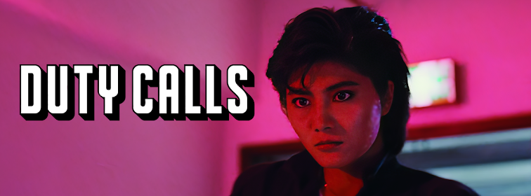
Duty Calls

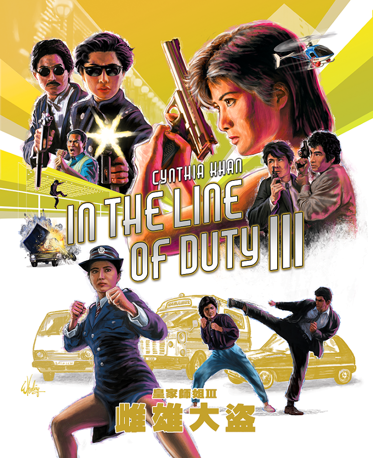
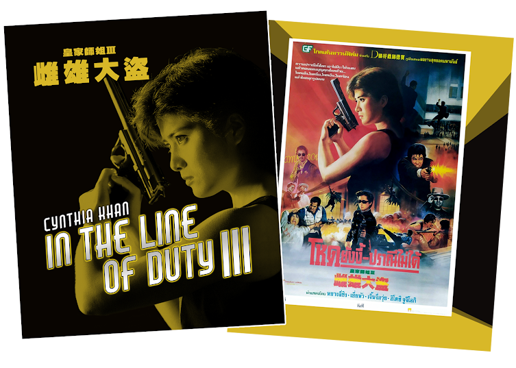
Taiwanese actress Cynthia Khan (a stage name amalgamation of Cynthia Rothrock and Michelle Khan) takes over for a retiring Michelle Yeoh in this hard-hitting installment in the very loosely connected Hong Kong "girls with guns" film series. For the IN THE LINE DUTY III cover art I continued the graphic theme established previously, this time with a yellow tone as seen on the original HK lobby cards.  

The booklet cover spread continues the visual theme. (The Thai poster is featured on the back.)

As does the menu featuring that iconic shot.


Next up... the fourth time's the charm.

Tuesday, February 28, 2023

Biao in Action


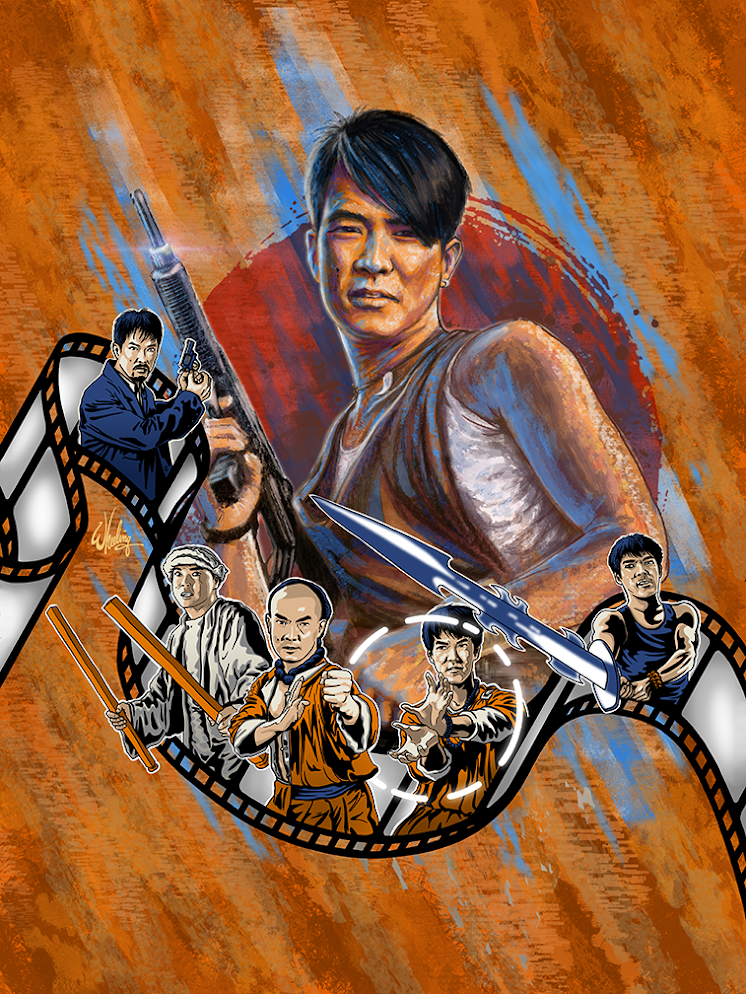
This was a quick little cover piece I did for a magazine highlighting the 1990s work of Hong Kong action star Yuen Biao. The main image is from 1987's EASTERN CONDORS per my client's request, but the inset images are all from his later work, made during the decline of the film industry. 

To differentiate the films profiled inside, I rendered the smaller images of Biao in a graphic flat style, with a limited blue/orange color palette and popped them out of a strip of 35mm film.


Next time, we return to the IN THE LINE OF DUTY series with impressive new-comer Cynthia Khan.

Saturday, February 25, 2023

Magnificent Michelle


The overdue appreciation of the work of actress MICHELLE YEOH continues in the US and UK, with the re-release of her 1987 actioner MAGNIFICENT WARRIORS. The period action adventure gave more than a passing nod to the exploits of one Indiana Jones. And therefore, my packaging took inspiration from that same source as well. It really was a missed opportunity to have her team up with the good doctor for an adventure or two. Although not playing an archeologist, Yoeh brings her own sensibilities to the roving adventurer archetype. She can more than hold her own in a fight. With fists, feet or her handy rope dart. And, more importantly, she knows how to LAND a plane.

The booklet cover (below) solely focused on Michelle in her defense posture. I actually did the art a few months before I even knew my client was going to release the film. Just as a fun exercise. 

Yuen Biao gets a retro retrospective... and a magazine cover

That's next time.