Since Michelle Yeoh had such a good year in 2022, I'll kick off 2023 with some artwork I've done for her classic films. Stay tuned to this channel (blog? website? whatever.)...
Happy New Year everyone!

Since Michelle Yeoh had such a good year in 2022, I'll kick off 2023 with some artwork I've done for her classic films. Stay tuned to this channel (blog? website? whatever.)...
Happy New Year everyone!

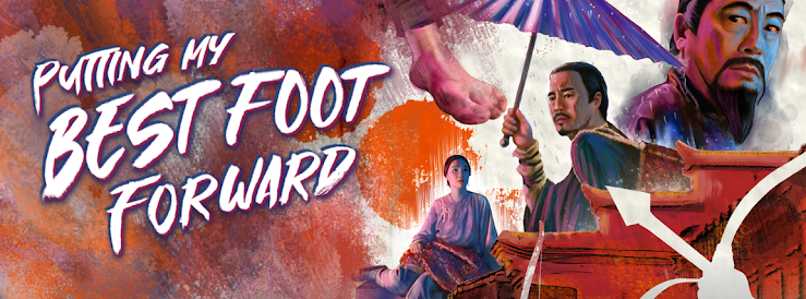
For my cover design for 1993 Hong Kong martial arts actioner, THE BARE-FOOTED KID, I decided to put my best foot forward. Literally.
I coated the bottom of my foot with India ink and stamped it on Bristol board. Then I painted the characters around it leading the eye back toward the protagonist, the titular "kid" (Kwan Fung-yiu), played by Cantopop superstar Aaron Kwok. (Can't miss him, I have several arrows pointing right at him!)
His bare feet drawing attention, as they alone break the lower frame. Maggie Cheung looking pensive as she does so well. The late Kenneth Tsang adding gravitas, as he did so well. Shaw Brothers veteran, Ti Lung, walks off into the distance. Which is suitable, since this film was a remake of the 1975 Shaw classic DISCIPLE OF SHAOLIN, and was produced as the studio itself sadly faded into the history books. Trapped on all sides, mysterious, unseen, marauders provide a threat to our ragged hero. As his love interest, always left behind, weighs heavy on his shoulders. (I added a tiny tear running down her cheek, but it's so small it's hard to notice.)
Originally I had more paint drips, referencing Kwan' job at the dye factory. But ultimately it was more of a distraction and, at the behest of my client, I removed them.
The film is a fairly beige affair, so I tried to liven up the color palette a bit and settled on orange. It's in the same overall vein as beige, but less drab and more energetic. I then added some "cool blue" tones for Tsang as the antagonist.
Next time... the dead get deadly.
NIGHTWING (1979) stars a young and handsome Nick Mancuso struggling with a swarm of angry vampire bats riled up by greedy oil prospectors.
While SHADOW OF THE HAWK (1976) stars a young and handsome Jan-Michael Vincent coming face to face with black magic... and an angry bear in a pretty cool scene. (As is the car crash scene.) Both films deal with tribal rituals and beliefs of native peoples, so they do work well as a double bill.
For the Blu-ray cover art I selected a suitable color palette for each film, to visually group those elements, and then did a soft vertical blend giving each movie equal weight.
If I was to do the art again today, I might do it in a more loose painterly (i.e. "rough") style. Doing so might convey that 70s horror vide a bit more. But for what it's worth, I've never been that impressed with my own work. I look at it and think what's the big deal, even I could do THAT. Oh wait, I DID!
A paper mill releases mercury into a river causing horrible animal mutations. Mutated animals go on rampage. Man versus nature. Nature, eventually, always wins.
The original poster art featured a mutated animal embryo. Possibly more strange than terrifying. So my brief from the client was to amp it up a bit and include the main creature, a mutant 15-foot bear, ferociously attacking.
Sometimes life happens when you are working, and an important personal event becomes forever linked to what you were doing at the time. I was still working on this piece when I got the call with the news that my father had passed away. So when I look at this, that's what I remember most. It was a difficult time.
Many films have a key scene that audiences remember above all others. Ridley Scott's ALIEN has the chest bursting scene. And John Frankenheimer's PROPHECY has the sleeping bag bursting scene. If you've seen the film, you likely remember this "highlight". So I illustrated the moment before that event for the booklet cover. So no spoilers, but fans should get that "oh yeah" feeling when seeing the cover.

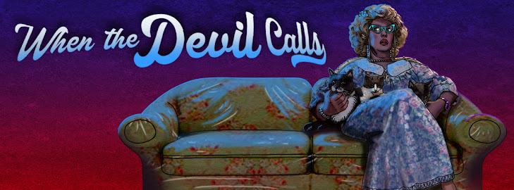
In celebration of "spooky month", I look back at some cover art I did for a 1988 horror film entitled 976-EVIL.
The film, directed by Robert "Freddy Krueger" Englund, features a Twilight Zone-esque concept where a bullied introvert discovers a fantastical connection (a phone line in this case) to a higher power (Satan himself) enabling him to turn the tables and get revenge on his tormentors. But, of course, there's a catch. There always is.
Perhaps inspired by the epic play Faust, our protagonist descends deeper into madness as his soul becomes more and more consumed by Satan until in the final reel... well, you'll just have to witness it yourself.
The piece is fairly straightforward in concept.
Our protagonist-turned-antagonist looms threateningly large over the cast. Enticing the viewer with his red hot phone, receiver in hand. Satan's fire reflecting in his eyes (the windows to his soul). He wears his sunglasses at night because he's a Corey Hart fan. But who isn't?
His overtly religious, domineering mother sits nervously on the plastic covered couch with her multitude of cat companions. That never ends well.
His "bad-boy, cool-guy" cousin, whom he idolizes, tries to reach him but, "his line is busy". Always is these days.
And his therapist, (or something, it's been so long I can't remember who she is) looks on cautiously. "Was that a strange noise? I absolutely must go, alone, unarmed, into that dark room to find out what horrible creature made such a sound. Oh, an unlocked trap door in the floor I've never noticed before. Well, I'm not exactly dressed properly for exploring mysterious, labyrinthian passageways, but what could possibly happen to me? Hello. Anyone there? Helllooo?"
See you next time as the horror continues and things get messy when someone feeds a bear a little too much mercury.
For the third entry in the popular POLICE STORY series,
Jackie Chan turned the directorial duties over to a young stuntman-turned-director, Stanley Tong. Tong suggested Chan partner with action actress Michelle Yeoh,
who was looking for a suitable project for her return to cinema screens after
her brief retirement (and marriage). This was a first for Jackie, as usually his
female co-stars were primarily there for him to rescue in the third act. Not so
with Michelle. Their on-screen chemistry, along with Tong’s talent for staging
jaw-dropping stunts, gave the film a freshness, humor and was a recipe for both
commercial and critical success. I was pleased to be offered the opportunity to
do package design for this
Every month I like to drive up to the mountains for a few days rest. It’s a four hour drive and I’ve taken that road so many times I basically drive on auto-pilot. Not literally. (It’s not a self-driving car.) But when I have a design project I often pass the time by doing the creative design work on the road. Choosing fonts, colors and building the composition mentally on the inside of the windshield. In my head I’m talking to myself. “How about these colors? No wait. Move the leads to the top and position the car crash at the bottom. Or how about down the side? Run the text vertical or better yet on an angle. Oh so now the whole thing flows this way. And that leaves me room for… “
By the time I arrive, the design is done and all I have to do now is to physically render it. Not an insignificant task, but at least the drive is fruitful and I can sit at my desk with some deliberate direction instead of my typical blank thousand-yard stare.
That was the process with POLICE STORY III: SUPER COP.
For the interior inlay card I played it a bit more safe. This design is a more typical "action movie" composition.