Tuesday, May 31, 2022

They Be Dragons... Forever

One evening I was contacted with the seemingly odd request to see if I could whip up a design for the cover of the Sammo Hung/Jackie Chan/Yuen Biao classic DRAGONS FORVER… in a couple hours. They wanted to review it THAT night. Weird, but NOT the strangest request to come across my desk, believe it or not. So I put down my fork, shoved my dinner back in the microwave and went to work mocking up a quick design.

This is what I presented. With my intention to illustrate it (or something like it) if approved. Jackie is a little blurry here as I only had some 30-year old magazines to work from.

I believe it was posted for feedback on a public forum with the general consensus being it looked like something hastily mocked up in Photoshop in a couple hours. Um. Bingo. That’s EXACTLY what it was! An initial concept, not final art.

So a request came for a second design. Posthaste. Okay. Here we go again. More red meat was thrown to the masses to stick their pitchforks into.


The next day, this potential client then asked for a mockup of THE PROTECTOR as well. I did an original, as well as a revised updated version of the Japanese poster adding in the missing Sally Yeh. (Everything goes better with Sally Yeh.)


Then a few CRIME STORY comps followed also in a hurry the following day. Not sure what the rush was. Perhaps they needed something to show someone I guess. It wasn't for me to know.


In the end that client was like, "Eh. Thanks, but nevermind."

You win some. You lose some. That's the nature of business. I've learned from 30+ years of graphic design you just do your best, but don't get too emotionally attached to this stuff. It'll break your heart.

Funnily enough, soon after, I noticed a Blu-ray distributor in Asia apparently felt quite differently regarding the artwork. And was happily using my DRAGONS FOREVER art for the slipcover on their release of the film. Would've been nice if they asked me first. But I contacted them and settled it. I told them it was only a design mockup, but apparently they are quite fond of photo collages and felt it worked for them perfectly as it was. No more work needed.

You lose some. You win some. On it goes.

Next up.... designing a flexible template for a series of martial arts classics.

Wednesday, May 25, 2022

Animals With Weight Issues

HK filmmaker and martial arts super star Sammo Hung severed ties with longtime powerhouse production company Golden Harvest as the 1980s came to a close. With a leaner budget he soldiered on with intensity, but the cracks were starting to show. 1990 saw the release of SKINNY TIGER AND FATTY DRAGON, an uneven but fun action comedy that sees Hung reunite with comedy legend Karl Maka and action master Lau Kar-wing. The fight scenes still shine brightly, while a few of the “in between” scenes feel a little more like filler material. Still, the film remains a highlight of Hung’s 1990s output.

For the cover art, I tried to play-up the dynamic colorful nature of the film while paying homage to the design aesthetic of the time in which the film was made (especially inside the pages of the included booklet). I derived the color palette from the HK title logo and gave the composition energy with an explosion of overlapping lavender-toned characters amongst orange and teal paint splatters. Our heroes are depicted surrounded by adversaries (even quarreling with each other in the center as they do in the film), but at the bottom stand together ready for battle.

 Not being a fan of the original somewhat awkward-looking English title, I created a new title treatment that read clearer and better fit my various uses for it (spine, disc, menu, etc.).

Since I feel a so-called “limited edition” o-card slipcover should provide something that is actually limited in availability, for the inlay artwork I decided not to reuse the same art but rather to utilize this space to highlight the wonderful Thai poster artwork. I painted out the Thai text and added the new English title font. And for the reverse, I recreated a close approximation of the original Hong Kong photo poster artwork from various elements I had, since a high resolution version could not be provided by the licensee.

I had seen a YouTube trailer for the Mark Houghton documentary I AM THE WHITE TIGER and suggested to my client to possibly license the doc as an extra feature. Sometimes they go along with my suggestions (such as fixing the color grade on THE BRIDE WITH WHITE HAIR, as the provided master was an over-bright teal and orange mess) and sometimes they don’t (releasing WARRIORS TWO and THE PRODIGAL SON in separate Amaray cases inside a hard slipbox, ala CINEMATIC VENGEANCE). You win some, you lose some. But somewhat to my surprise, a week later they told me they were now including it on a limited bonus disc. Cool!

I wish we could’ve sourced an HD version of the entire extended Taiwanese cut of the film. But it’s not unusual for those Mandarin-dubbed prints to be extremely hard to find in good condition these days. At least excerpts are included in standard definition as a bonus feature.

See you next time… where we keep the DRAGON theme going. FOREVER.

Friday, April 29, 2022

Paper Tears

The classic 1972 Hong Kong film, KING BOXER, was given an English dub and released the following year in North America as THE FIVE FINGERS OF DEATH.

Its enormous popularity opened the door, I should say floodgates, for a wave of kung fu quickie films of the early 1970s. It even preceded Bruce Lee’s ENTER THE DRAGON by several months. Quentin Tarantino called it one of the 10 best films of all time.

That’s high praise.

But when designing cover art you can’t let the pressure get to you. Just do the best you can. In the time you are given.

This cover project was for a large Blu-ray collection of remastered Shaw Brothers martial arts films presented within a digibook style package. So this art would be seen inside the packaging next to the disc itself, and not on the cover of the outer slipcase box. Also it was a “landscape” presentation instead of the normal vertical “portrait” format.

The first version I rendered is below.


I was caring for my ailing father at this time and he passed away while I was drawing this.

At his funeral I had a large black poster board with family photos mounted on it. A few days after the service I removed the photos, unintentionally ripping the poster board. The black paper turned out to be white on the inside. Never one to ignore an interesting texture, I scanned those rips and incorporated them into the design. Jaggedly radiating out from Lo Lieh, dividing the screen into 5 sections (the fingers) and one lower section (the hand/wrist.) 

(If I had a dime for every rusty truck tailgate and crumbling wall I’ve photographed with the hopes of later using it in some design.)

Sadly the client was less than enthused with the design. Particularly pointing out the rips and the "comic book" halftones in the background. So a second (more painterly?) version was done which they accepted. As seen below.

Many months later when I saw the final release, I realized that although I was afforded a full page for my art, many other films shared a single page in the digibook style package. Two movies on a single disc. Therefore, two cover images on a single page. 

And what was the divider between each film’s artwork?

A paper rip. 

So maybe they objected to it because they planned to use it BETWEEN the cover artwork on a page and didn’t want it used within a single film’s art. (Or maybe they got the “rip” idea from me. Ha. Who knows.) But one way or another, that rip is now tearing up 5 out of the 10 pages in the package. Instead of just mine.

Way to go Dad. 

----

Next time. We visit a zoo. To meet a Skinny Tiger... and a Fatty Dragon. 


Ishiro Honda Future Fears


ISHIRO HONDA was the visionary Japanese director of the original classic 1954 film, GODZILLA. As well as a dozen or so more Godzilla and tokusatsu (special effects) films. His lasting legend looms high in the hearts of kaiju (monster film) fans and throughout the annals of cinema history. It was a treat to illustrate images for a double feature of not one, but two, of his works.

Honda’s 1959 space-invaders-attack-the-earth sci-fi extravaganza BATTLE IN OUTER SPACE, contains reused elements, slightly modified model ships and even character names, from Honda’s earlier 1957 film THE MYSTERIANS, but is generally considered only a very “loose” sequel, if at all. With that in mind I could approach this design with no need to tie it into that film. BUT, this being sold as DOUBLE FEATURE meant I had to find a design that worked well set beside a vastly different film altogether, THE H-MAN. Which is a 1958 sci-fi noir thriller, dealing with Tokyo police investigating mysterious disappearances, where only the victims clothes remain. These events are eventually discovered to be linked to the strange effects of radiation fall-out from a hydrogen bomb test. No space invaders to be seen, but creeping slimy monsters none-the-less.

It’s always a challenge to find a cohesive and clever way to meld two different films into a single design. Especially two slightly different genres. Sure I could retrofit two posters side-by-side with little effort. Boring. As nice as the original poster art is, and it is cool, that is not what I'm being paid to do. None of these characters are consistent between the films so finding a single protagonist to represent both films (ala Wong Fei-hung in Tsui Hark’s ONCE UPON A TIME IN CHINA series) won’t work either.

I got to thinking… (I know, never a good sign.)

What if the whole was something more than the sum if it’s parts? What if the two films together could somehow create a new image (sort of a MAD Magazine fold-in). What if they conveyed a greater understanding of Honda’s talents than did each film alone.

To that end I decided to try to blend the two “half” images (representing each movie) together to form something more cohesive.


The left side would feature a circular mushroom cloud with the vertical shaft of the cloud extending straight down underneath. The right side would be a half moon, the same size as the hydrogen bomb cloud. A carefully positioned rocket would mimic the shaft of the explosion, the baseline ground level would line up, and bingo bango jig-a-jog jango, the two images would together create two halves of the same shape. Well, worth a try anyway.

BATTLE was the first I illustrated. The client requested full-cover images of each film on the inside Blu-ray case inlays so that was rendered with cropping it in-half in mind. The first illustration I did was against a white background. I was just going for something I felt was modern and gave it a fresh feel. But once I saw it transferred from my imagination to the physical world, it didn’t please my eyes as much as it did my mind. Back to black. As a designer I feel, if you are afforded the luxury of time, it’s sometimes good to veer a bit “off road” even if you end up getting back on “the path” once you see things more clearly. I tried it. Meh. Maybe it’s more suited for something else in the future, but now I see the value of black space. Especially for a 1950s sci-fi film. But I still couldn't resist the urge to add a subtle splash of color to the blackness of space to give it some life, some visual interest. Space is alive isn’t it? Whatever. It matches the colorful film it represents. Plus I love dreamsicles ice cream treats and it reminds me of those. Mmmmm, I'll be right back. 

Anyway, below is the final cover used.

Then THE- H-MAN came next and was more straight forward to do. Once I knew the size I needed to draw the mushroom cloud and the ground level (and that the sky was now black) it all came together easily. I digitally recreated the films title logos from poster references and gave each film its own color theme.

Oddly enough, after living with this design for a bit, I eventually decided I DIDN’T like the moon rocket cut in half and moved it over to the right. This compromised the initial intent of the composition, but I can’t be tied to any idea, no matter how clever I thought it was, if it’s hurting the overall work. I have to let go if something better comes along. The work is not finished until I send it out to the printer. Usually stepping away from the work for a bit and then returning gives me fresh impressions which can illuminate areas of the art that should be addressed. Sure, you can kill it with improvements. But the more I looked it at, the more I felt it might be seen as a mistake to have the rocket halved right in the middle of the "canvas". So below is the version that finally went to print.

I retrofitted the artwork for use as menu backgrounds and even did WRONG REGION CODE NOTICE backgrounds you only see if your Blu-ray player is set to any region other than 2. I also created white versions of the menus for BATTLE which can be seen below, although they were never used.


It was a fun project as I love 1950s sci-fi, physical media, Blu-ray and Japanese cinema of that period. So combining these elements, and getting paid in the process, was a dream come true. I’ve long considered writing a chronological reference book on 1950s sci-fi/fantasy cinema, but with my limited time this may be as close as I get. For a while anyway.

Next time... we meet the KING BOXER. But don't look him straight in the eyes.


Monday, March 28, 2022

Train Keep a Rollin

THE MILLIONAIRES’ EXPRESS is an all-star Hong Kong action comedy “western” directed by and starring Sammo Hung. It was a 1986 lunar new year release intended to be a fun rollick. Though a modest success at the time, it is perhaps even more highly regarded today for it’s entertaining action sequences.


For the re-released blu-ray cover I didn’t try to get overly artsy with this one. Just straight down the middle exactly what most audiences would expect for an epic like this. Big centered Sammo head shot. Surrounded by headshots of the comedy stars and body shots of the action leads poised for conflict. The exterior set where some key action bits happen gets some prominence below Sammo. Then a new golden title treatment positioned below that. Big, bold and fittingly “western” in it's flavor. With the apostrophe in the right spot. (It’s plural possessive folks. More than one millionaire onboard.) Then the steam-belching train of the title anchors the piece with a hint of actiontwo bandits on horseback approach while Richard Ng trots across the roof of the train in the distance (shuttling from his wife in one car to a potential mistress in another, if memory serves me). All set against blazing orange with a burnt parchment border. (Referencing the stunt-filled fire sequence in the film.) Although the comedy segments perhaps outnumber the action bits in the film overall, it’s the impressive action that wows western audiences so that element naturally gets “played up” in the marketing.

I'd do some things differently if I had a redo, but that's the case with almost all my art if I sit with it long enough. At some point it's "pencils down". But I hopefully take what I learn and apply it to the next one. Train keep a rollin'.  

Originally these HK films feature the Chinese title large and the English subtitle as a smaller afterthought beneath. But for these English-friendly re-releases I have to reverse the emphasis. For this one, my redesign left the Chinese title still on top (like a little hat), but I tried to emulate the WIDESCREEN SCOPE aspect of classic western movies (such as HOW THE WEST WAS WON) in the subtly arching distressed antique English type. Even if you can’t actually read what it says, hopefully you can still comprehend what it conveys, through the careful use of these tropes. 

Although the film boasts many stars, I like to limit the number of actor names on the cover to just a few of the key players so as not to clutter an already busy piece. Blu-ray covers are small enough as it is. And target audiences tend to already be quite familiar with these 40 year old films anyway. There’s no need to list half a dozen names regardless of their popularity.  

Although the slip cover art was rather straight forward, I did get a little cheeky with the included booklet cover concept. Designing it to appear to be the boarding pass for the titular train. With a back cover featuring the “conductor”, director Hung.

I remember back in 1990 I worked for a television station in the production studio. We finished video taping a segment and the on-air talent came into the control room to view the playback. She looked forlorn, then finally turned and asked me if I could make her look thinner. I looked at her inquisitively as if to say “Uh, how?” She then said, “I dunno, can’t you push a button or something?”

Ever since then I’ve had this reoccurring feeling that others who don’t truly understand what you do, what you actually do, always think there is just some button you push. So perhaps I’m writing these reflections down just to express what it is designers actually do, I mean, before we push the magic button that draws all the pictures for us.

These reminisces on past projects are not presented in exact chronological order, just whatever order that strikes my fancy. Next time, we go further back in time… to the late 1950s.

To reflect on a midcentury view of the future of Japan. Which, by now, is already the past. Stay tuned.

Saturday, March 26, 2022

Vengeance! is Mine

My responsibilities continued to grow. This time I was afforded the opportunity to actually name the release, as it was a collection of 8 action films from the same director. The “Joseph Kuo Collection” just wasn’t gonna cut it, so I suggested CINEMATIC VENGEANCE! 8 KUNG FU CLASSICS FROM DIRECTOR JOSEPH KUO. The exclamation point is key.

It’s always an interesting challenge when tasked to represent several movies in a single image. Especially when it’s not a series of sequel films in a continuing saga, (such as Indiana Jones) but rather films only linked loosely by genre and director. And, sadly, not one who is instantly recognizable (such as Alfred Hitchcock, who used his own silhouette as his logo). 

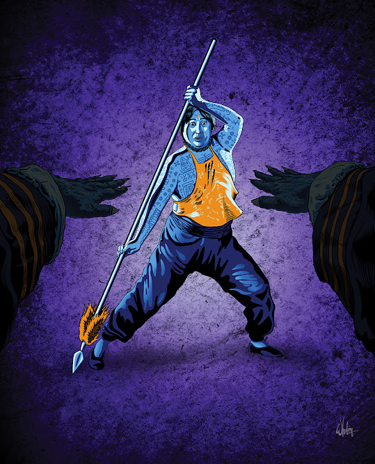
So with those issues in play, I decided the title, handwritten in a pseudo graffiti style (as hand-made as these films are), should be prominent and perhaps surrounded by his cast of archetypical kung fu characters. All tensed and ready for action. Or more precisely, VENGEANCE!

I divided the cover into eight equal sections, each representing a film in the order they appear in the set. Then filled each with the cast from that film. 

To me the negative space between elements can be as important as the elements themselves. For example, the space between notes in a song, (the semitones) are what give the music its rhythm and character. Otherwise it's all noise. The same can be said to be true in the visual medium. I call an image with no eye-lines “wallpaper”. (Apologies to Jackson Pollack fans.)

I generally try to avoid this. But, in the case of CINEMATIC VENGEANCE! after cramming in a few characters from each film, at least 23 figures in total, into the cover, it came dangerously close to becoming just thatwallpaper. Efforts were taken to keep all the section’s dividing lines leading the viewer's eye toward the title. And all the characters were also facing the center, again, leading the eye toward the title.

Notice the “blue left side” and “red right side”. Adding a consistent lighting scheme to all the painted figures is an easy way to bring them all into the same environment. (This can be done much more easily with illustrated art than when Photoshopping a bunch of separate photos together. Careful attention has to be paid toward getting all the lighting consistent in a composite shot otherwise something just seems off.)    

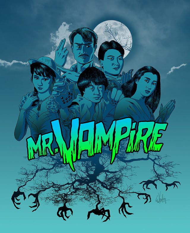
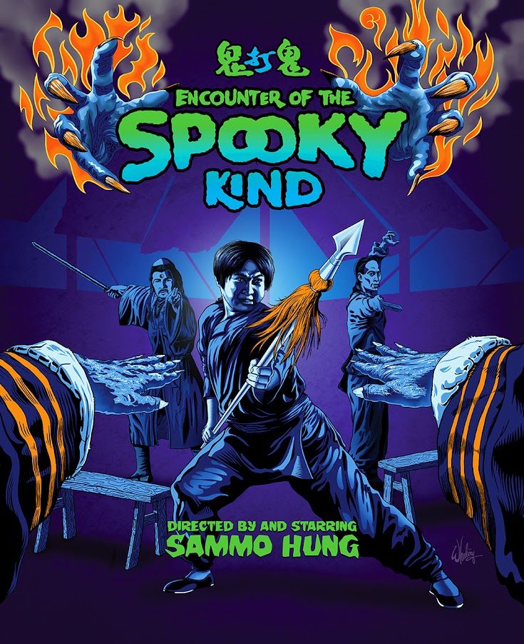
To me, two of the most important aspects of the design, is tone and composition.

In my previous post I discussed some art I did for a couple horror/action/comedy films.

See below.

The tone reflects the color palette of the predominantly nocturnal stories. While the symmetrical compositions create eye-lines that effectively lock the viewers gaze into the center of the frame. Which is also helped by the direct eye-contact from all the characters. It's an "eye-catching" cover by design, not necessarily by its content or fairly simple rendering.

See below.

Your eyes might not have noticed, but your brain did.    

After considering the age and “rediscovered” nature of the films in this collection, I then decided to add further visual interest by giving the box art some natural distressed wear and tear. As if it’s been on a shelf in some backroom of a long abandoned Taiwanese film studio. But as you open the box the contents get cleaner and cleaner until you get to the gleaming mirror blu-rays themselves. The sparkling jewels within. Giving the customer a subtle feeling of discovery.  

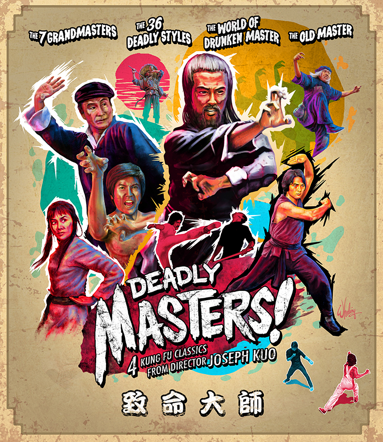
Inside the hard slipcase is housed two separate Amaray style cases with two discs in each. I was asked to come up with names for these as well in case these might get solo releases one day. So I divided the films into two logical groupings, one becoming DEADLY MASTERS and the other FEARLESS SHAOLIN.


The art for these only includes characters from those four films and carries over the graffiti style for the titles as well as a similar framing border. The weathering is noticeably less, but still present to some extent.

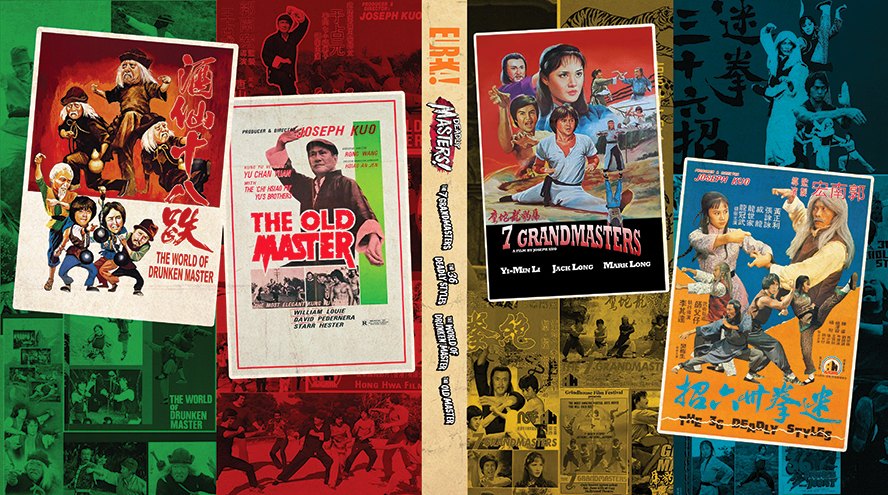
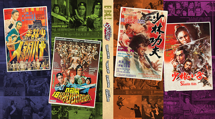
I did reversible color-coded covers featuring the original poster art fans may remember. Sadly the posters had to shrunk to fit the available real estate, but I made them as big as I could filling both "front and back" panels of the spread. Personally, I’m a fan of using the original poster art, but I also understand the need for studios to give fans something new, as well as to distinguish their release from others (such a Joy Sales or some Japanese distributors that only use the old poster art) especially when viewed as a thumbnail online. A lot of work goes into these releases so it makes sense to make your product unique so fans don’t order the wrong version. Therefore unique cover art is essential. But I always include as much of the original promo art as I can where I can. As a designer I naturally love that stuff.


And as a longtime collector of HK movie memorabilia (and being married to the owner of a Chinese video rental store), I like to dig thru my archives and include whatever rare old imagery I can.


Beginning with this release I was hired to now do the full layout of the entire package and provide final print-ready files. This now included the interior design of the included book as well. (Not just the front/back covers and photo/poster/lobby card page inserts as I had been doing, along with disc art and MENU background files.) This added level of control allows me to create a visual consistency throughout the entire package and provides a more cohesive final product. It can also contribute to resulting in a better product in other ways. As it gives me more time to dig through my old Cinemarts, Milky Ways, etc., to find rare imagery that I can include in the booklets last minute. Since I don't have to provide this material ahead of time to another layout artist, since now I'm the last one who touches it.

For this release I also retrofitted or redesigned old lobby card art to fit in the package. It's a preciously rare opportunity to combine my personal interests, passionate hobbies and my professional work. It was a blast. 
 

Pack your bags! As we'll be taking a wild ride on... THE MILLIONAIRES' EXPRESS!
Next time. Right here.

Monday, February 28, 2022

Not Afraid of the Dark


Having just finished work on THE LUCKY STARS 3-FILM COLLECTION project there was suddenly a unexpected hold up.

An issue with two of the films meant that new transfers needed to be struck from negatives in Hong Kong. But with COVID-19 now hitting that region and the resulting shutdowns, it became apparent that that would not happen in a timely manner. So with the looming release date ever approaching, the decision was made to push back the LUCKY STARS box set and find a replacement to slot into that month’s release schedule.

Looking forward to the fall schedule, MR. VAMPIRE was deemed ready enough to move up to fill the now vacant summer slot.

But that meant the packaging art had been done ASAP. No problem. Time to get CREEPY.

This being a horror/comedy dealing with Chinese vampireswhich are actually closer in spirit to Western zombies than Western vampiresI felt it needed a moonlit, comic tone. I went with thick and thin black outlines, a limited color pallet of cool blues and greens (mimicking our vision at night) with a few pops of orange (as the complimentary color). The candles flutter out as something enters the room catching the attention of our heroes, fearful, but ready for action. Lots of direct eye contact to intensify the emotional impact. Our Taoist priest protagonist does his best to keep the evil as bay. But for how long? The stylized smoke and flames were a pleasure to draw.

I designed a title font sporting rotting fangs and a matching color gradient.

For the booklet cover we get a tight grouping of the main cast of characters huddled together as night unfolds and a full moon looms overhead. Even nature cannot be trusted as tree branches grope and grab in all directions. But with no warm orange fire as protection this time.

Knowing more films in this genre could be forthcoming, I felt this visual approach could function as a suitable style for a matching series when similar titles get greenlit for re-release. 

And so it was... for another classic HK horror/comedy was indeed in the pipeline.

Sammo Hung's seminal 1980 martial arts action/horror/comedy classic ENCOUNTERS OF THE SPOOKY KIND (aka SPOOKY ENCOUNTERS) was given the remastered blu-ray treatment and released the following year.

Working within the style guide I set for myself with MR. VAMPIRE, I went with a slightly more purple tone for the background here so the characters could be edge lit and pop out. 

Again the characters challenge the viewer, as if our POV is that of the Jiangshi (Chinese hopping vampire) itself. It features two large gnarly, burning hands reach out to engulf the title. Again orange is used as the pop color, with blue-green gradients.


For the booklet cover we have Sammo as "Bold" Cheung holding his breath, cowering next to an open coffin while a Jiangshi (played by Yuen Biao) rises up, coming to life. This scene was one of the many highlights of the film. As you may know, Chinese vampires can find you by sensing your breath. If they get you, they can take your qi (life force) away. Which I'm told is a bad thing. Just FYI.


I know most fans want to see Hung posed as a confident action hero, but his character is afraid through most of the film until the very end. So to convey the threat of the undead, I also did a version where he actually looks fearful.


It was fun working in this style and I hope to do more sometime. We shall see.


Next up... enter the shapes
We'll open up a BOX OF KUNG FU and get our CINEMATIC VENGEANCE!