Thursday, January 27, 2022

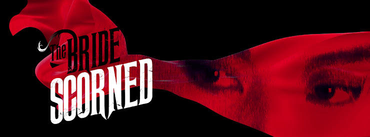
The Bride Scorned


THE BRIDE WITH WHITE HAIR has long been a favorite of mine. (You’ll probably hear me say that about a LOT of the films I have done blu-ray covers for. But, not ALL of them.) The original HK poster for BRIDE hung on my studio wall for over a decade and, as much as I loved the image with its deep colors and photogenic leads, the fact that the bride with "white hair" sported "black hair" in the poster always bugged me. So I knew right away when doing the art for the film that I would represent her AFTER her hair transitioned to white. My white haired bride would have white hair. Naturally.
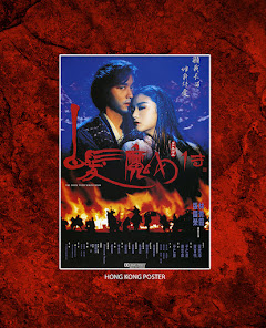
I’ve also never been a fan of anachronistic packaging. So for instance, if the film was made in 1955 then the packaging or marketing materials should look as if they were made around that same time, with a 1955 approach to the art style. After all, the cover is meant to represent the product inside. (Hong Kong action fans who bared witness to that ubiquitous mid-90s Jackie Chan "black t-shirt photo" used on dozens of re-released films dating back to his teen years know what I mean.) Come on. Try a little harder.

So in representing a romantic action fantasy film from 1993, the requisite I set for myself was to create a cover piece that prominently featured the two famous leads, hints at their interaction and teases the action element, while setting the tone and atmosphere in a bold visual style befitting a film from that era.

Many currently popular art styles, commonly represented in the awesome work of Mondo, reinterpret the visual tone of old films with modern graphic art styles. As if to say, “What if John Carpenter’s THE THING were made TODAY? How would it marketed to a younger generation? What if it looked more like the cover of a graphic novel?” I considered this, but ultimately felt old school was the proper way to go to represent it respectfully. Plus I’m kinda old school myself (or maybe just old), so it was just more natural for me to go that way. Who knows.
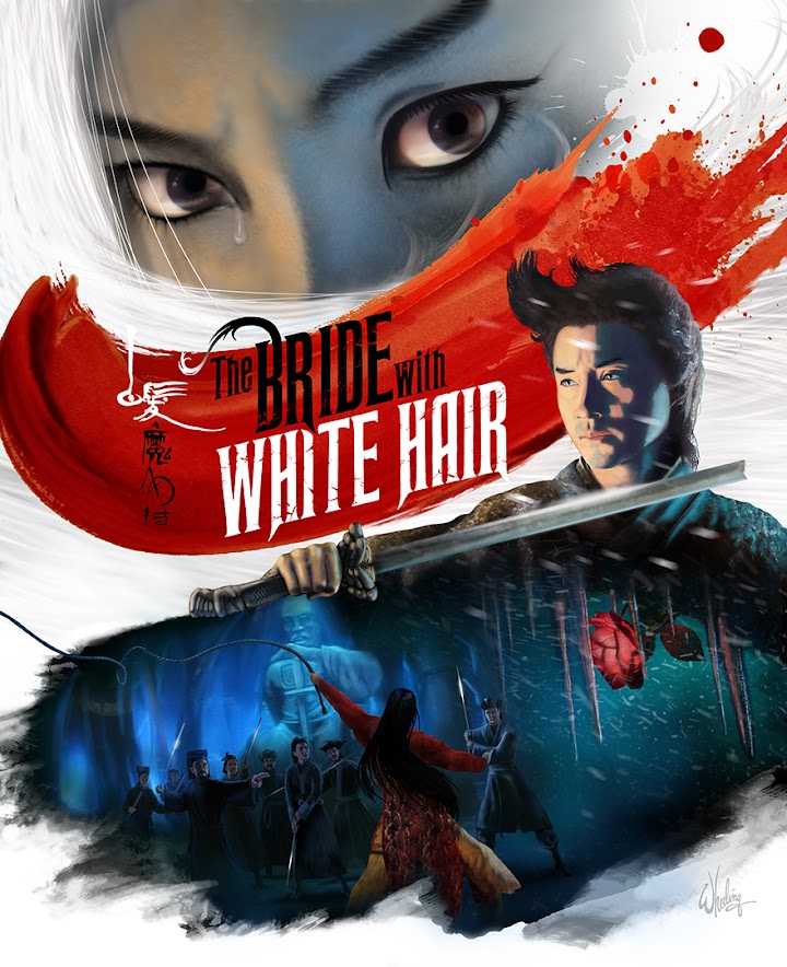
This was another Hong Kong film that didn't have a "designed" font for the English title. Just a boring sans-serif ARIAL. So I created a distressed jagged logo with flowing strands of the word BRIDE literally turning white. Set against a blood red swath of watercolor. The billowing snow and hair, and the cracking whip give it some movement, even if the characters are static in their poses. Much like the start/stop feel of the film's action. You can almost hear the image. Leslie Cheung protects the magical rose (as it blooms in his heart) with his broken sword.   

But I felt the main focus should be, of course, Brigitte Lin Ching Hsia's dramatic intense stare. Angry and hurt. Tearful and shocked. Scorned and bitter. Powerful and vengeful to the very end.

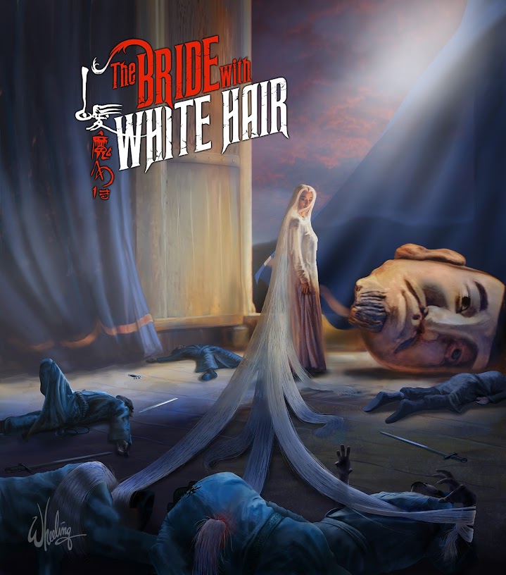
For the cover of the Limited Edition book, I fast forwarded to the climax of the film. I felt the image is a bit too "spoilery" for the outer cover, but was just too cool a mental image NOT to create for the book. I had fun with this one. I actually posed for photo reference as all the dead soldiers.  

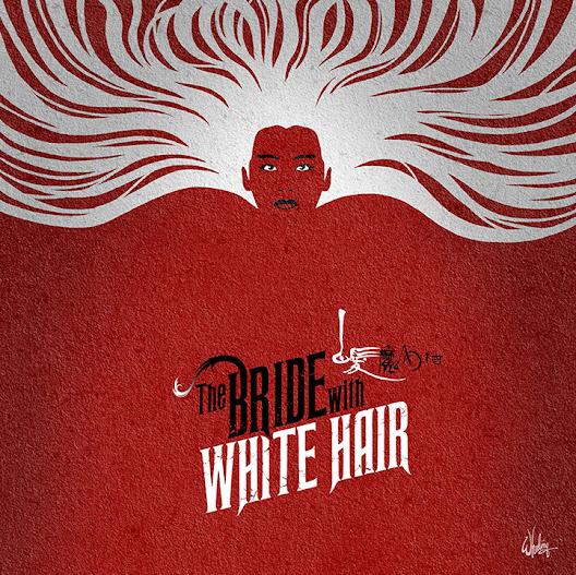
For the disc art I went with a simpler more graphic style approach. I had less than a hour to do something so I did a simple image (emphasizing Lin's flowing locks) that would hopefully reproduce well when printed on a plastic disc. (I was fairly new to this UK client and wasn't sure of the image quality of their on-disc printing.) I live in the US and their products are not commonly found on shelves here. Heck, blu-rays are getting harder to find in stores in general, much less 30 year-old Hong Kong films re-released by UK companies in Region B.


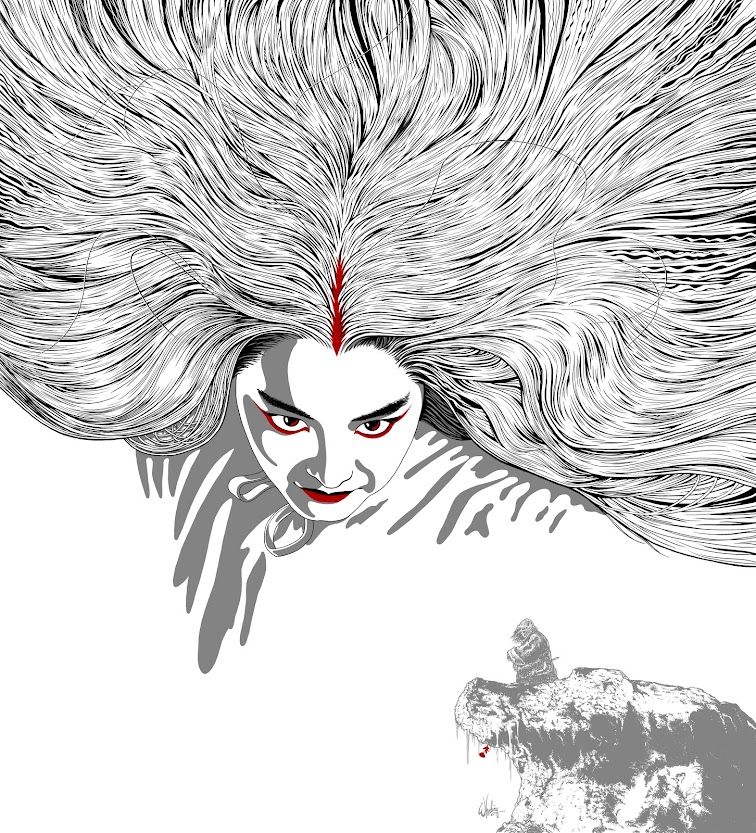
Surprisingly, a month later I was approached by a German company who particularly liked my disc artwork and asked if they could license it for the outer box cover of THEIR release of the film (packaged along with a new transfer of it's sequel, which sadly wasn't available at the time of the UK release). But it didn't sit well with me to sell the same art to two clients, nor did I want any potential confusion in the marketplace from having the same art on two totally different releases of the film. That defeats the whole point of creating new art for these old filmsit's a selling point that differentiates your release of the film from others. 

So for the German company I created new art in a similar flat style. I spent the better part of a week just drawing individual strands of Brigitte's hair. But her HAIR is the visual 'hook' of the film, so it HAD to be done. Lin looms large over a small figure of Leslie, nestled on his snowy perch, patiently awaiting the rare bloom of the magic flower that will return his love to him. 


It's curious how one thing leads to another. I don't think I would've been approached by the German company to do the art for THE BRIDE WITH WHITE HAIR, if I had not ALREADY done the same thing for the UK company. But this stereotyping as a "Brigitte Lin Artist" would not last long, as I was soon off to illustrate JACKIE CHAN, SAMMO HUNG, and YUEN BIAO in three exciting adventures.

But that's another story. For next time.

Tuesday, January 25, 2022

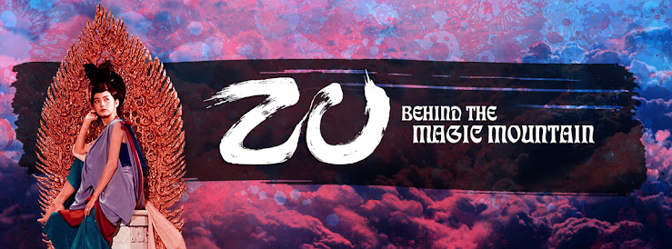
ZU: Behind the Magic Mountain


Returning to blogging after a 10 year break?

Sure why not.

I thought I would reflect back on some of my illustration and design work completed over the past couple years. Particularly in the area of blu-ray packaging for legacy titles (i.e. old movies).

I had been working behind the scenes on various projects to restore classic Hong Kong films for re-release on blu-ray in the US, UK and elsewhere. Providing deleted footage, subtitles, original  soundtracks, references for color grading, rare photos and other bonus materials from my 35+ years of collecting. After a while I was asked if I’d like to contribute some artwork as well.

Sure why not.

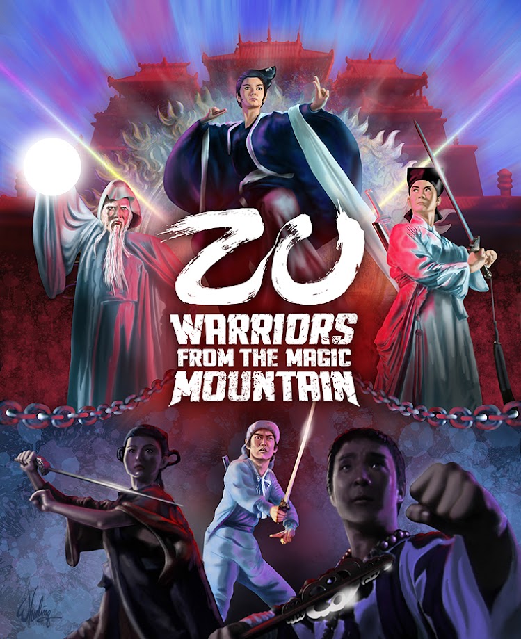
I was tasked with illustrating a limited edition slipcover (commonly called an O-card in the UK, as it’s open on the top and bottom, sliding down to wrap around the plastic blu-ray Amaray case). Limited edition ‘bonus’ packaging has long been a successful way for companies to encourage initial sales to consumers who might otherwise tend to wait a bit. Act now and get some free goodies! 

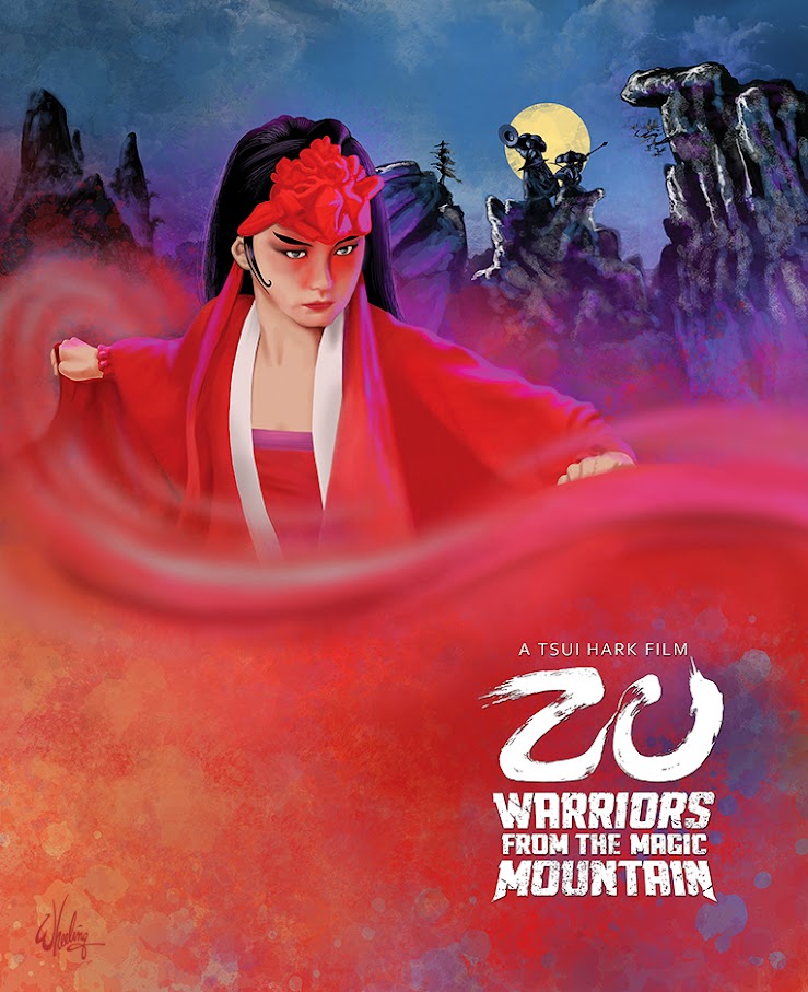
Collectors (a rabid group, which I certainly consider myself a member) love to fill our shelves with physical media, even more special if it’s the rare “fancy version”. In this case, the first few thousand purchasers of the title would also receive a limited edition cardboard slipcover as well as (roughly) 28 page full-color booklet featuring an essay on the film and its production. (My cover art for the booklet is shown at the bottom of this page.)

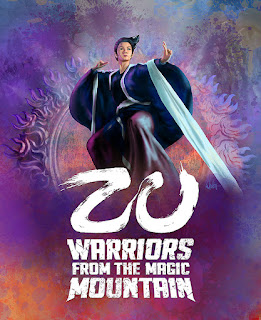
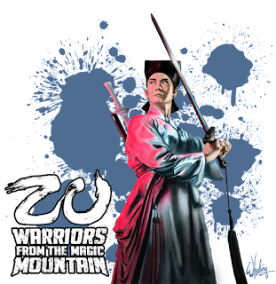
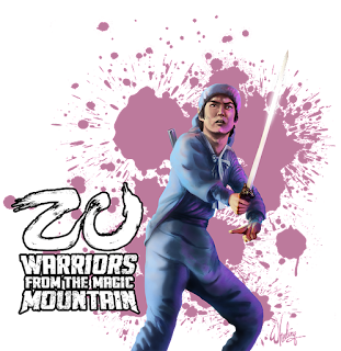
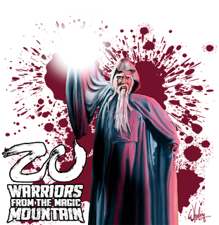
So the first film I was asked to illustrate was Tsui Hark’s 1983 seminal fantasy film ZU: WARRIORS FROM THE MAGIC MOUNTAIN (Chinese: 新蜀山劍俠).

Although less-than a blockbuster upon release, the film was highly influential, inspiring Asian filmmakers as well as those in the West such as John Carpenter (BIG TROUBLE IN LITTLE CHINA), Sam Raimi (EVIL DEAD). Considered the first ‘modern’ special effects film made in Hong Kong, visual effects technicians, some of whom had worked on the first Star Wars, were flown over to help train the HK crew. Thus laying the groundwork for future fantasy films, Wuxia Pian and even the occasional sci-fi film production. Although audiences at the time weren’t certain what to make of Hark’s ultra-fast-paced edits and constant momentum, that style is now fairly common and even desired in modern day entertainment.    

The films plot is a bit scatterbrained and characterization is merely archetypal, so the main attractions is mostly the all-star cast, breakneck action and colorful visual spectacles which were novel at the time. So my artistic approach was to feature the main cast prominently in their classic ready-for-battle poses, while emphasizing the bright fantasy colors and hinting at the dark undertones. Any story elements are mostly left out of the composition, leaving the plot for the first-time viewer to discover.


The characters completely surround the film’s title, which I redesigned as a Chinese calligraphic-inspired logo (in a modern reverse knockout white).  I normally prefer to use the original English film title treatment, if any aesthetic thought had originally been put into it. Otherwise I make a new “pretty” one for English-friendly audiences. Sometimes with these old HK films, subtitles were an afterthought and the English title is simply a tiny Arial font centered under the Chinese title. As authentic as that may be for a Chinese audience, that won’t due for my client in the English-speaking market. Here "ZU" sits proudly on its thrown pedestal of "WARRIORS".

Much of the film takes places in a neither-here-nor-there mythical netherworld so to represent this aspect the characters are set against a splattered color wash with chains (featured in the film) turning to beams of radiant light dividing the worlds between them. The lower half of the canvas features two ready-for-action characters rim-lit with lead actor Yuen Biao getting the spotlight.  

Creatives know that rarely does that initial vision make its way to the physical world unchanged. Whether it’s music or the visual arts. Much of that evolution is necessary and welcomed. Interesting discovers can and do happen along the way. But managing understandings of the limitations of the physical world versus the boundless nature of imagination can be a balancing act of artistic frustration, ego, and the fundamental nature of commercial art. You’ve got a deadline to meet. Period.

So you get it done, meet your clients expectations, learn something along the way and hopefully move on to the next project. That’s the measure of success.

It was a pleasure drawing these characters from a film I’ve long enjoyed. The cast are luminaries of HK cinema’s golden age. Brigitte Lin starred in my favorite film PEKING OPERA BLUES, also directed TSUI HARK. I was lucky enough to meet her back in the 1980s at a film festival in her honor. And as it happened, this would not be the last time I was hired to illustrate her chiseled features and famously cleft chin.


But more on that in the next post.


Wednesday, April 17, 2013

Sight for Sound: "I Remember"


third in a series of illustrated song lyrics ]

 words by molly drake (mother of nick drake)


We tramped the open moorland in the rainy April weather,
And came upon the little inn that we had found together,
The Landlord gave us toast and tea and stopped to share a joke.
And I remember firelight, I remember firelight,
I remember firelight, ... and you remember smoke.


We ran about the meadow grass with all the hairbells bending,
And shaking in the summer wind, a summer never-ending,
We wandered to the little stream, among the river flats.
And I remember willow trees, I remember willow trees,
I remember willow trees, ... and you remember gnats.


We strolled the Spanish marketplace at ninety in the shade,
With all the fruit and vegetables so temptingly arrayed,
And we can share a memory, as every lover must.
And I remember oranges, I remember oranges,
I remember oranges, ... and you remember dust.


The autumn leaves are tumbling down and winter’s almost here,
But through the spring and summertime we laughed away the year,
And now we can be grateful for the gift of memory.
For I remember having fun, two happy hearts that beat as one,
When I had thought that we were “we”, ... but we were “you” and “me”.


Sunday, March 31, 2013

Plop Art Pop Art: The Beauty of Ugly


PLOP! "The New Magazine of Weird Humor!" was a 24 issue "anthology comic" magazine, published bi-monthly from Sept./Oct. 1973 to Nov./Dec.1976. Boasting many of the talented artists from the early years of the satirical counter-culture rag MAD Magazine, PLOP! delivered gruesome yet comic morality tales (usually "hosted" by a cast of three reoccurring characters, Cain, Abel and Eve) illustrated in typical offbeat fashion (from the pen of master cartoonist Sergio Aragonés). 

A Wolverton classic based upon his even uglier Lena the Hyena
As a juvenile at the time, I was attracted to it's grotesquely zany cover art of exaggerated anatomy by the uniquely inventive and free-flowing artist Basil Wolverton and the brilliantly versatile but deeply troubled Wallace Wood. This work represents both veteran artists near the end of their lives. Looking back I can see how these outlandish characters influenced my early free-form doodles and "just for fun" illustrations. In fact my school notebooks looked like leftover PLOP! cover concept galleries.  

Wolverton, referred to as the 'Michelangelo of MAD' by The New York Times, had a trademark "crossed-hatched rubber-hosed bug-eyed" style and was very fond of grotesque portraiture. You may have seen his famous cover for the May 1954 issue of MAD Magazine, parodying Life Magazine's "Beautiful Girl of the Month" issues. (Image at right) Yep, she sure is sumfin.

Wood had a more refined and varied style, illustrating everything from Atlas and Marvel comics (Daredevil, Dr. Doom), children's picture books, record album covers, Mars Attacks trading cards, product packaging, as well as writing and drawing syndicated comic strips. 

He's also well known for his edgy satirical work. He illustrated a few risqué titles which featured parodies of Disney characters shown engaging in "unexpected situations". Sadly, Wallace later took his own life. 

So welcome to this long overdue "virtual retrospective" of the PLOP! ART of Basil Wolverton and Wally Wood. You are more likely to find their work hanging on some college dorm room wall, than in the Louvre or the Smithsonian. And something tells me that's just how these guys would've prefered it. Admission here is always free, but if you should feel like offering a contribution... we only accept your comments. Your money is no good here. Enjoy!  

Art Arteries by Basil Wolverton

Roarin' Rodney Roadrunner by Wally Wood

Messy Tessie and Darlin' Daisy Dallyrimple by Basil Wolverton

Untitled by Basil Wolverton

Famous Four Eyes "Bo" Garth by Wally Wood
Josephine by Basil Wolverton (an obvious satire of those controversial 1971 ads for National Airlines)

Feets Fleagle by Basil Wolverton

Untitled  by Wally Wood


Nooly Nostrildamus by Basil Wolverton
"Arms" Armstrong by Basil Wolverton

"Smokin' Sanford" by Wally Wood
Billy Button by Basil Wolverton
Ashur, Crasher and Basher by Basil Wolverton


"Multiple Mouth McCardy" by Wally Wood


Alfred Adamsapple and Snapper Snodgrass by Basil Wolverton
As far as I know this one is untitled, but I like to call it Blobby McGee

Byron Bigbrain III by Basil Wolverton

Basil Wolverton has such an interesting catalog of work... I'll highlight more of his fun stuff in a future post.


Sunday, March 24, 2013

if only (a poem)


If only for one wish,
an angel or a bird,
a winged messenger to speed my love to you

If only to accomplish,
those words you never heard,
an expression of the heart you never knew

If only for this fire,
still raging in my heart,
sending skyfulls of smoke signals your way

If only for this desire,
even though we're apart,
simply to know you felt a smile today

If only for the chance,
to cast away your fears,
a gift of comfort on the darkest night

If only for one romance,
to last my final years,
letting you fly free while holding you tight

If only for the way,
perhaps a chance to say,
this love is stronger than you realize

If only for one day,
without these clouds of gray,
always turning to rain... behind my eyes

If only...


Wednesday, February 13, 2013

The Vinyl Word (Designer Toys)


In 2010 I designed a series of vinyl toys built on the popular Monskey frame. So-called "designer toys" have been growing in popularity since the late 1990's and offer fans a way of collecting limited edition "tiny sculptures" from artists around the world. 

Of course for children toys have long provided an outlet for imaginative play, exploration and learning, as well as offering comfort and companionship in times of stress. Today adults can appreciate toys for their aesthetic design. And by collecting unique "urban vinyl toys" they help support artists directly while actually making small investments into the art world. True designer toys are hand-produced in very limited runs and nearly always go up in value. 

I thought I'd share some of my 2010 Monskey designs with you. Enjoy.

Exhibiting two opposing personalities, Skitzo can reflect your mood, whether it be gloomy or sunny.

This little Canadian fella wears his heart on his sleeve... and um, his other organs too. 

This is the down-on-his-luck cousin to a certain more famous mouse.

Leaping from the stages of Peking Opera comes this dynamic woman warrior character (Wu Dan).

For the lovelorn comes this little broken-hearted companion. Don't be sad.

When things get too hot to handle, this tiny guy can take the heat. Flame On!

Cheer up! She's just too cute to not decorate your desk with. 

Now you know who's been eating your bananas. Chinese mythology comes alive! 
[Just follow the links in the text at the top of this page to learn more.]